The people behind Stalingrad spent many years helping to create watches for other large brands, but felt it was time to step out of the shadows and make their own watches.
But why call it Stalingrad?
The Battle of Stalingrad was one of the greatest battles in the Second World War and possibly one of the deadliest single battles in history, where the Soviet defence of the city of Stalingrad stopped the German advance into Eastern Europe and Russian which in doing so turned the tide of World War 2 in favour of the Allied forces. The brand, therefore honouring the war heroes who showed extreme courage, determination and strength against all the odds.
But, we must remember that the city was actually renamed Stalingrad in honour of Joseph Stalin, one of the worst tyrants in modern history. So, for that reason I find it a strange choice of name for a watch brand.
First impressions
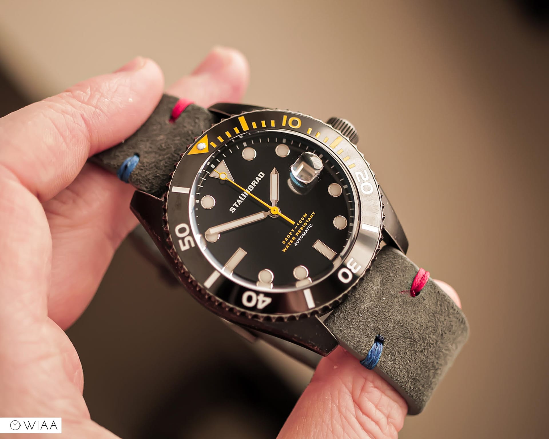
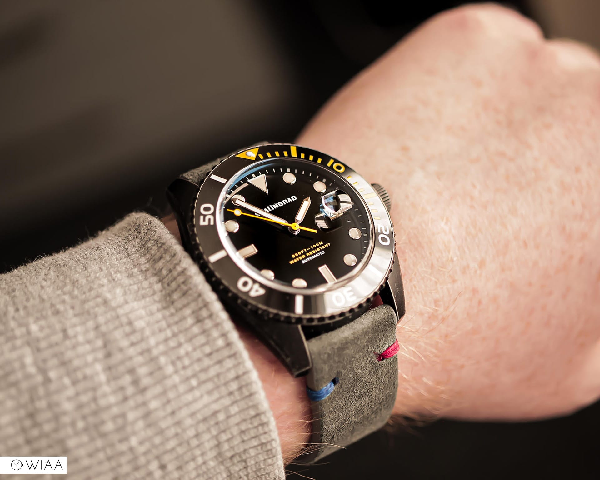
Right off the bat, from the moment I picked the watched up I was impressed, this looked and felt great. The design of this watch is definitely not unique, the hour indices and ceramic bezel are the same as a Tudor Black Bay 58s for example. I don’t think that’s a bad thing though, imitation is best form of flattery. But, yet again, from another micro brand, the strap was a let down for me but I’ll touch on that later.
Case
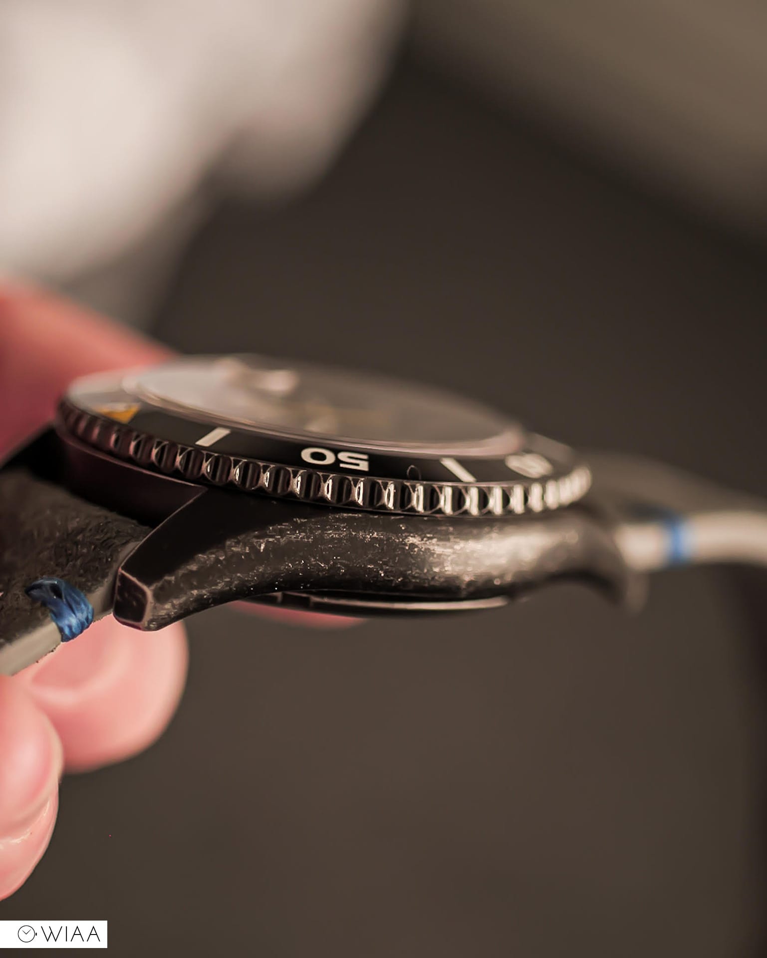
The 42mm stainless steel case design is basic, smooth to the touch but the forced patina helps to make this watch stand out. Designed in this way to help evoke thoughts and feelings that this watch has been through war to get here, it has been beaten up and battered but still made it through to see the light of day.
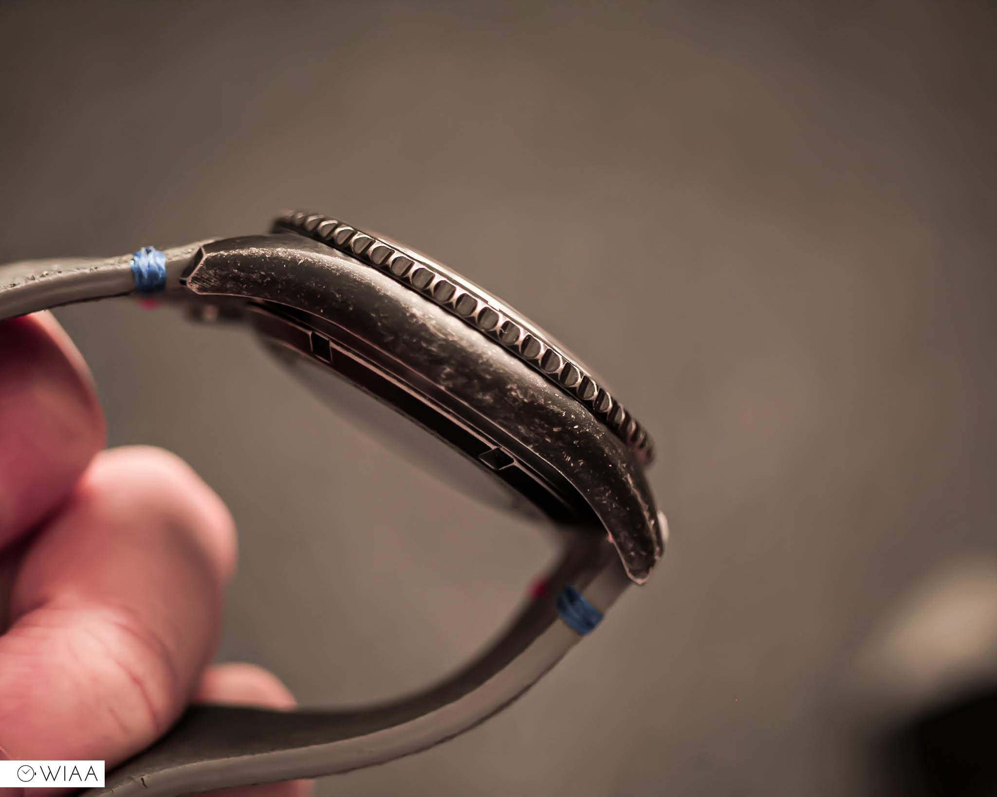
It’s classically shaped, rounded and leads you to the short and angular lugs which show the most signs of patina. The nicely sized screw-down crown is expertly finished, no rough edges visible and is also features the same patina. The crown features a star which I can only assume is the Soviet Red Star historically representing communism.
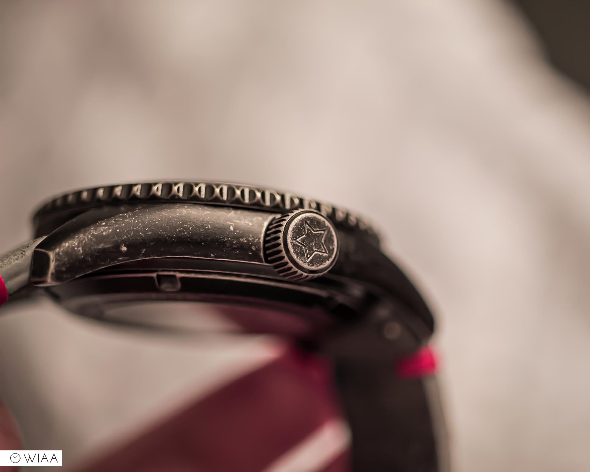
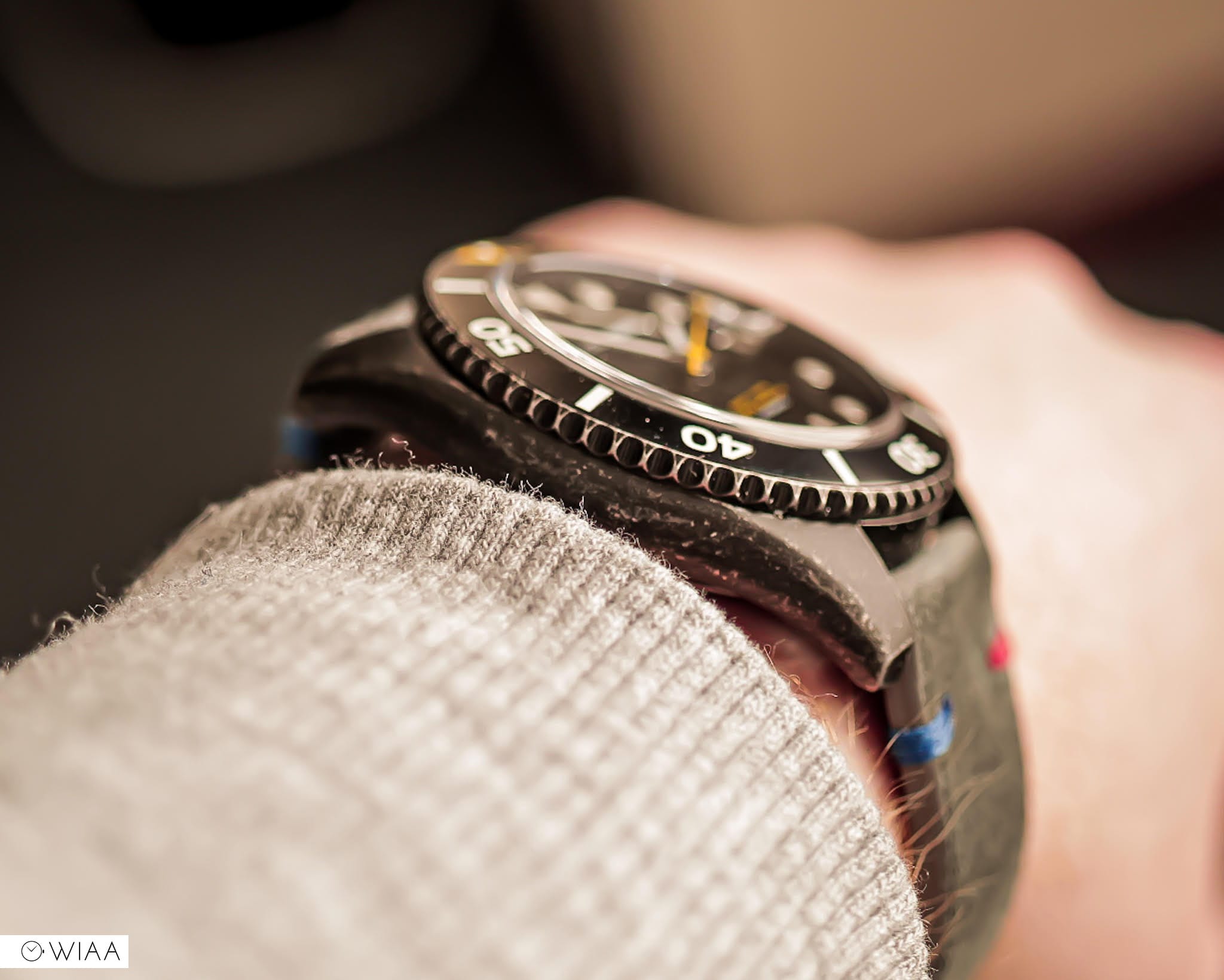
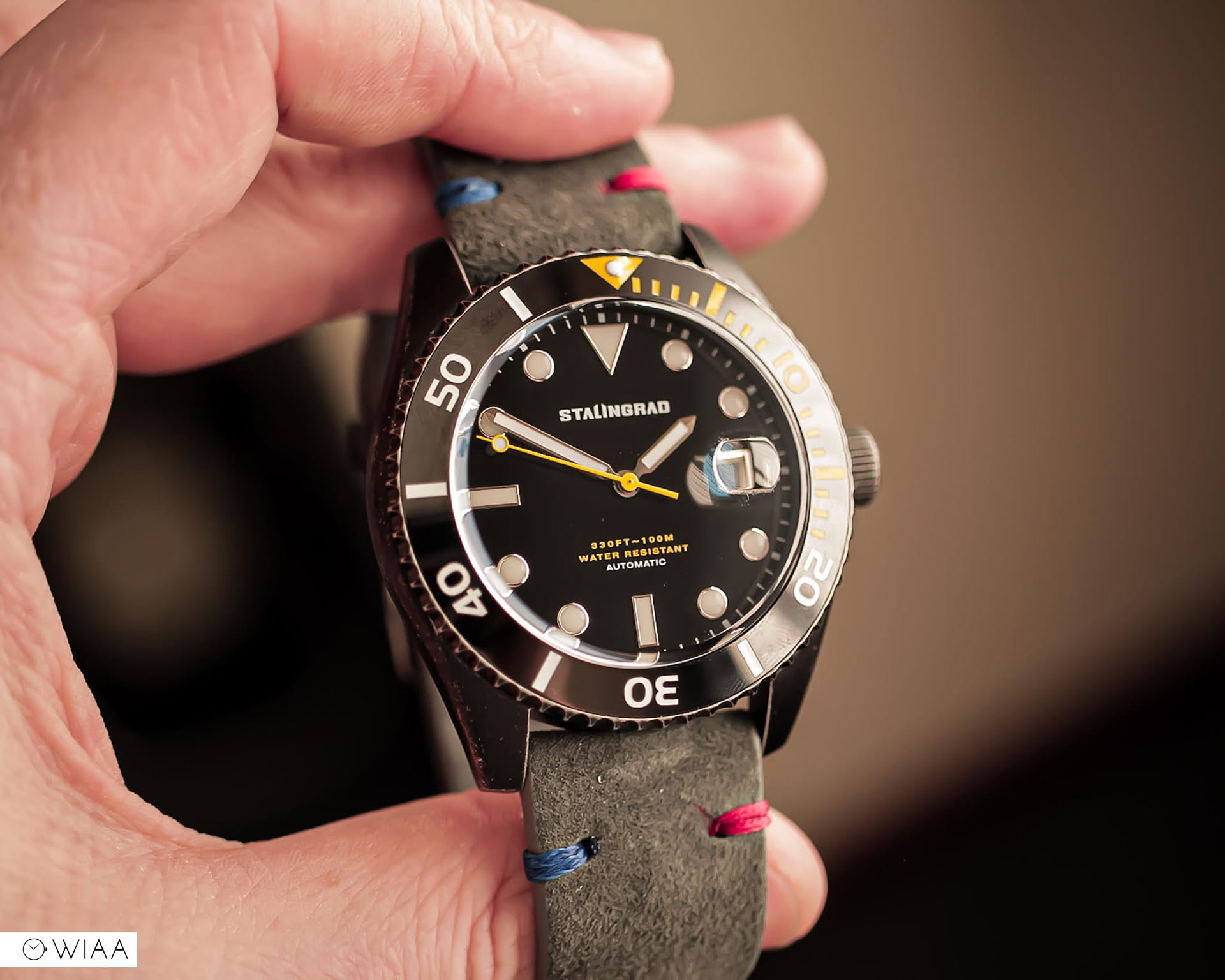
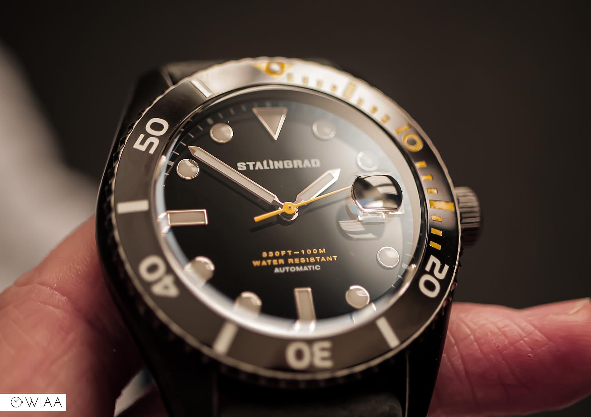
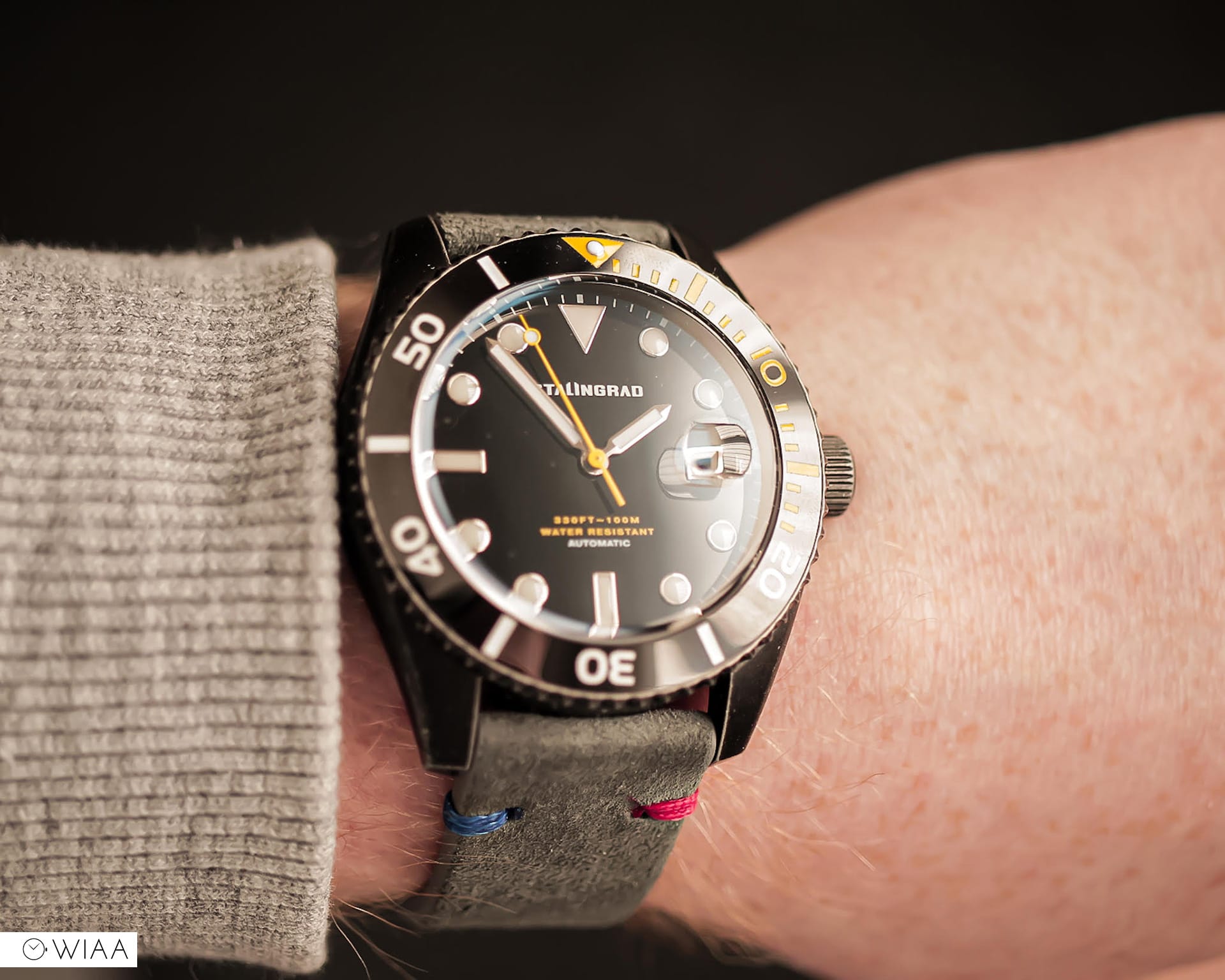
The 90 click unidirectional ceramic bezel is ridged but smooth to the touch also showing signs of patina, but thankfully not on the smooth surface. The motion moves with a nice click, there is a bit of back play on the bezel but nothing major. You have a classic dive watch bezel design, triangle with a lume pip at the 12 o’clock position then minute markers around the bezel for 20 minutes and from that point on you have 10 minute markers. The yellow markers for the first 20 minutes on the bezel nicely contrast and stand out against the black bezel and compliments the seconds hand nicely.
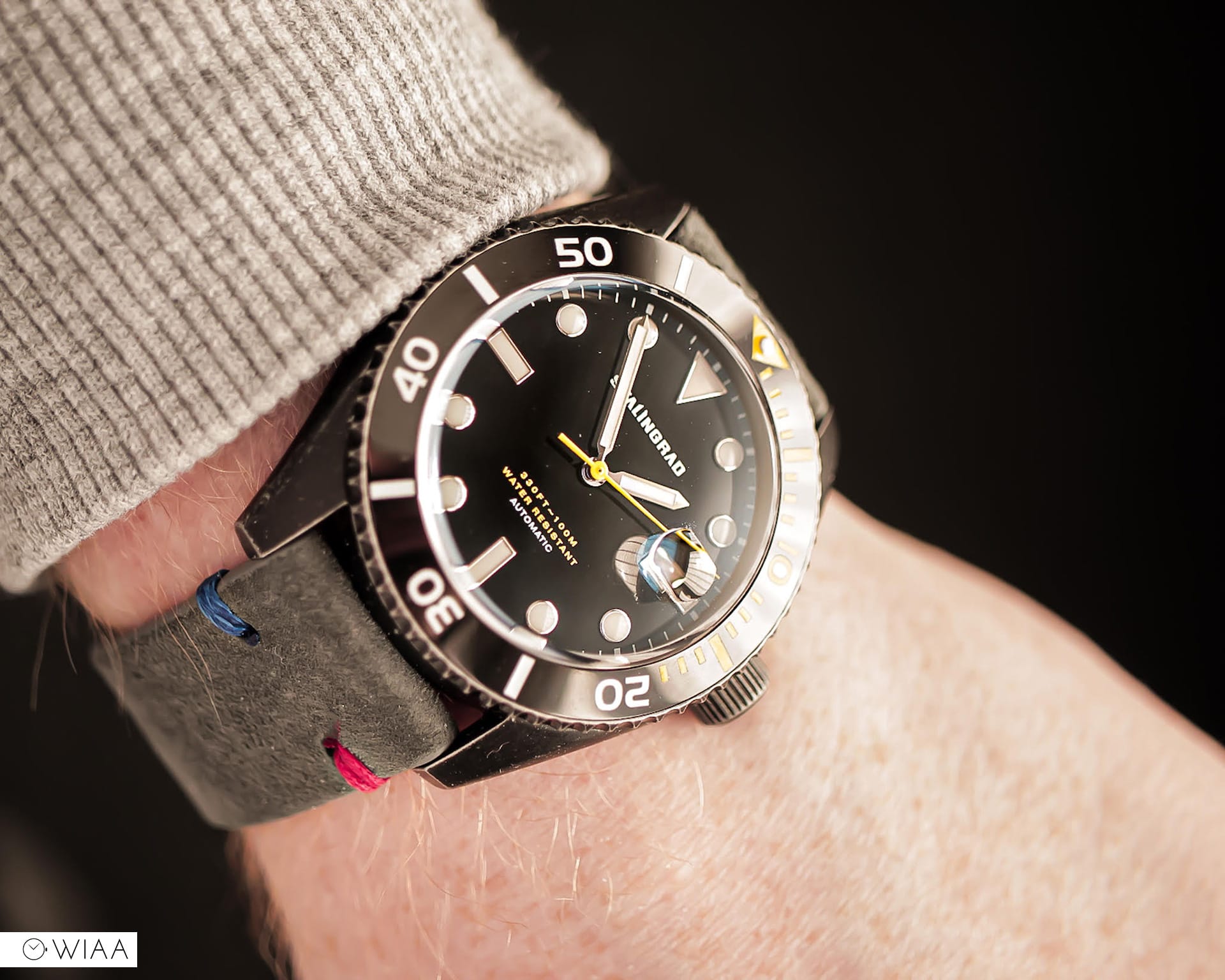
Dial
The dial features the same hour markers as the Tudor Black Bay 58 as I’ve said before that are all filled evenly with a lume that burns a bright green and lasts a healthy amount of time. The sword hands are also filled with the same lume and overall are extremely legible against the deep black dial. The lollipop seconds hand is a bright yellow that helps provide a colour pop and keeps the yellow and black theme going nicely.
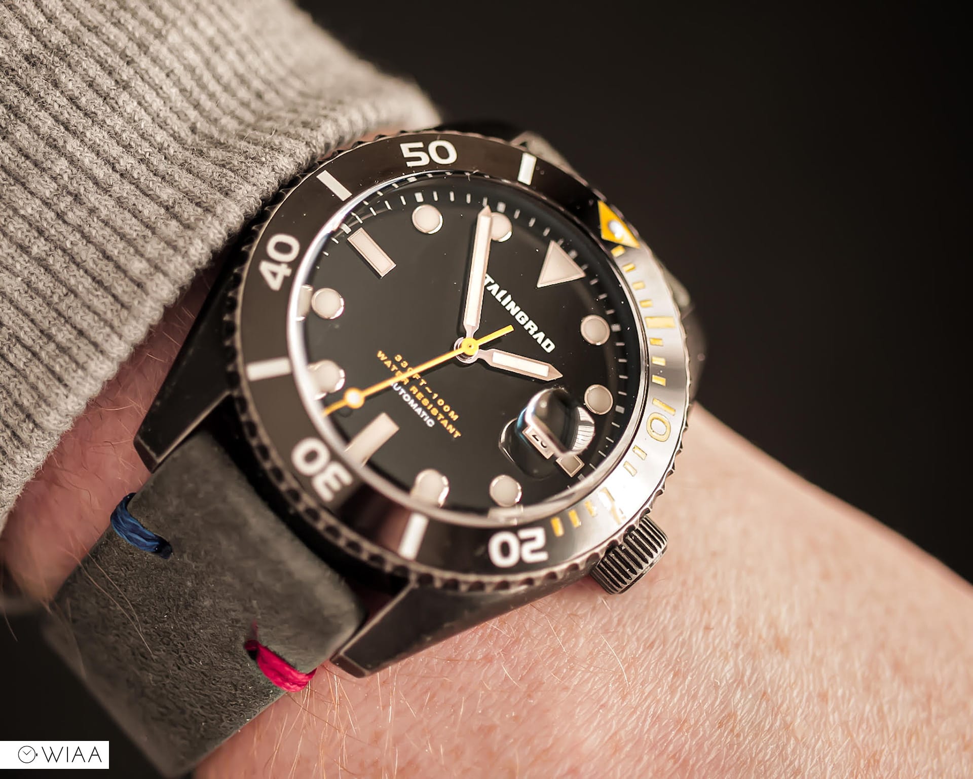
The watch features a date window and a cyclops at the 3 o’clock position which I personally feel that the watch could have done without. The cyclops is nicely done and magnifies the date window like it should, not spectacular but not terrible. My issue comes with the date numerals, the font is uneven and rather crudely done. This is due to the movement inside the watch, a movement that I have never enjoyed and still don’t enjoy; the Miyota 8 series.
Movement and case back
The Miyota 8215 is a 21 jewelled automatic movement that is common in a lot of micro brands due to its low cost and workhorse capabilities. Miyota state the timekeeping parameters at -20/+40 seconds per day at a full wind of its power reserve which is around 42 hours. I personally had no issues with timekeeping on this model and found it to be pretty accurate all things considered.
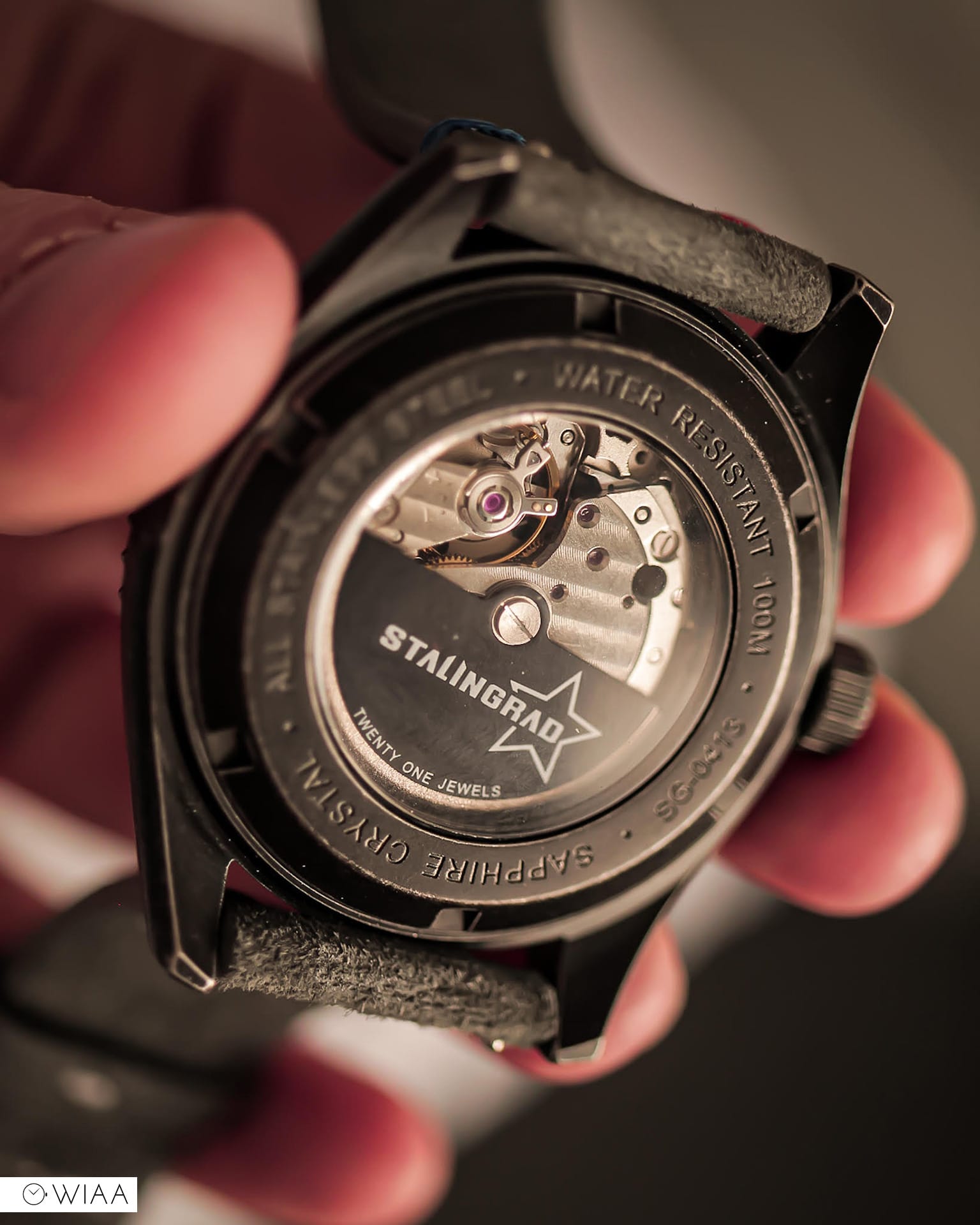
The issue for me with this movement comes with the ‘stuttering seconds’ hand, a common feature in the 8 series movement. An issue that is purely aesthetic and doesn’t affect time keeping at all. A shallow reason, I know, but it is a feature that really bugs me and can be seen simply when you flick your wrist or move the watch from side to side.
The movement beats away at 21,600 vibrations per hour and can be seen through the display case back, whilst the movement itself is nothing to admire there is a nice touch from Stalingrad who have used their own custom black rotor to decorate the movement somewhat.
Strap and closing thoughts
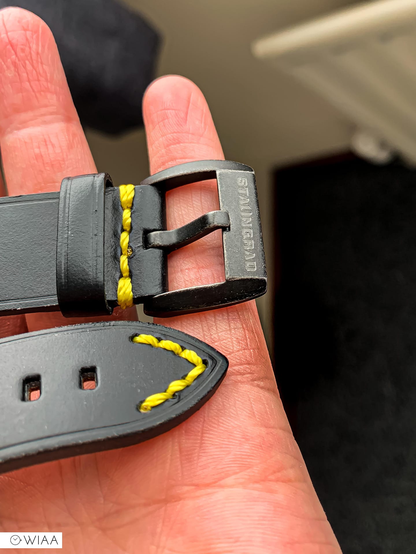
The strap, as I touched on earlier was something that I was very disappointed in and is a disappointing feature in an otherwise very good watch. The black genuine leather strap is nicely stitched with yellow stitching, complimenting and continuing the colour scheme shown throughout the watch but it is thick and really makes the watch feel big on the wrist. It’s a recurring theme in micro brands, make the watch as nice as possible but forget all about the strap, almost as if it is an afterthought, that the average wearer wouldn’t care about the strap.
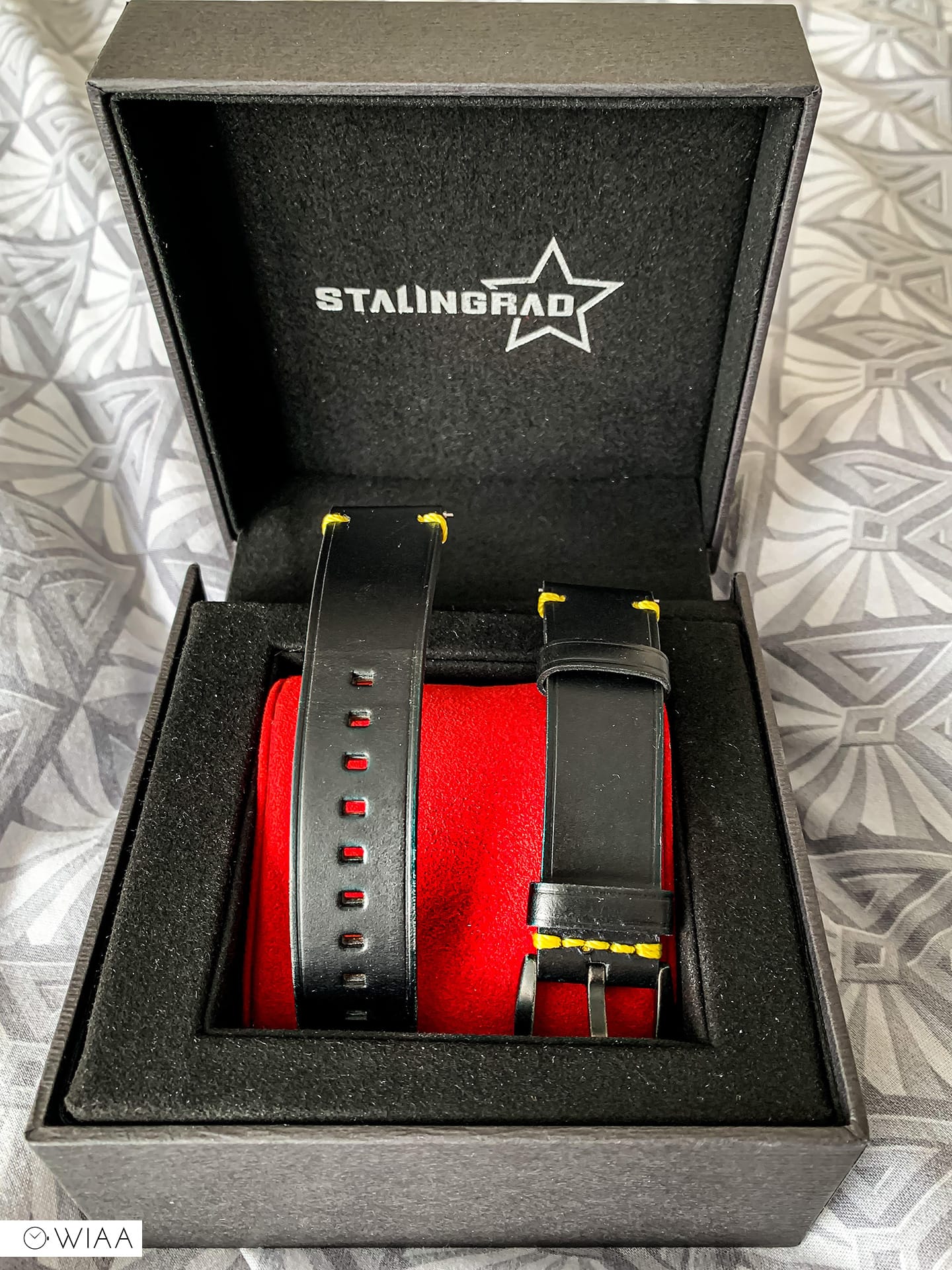
When looking at the strap not attached to the watch its actually a very attractive strap, the large black signed buckle features the same patina as on the case but I just couldn’t wear it, so I swapped it out for a softer suede strap and it made wearing the watch a very nice experience.
For $350 you get a very nice option for a daily beater, a nice watch that is extremely close to being an excellent option in the crowded micro brand world of watches.
Specs
- MOVEMENT : Miyota 8 Series Automatic 3 Hands with Date
- CASE MATERIAL : Stainless Steel with Ceramic Bezel
- CASE DIAMETER : 42mm
- LENS : Sapphire Crystal
- CASE COLOR : Black plating with Black Ring
- DIAL COLOR : Black with Swiss White Luminous Markers
- BAND : Black Genuine Leather Strap
- WATER RESISTANCE : 10 ATM
- PRICE : $350 / ~£280
- Buy here: https://stalingrad-watches.myshopify.com/collections/destroyer/products/destroyer-sg-0413-02


fsdf
24 June, 2020 at 8:16 am
one of the worst tyrants in modern history. LOL
I would say one who won the WWR .
You’re full of shit man