It seems like microbrands are cropping up at a pretty staggering rate with new watch brands coming to life seemingly overnight, so how does a microbrand stand out from the vast sea of offerings? Well, maybe Mitch Mason has the answer. Founded by Benedict Ong in Singapore just last year, Mitch Mason seeks to merge vintage design with a more contemporary purpose. Their vision is simple; to become a truly independent microbrand dedicated to new creation rather than following the paths already paved.
Their first offering – the Chronicle is a vintage-inspired field watch that draws from field watches of old and blends that with newer modern design elements that bring these watches right into the modern era. But can old meet new in perfect harmony?
Prototype Specs
- Lug-to-lug: 43.5mm
- Lug width: 20mm
- Thickness: 12mm
- Case: 316L stainless steel
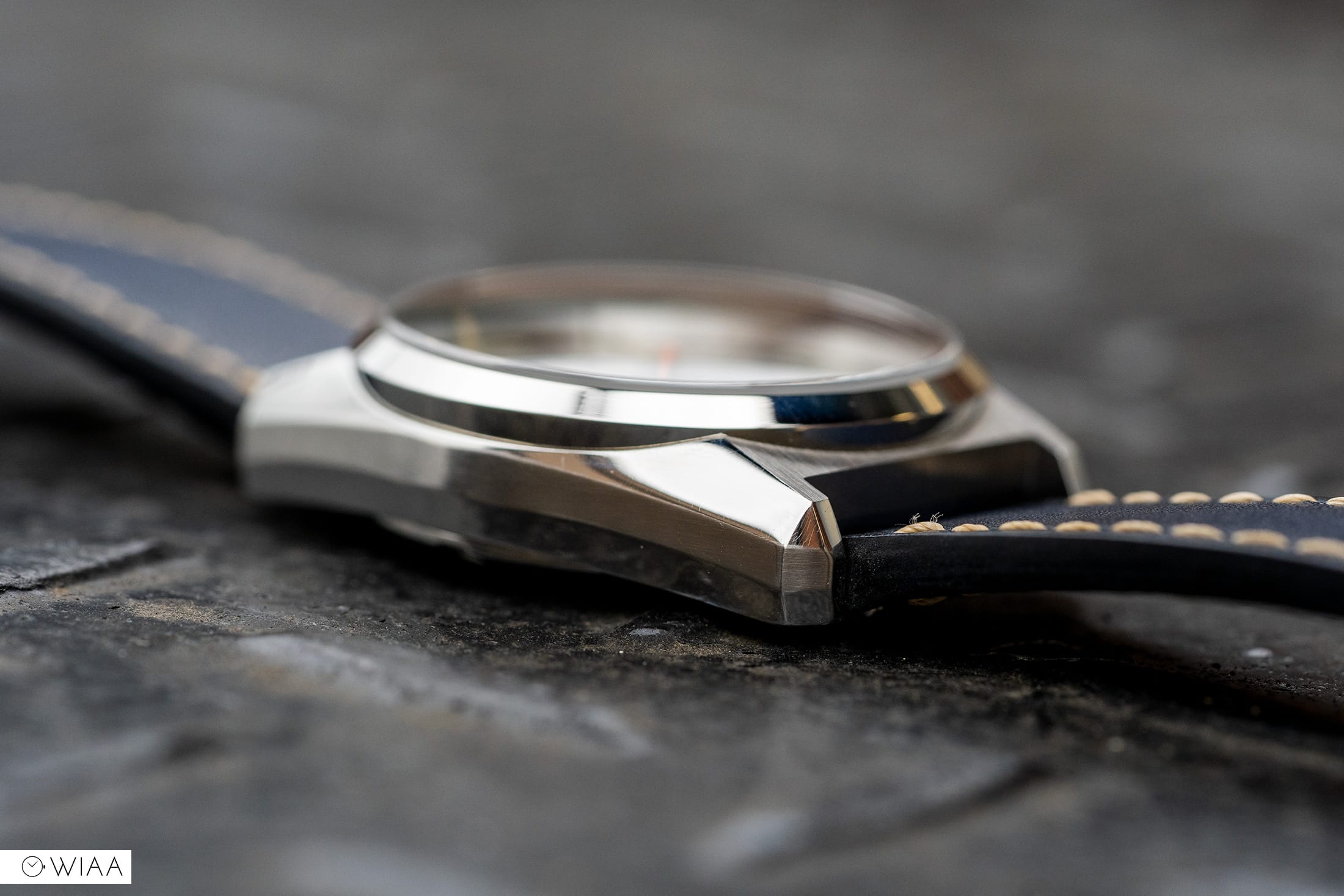
- Crystal: Domed Sapphire with 2 layers of AR / 1 under & 1 over
- Dial: Metallic Blue Sandwich dial
- Lume: Swiss Super-Luminova
- Movement: Sellita SW-200-1
- Water resistance: 100m
- Strap: Full-grain vegetable-tanned Italian leather
Retail Specs
- Case: 36.5mm
- Lug-to-lug: 43.5mm
- Lug width: 20mm
- Thickness: 12mm
- Case: 316L stainless steel
- Crystal: Domed Sapphire with 5 layers of AR
- Dial: Metallic Blue Sandwich dial
- Lume: Old Radium Swiss Super-Luminova
- Movement: Miyota 9039
- Water resistance: 200m
- Strap: Full-grain vegetable-tanned Italian leather
- Leather watch roll for up to 3 watches
- Buy from: https://mitchmason.com/products/chronicle-steel-blue
- Price: $449
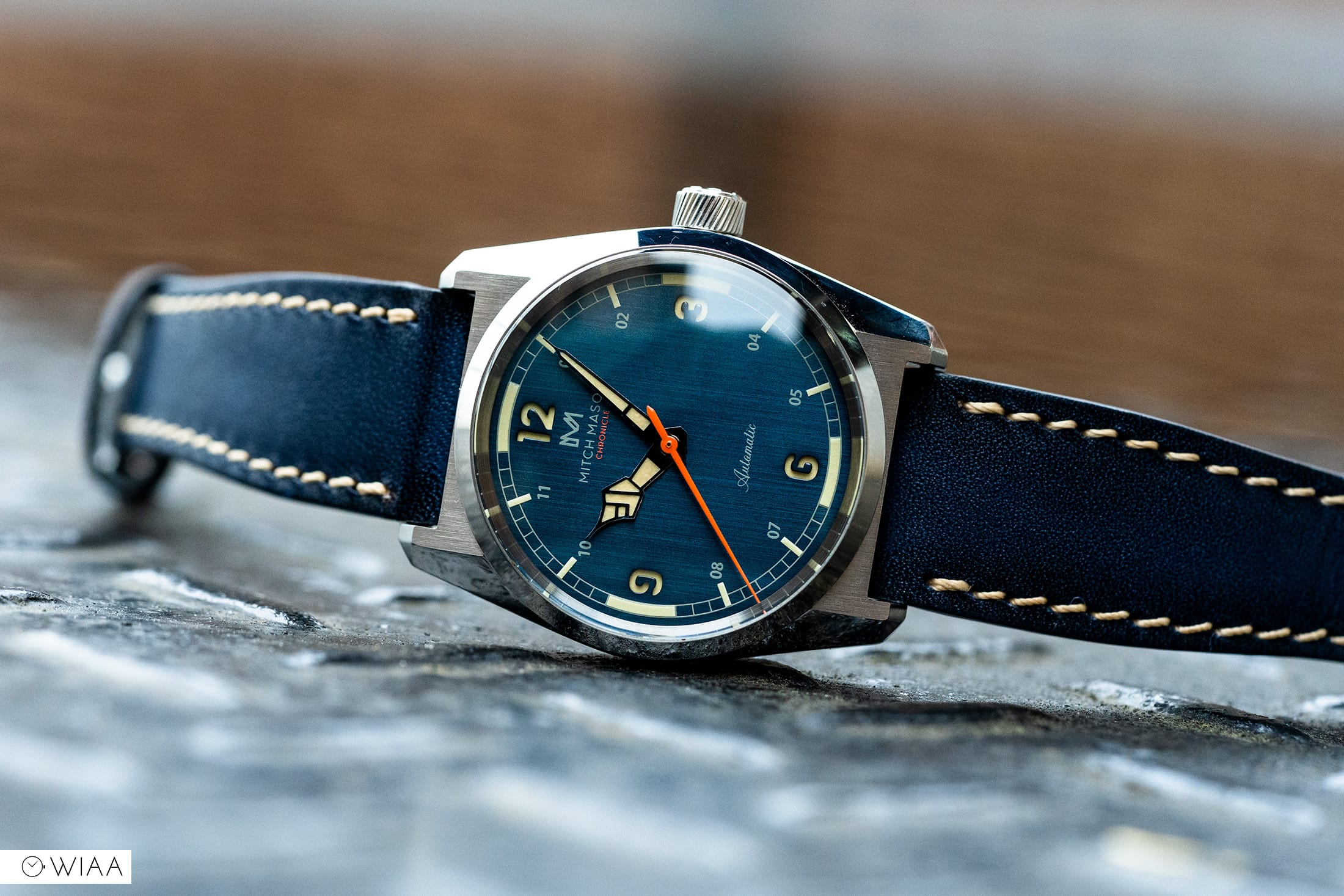
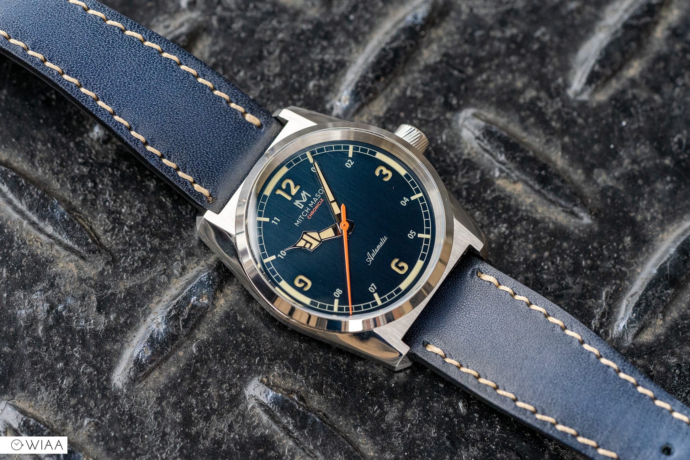
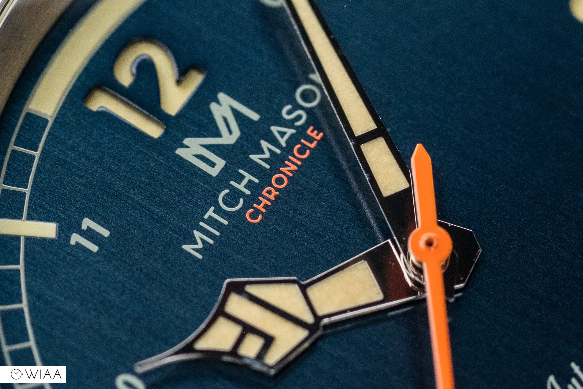
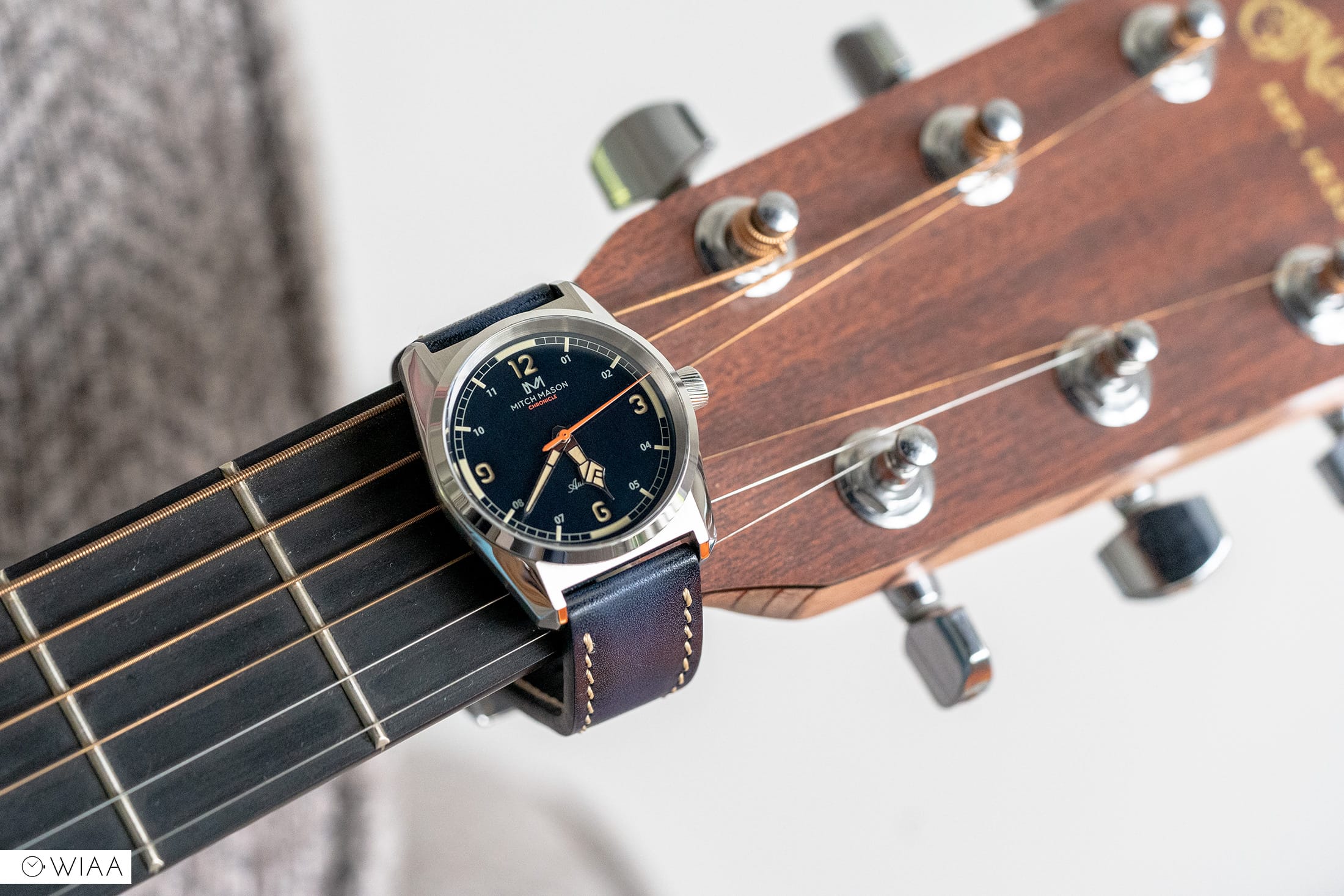
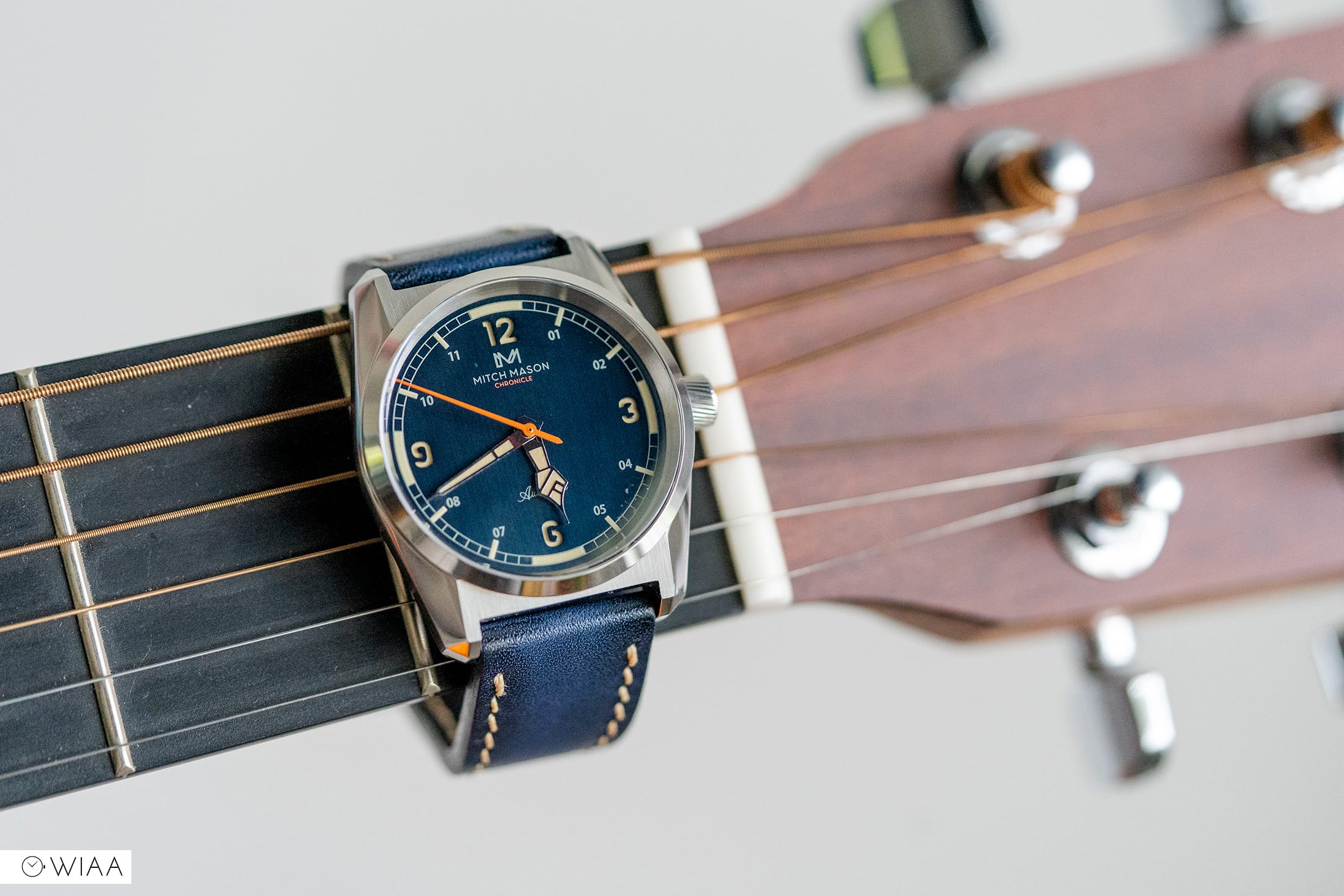
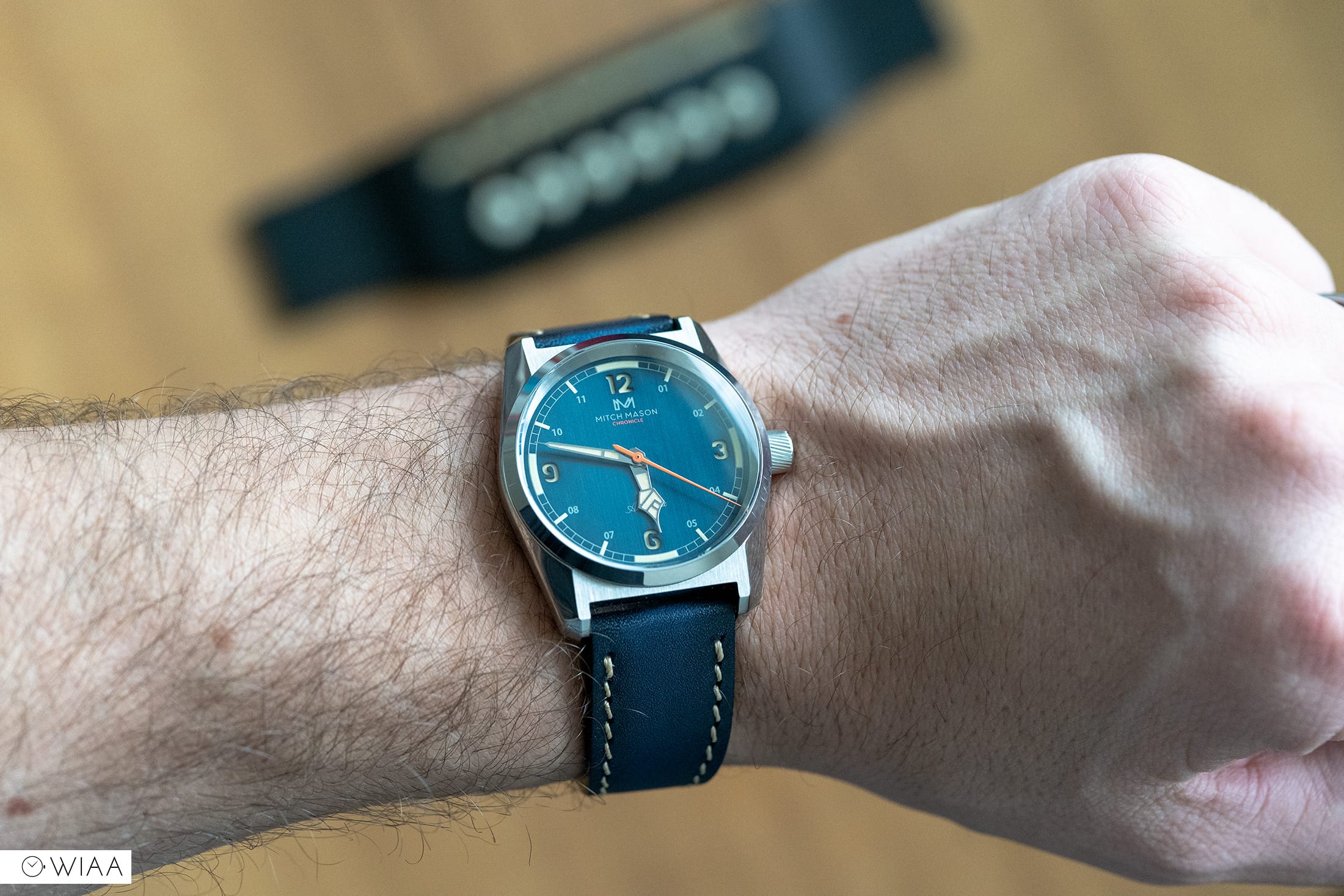
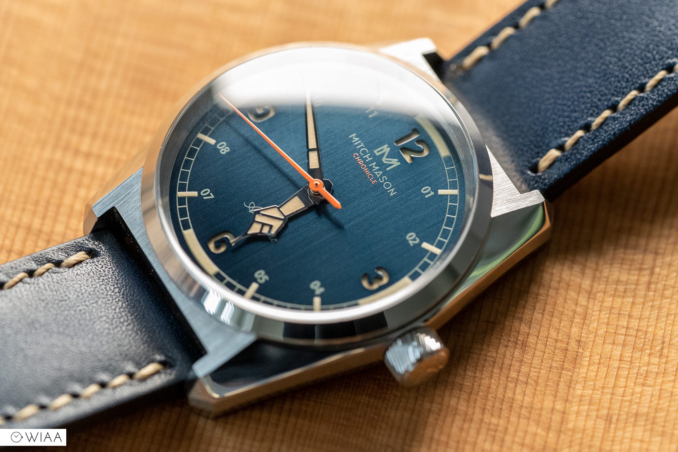
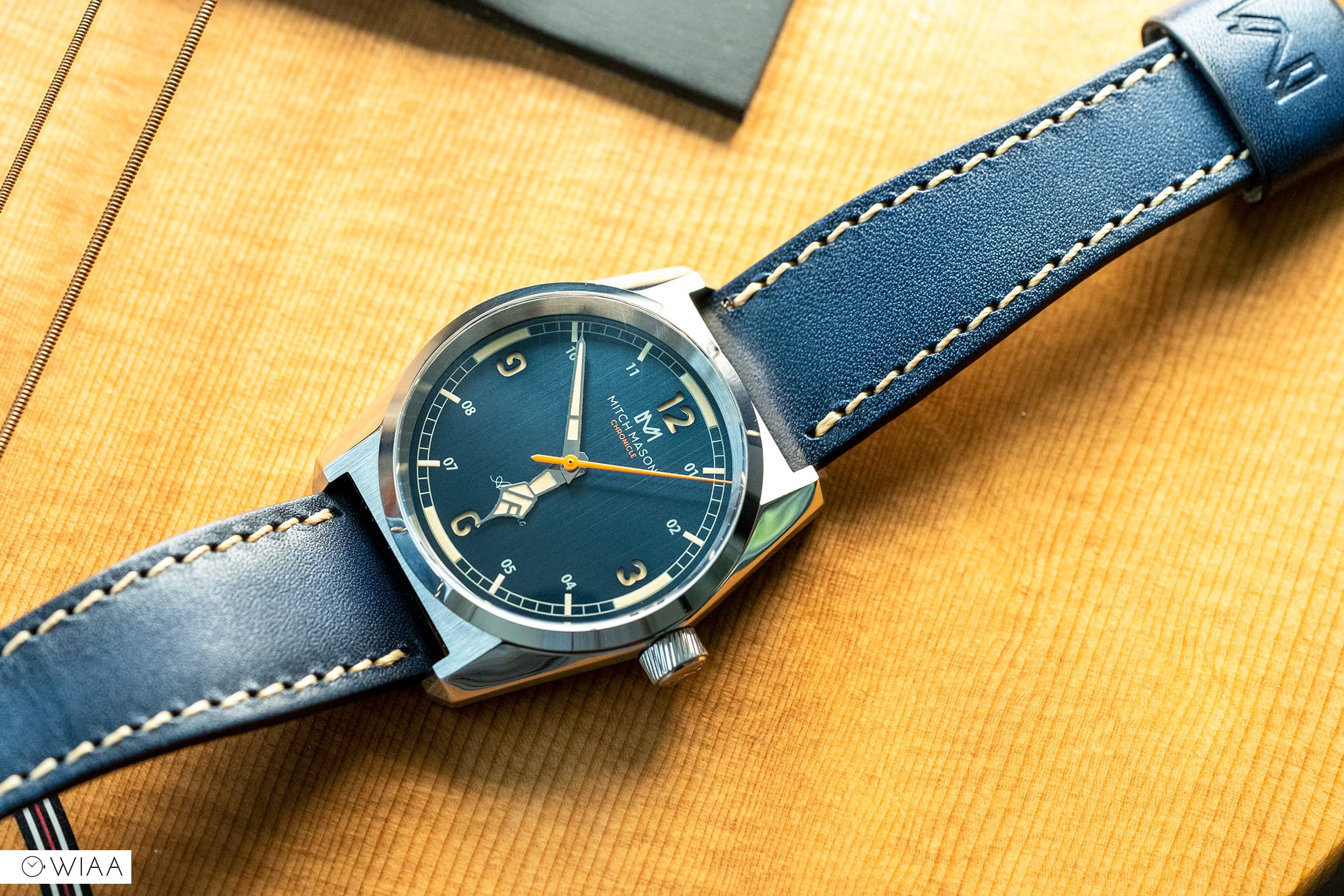
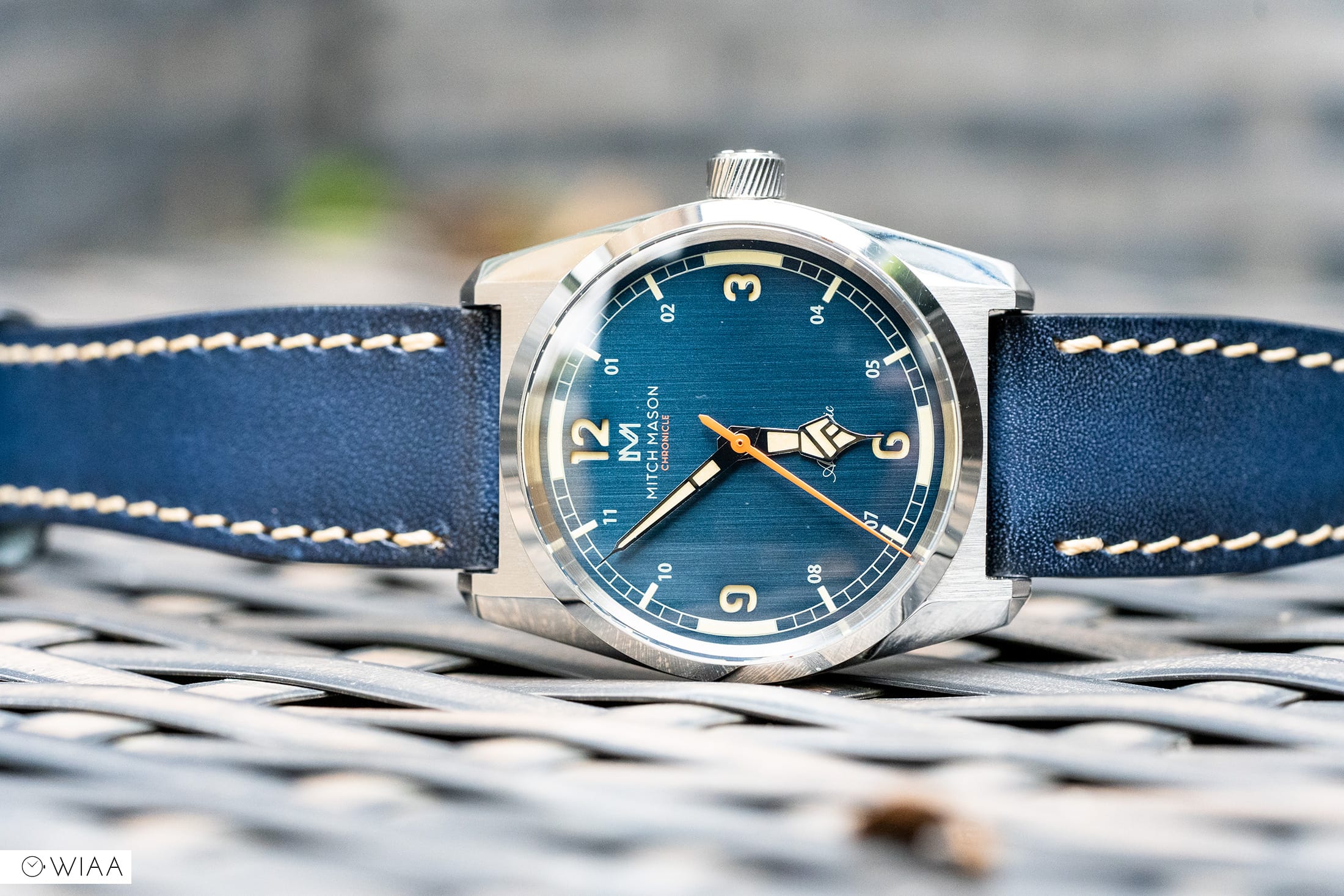
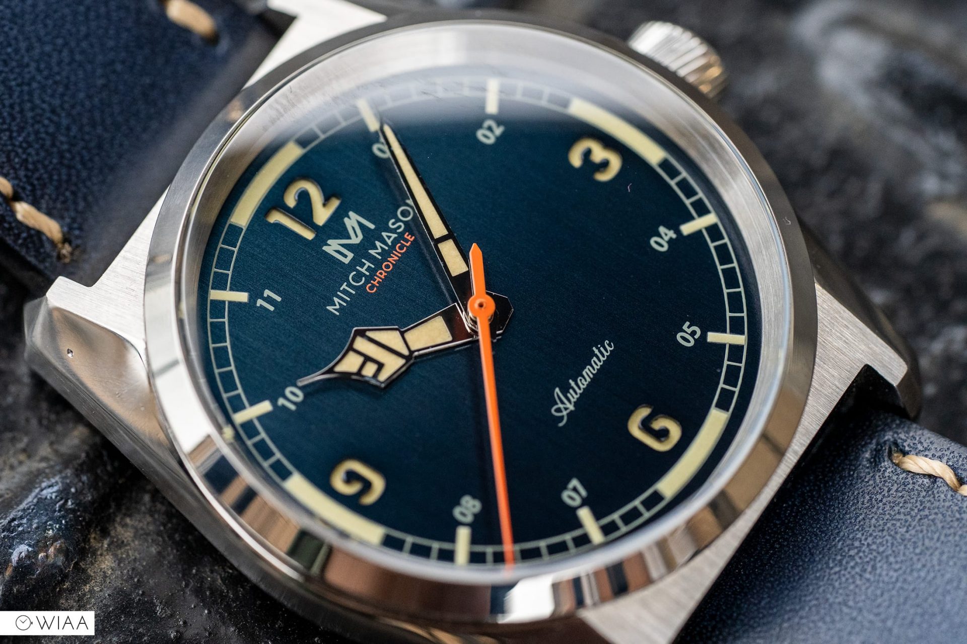
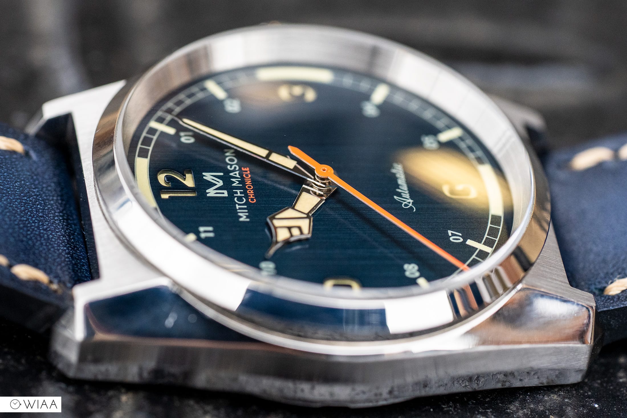
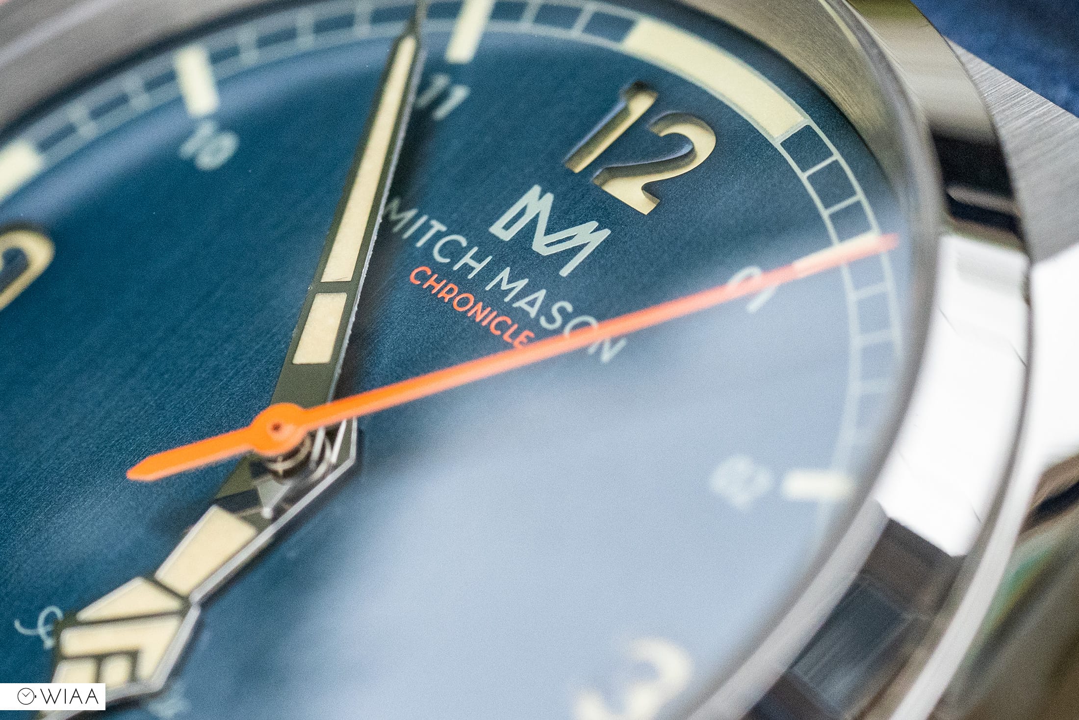
It’s easy to see where the inspiration for the dial comes from though Mitch Mason has put their own twist on it thanks to its vintage flourishes that are merged some more contemporary elements. Starting with the main dial – it’s metallic with some fine brushing that disappears in certain lighting and pops in others. The numerals at 3,6,9 and 12 are cut into the dial in a sandwich style that not only looks great but helps to give it some depth, these are then filled with a vintage-esque style cream luminescent compound that I’m not usually a fan of, but for me it works. The rest of the numerals are printed in a contrasting white and are double-digit, this is an important choice as the designers wanted there to be a strong sense of symmetry. Below the 12 you’ll spot the printed branding and model name in a high contrast white and orange. Bordering the main dial you’ll find a train-track style minute track with four large areas of lume and smaller batons that again give that perfect symmetrical look. Finally is the rehaut which is clean and is done in a brushed finish, this was the right choice as anything else would simply detract from the dial too much.
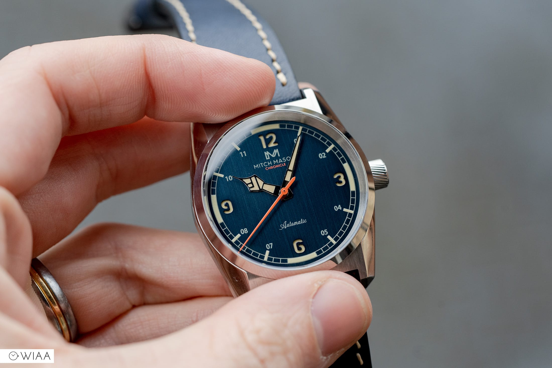
When it came to designing the hands, the inspiration there might surprise you – I know it did me, the designers at Mitch Mason drew from something not to be expected and that was a knot of twine. The goal here was to showcase that the watch intertwined both the contemporary and vintage. The design is – as far as I’m aware, unique, this is something you don’t see all that often and it’s very nice to see that they clearly haven’t just picked a set from a supplier. The hour hand is anything but boring and clearly has had a lot of thought put into it. The minute hand by contrast a little simpler yet still fits the overall aesthetic perfectly. Finally, the seconds hand; it’s long, slim and bright orange which gives the dial that pop of contemporary and of course some colour interest. And it’s to be noted that this will slightly change in the final production units. The styling will remain though the hand will be slightly shorter.

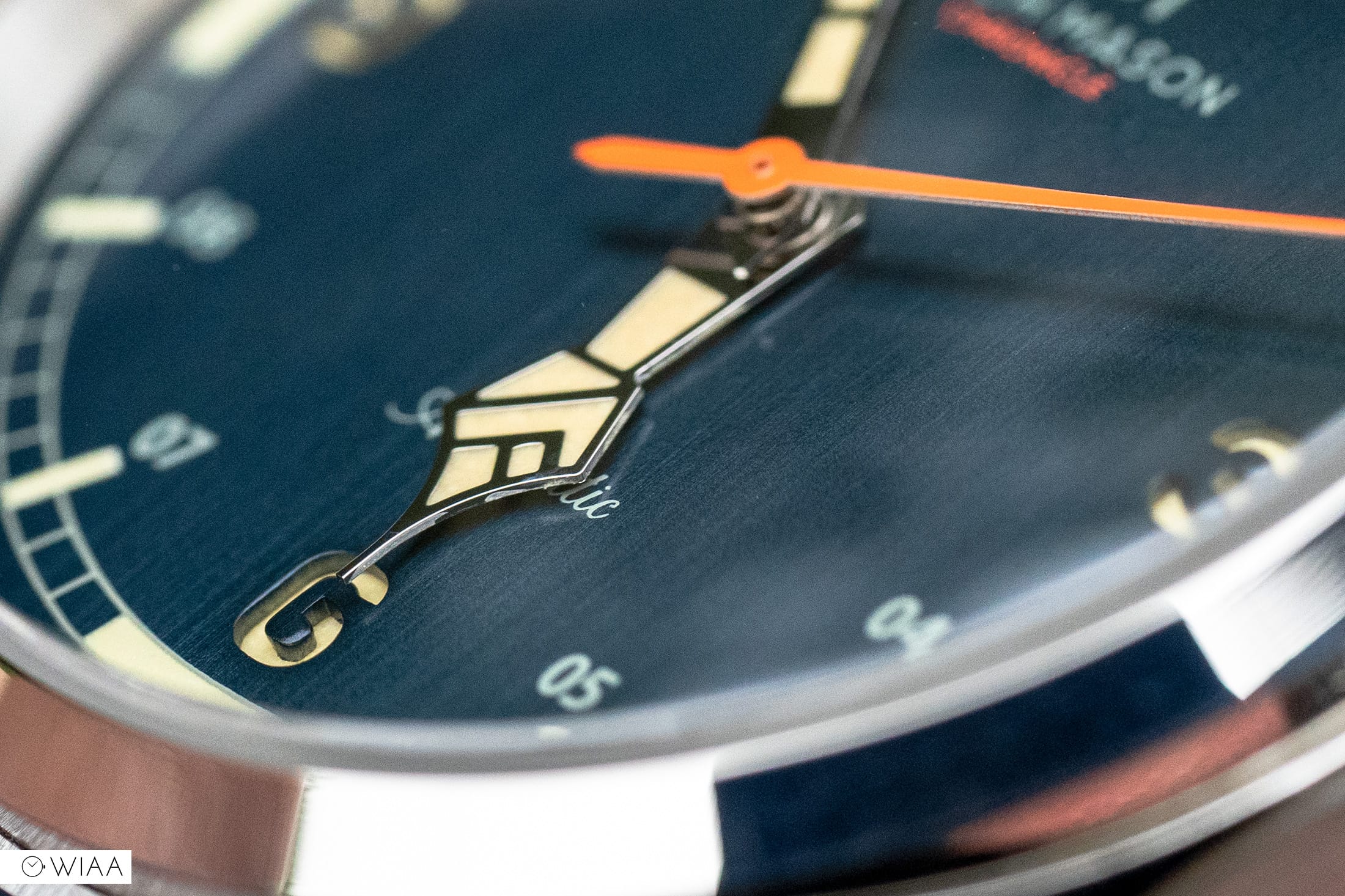
I’m honestly a fan of the dial and it’s truly so much nicer in the metal than you’ll experience simply looking at the photos. The hands are however a little more polarising, though they are growing me the more time I spend with it.
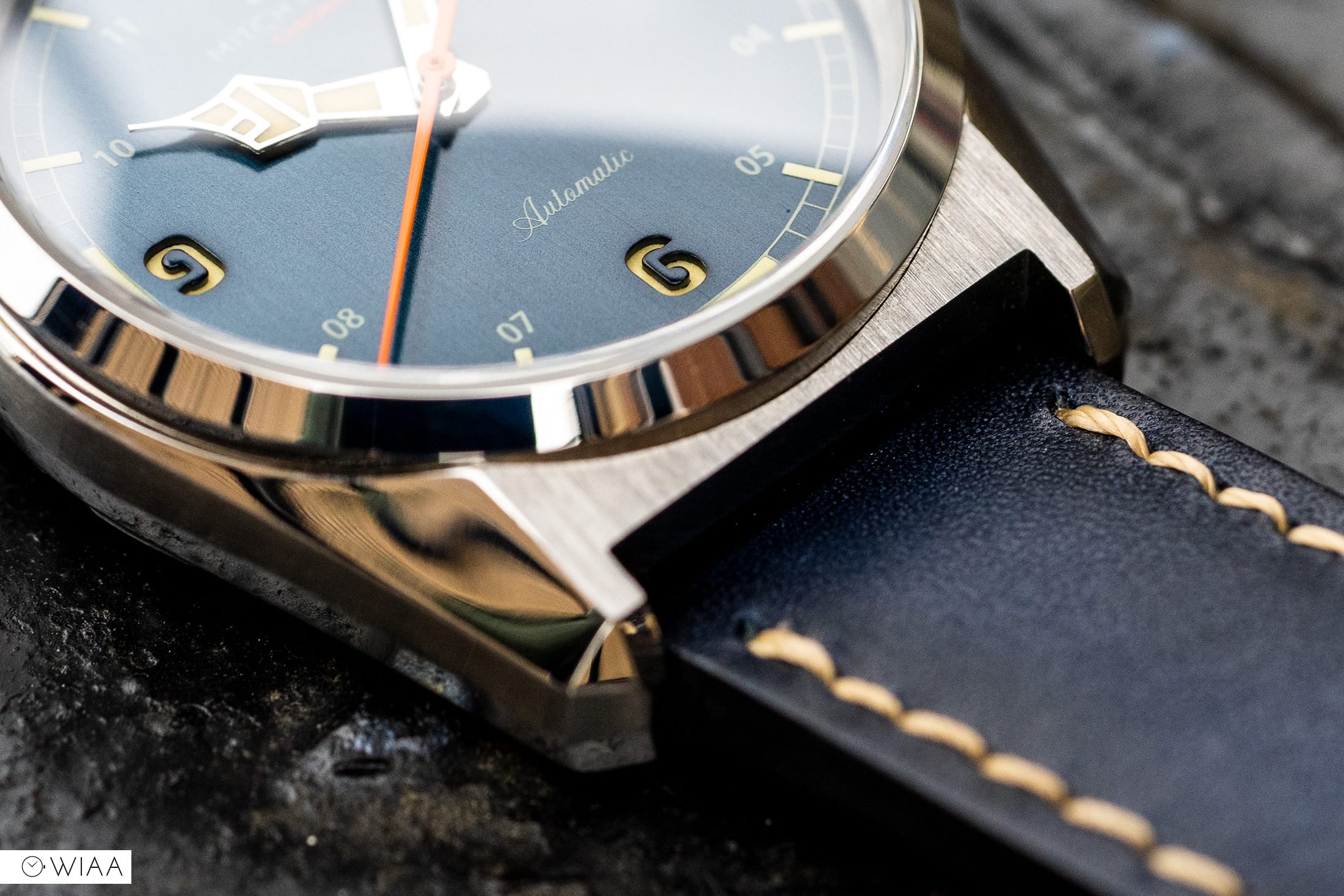
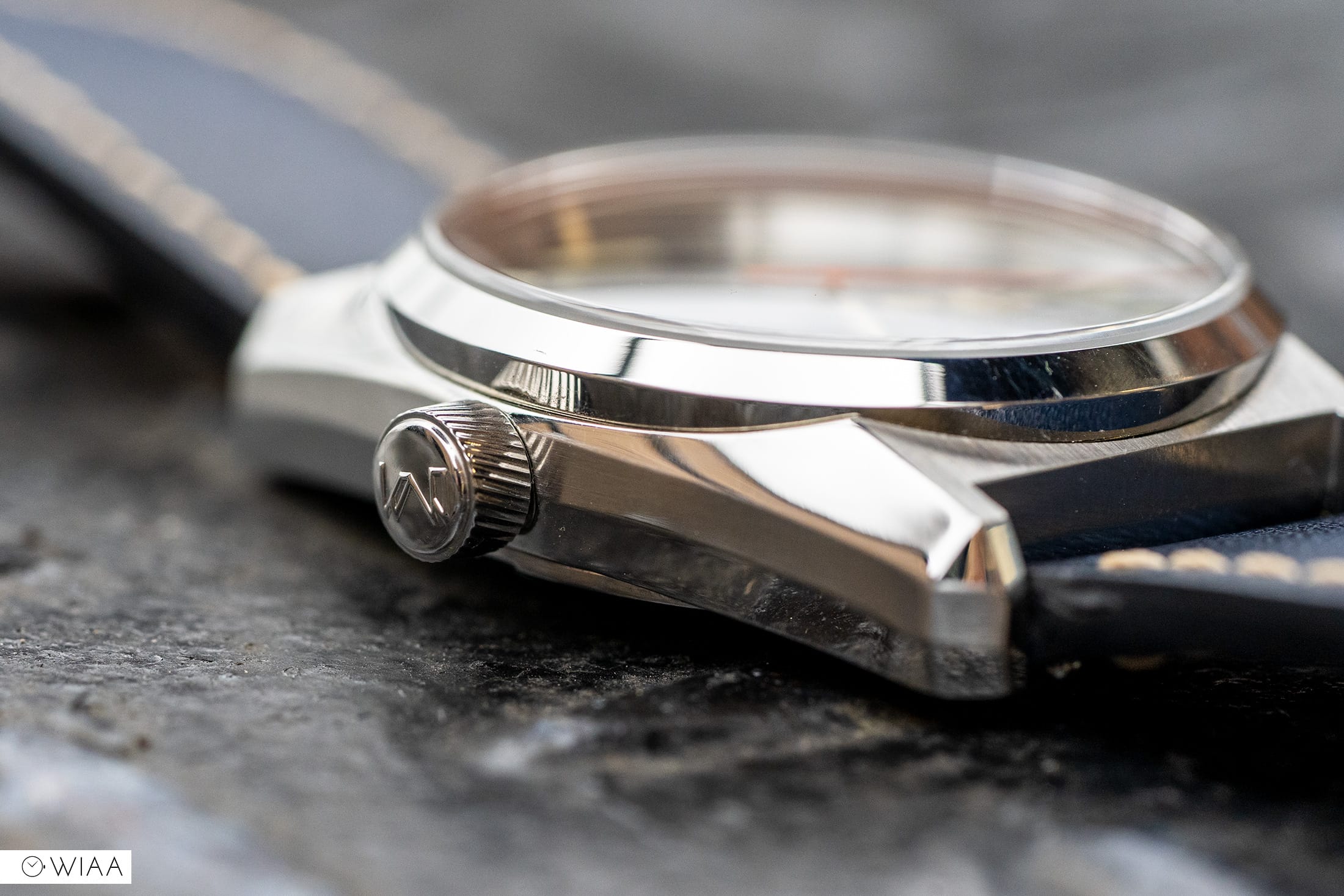
When picturing a field watch, what comes to mind? A Hamilton Khaki, a CWC perhaps or maybe even a Rolex Explorer and what do they have in common? A traditional field watch look that is distinct. Mitch Mason didn’t want that, they wanted something different, is that risky? A little, but in my opinion, it paid off. Instead of opting for the circular case and straight lugs, they took a leaf out of Seiko’s book – not literally, but their “Grammer Of Design” by Taro Tanaka. This principle, if you will, helped shape the design of Seiko’s, Grand Seiko’s and King Seiko’s throughout the late 1950s and well, to this day. If you’re interested in this, I’d highly recommend reading into more. But, how does this involve the Chronicle, well it’s clear that someone did their research and implemented some of the four tenants into the design of the case, this can be seen with the beautifully chamfered edges, the clean lines, the way the case finishes transition from one to the next and the overall profile. A simple circle this is not and I for one am glad they threw the rule book out here, it’s one of the most interesting cases I’ve had the pleasure of viewing in person. Of course, this prototype has a few rough edges that need a little refining, but I have been assured that the fit and finish will be improved. It’s hard to explain what the final watch will be like when you only have a prototype, but from I have had hands-on with, it’s great and will only get better. I did notice a bit of a gap between the caseback and mid-case, but hopefully, that will be an area that gets addressed, other than that, it looks well done though some areas need a few final touches.
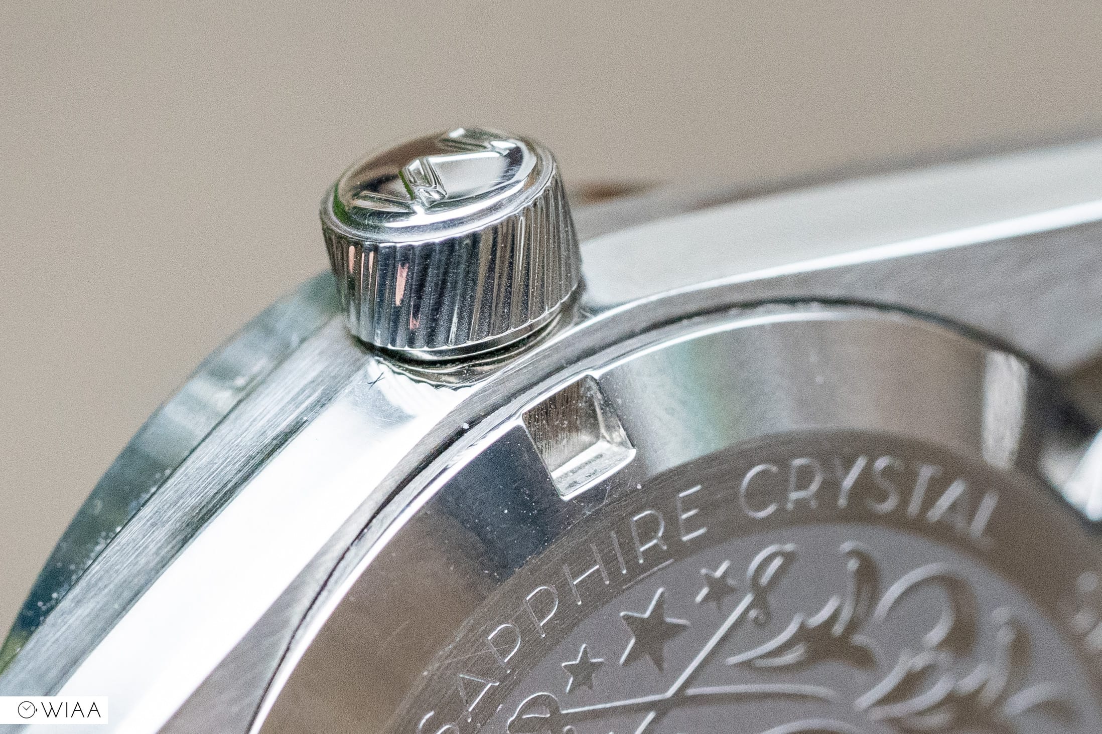
The crown is another area that will be slightly tweaked, at present the crown has a turbine-style pattern cut into it for grip, I personally like this as is, but the team at Mitch Mason have decided to tweak it in order to improve the aesthetic and feel. The new design will feature fewer deeper engraved ridges which in theory will give more purchase on the crown for manual winding and setting the time. As far as I’m aware the crown will remain signed which is great as it’s very well done.
To the screw-down caseback and it’s probably one of the nicer ones I’ve seen to date, it features a highly decorated design with a lot of fine detail. Starting with the outer ring that’s high polish and houses the cut-outs for easy removal of the caseback, you then move inwards to an area that’s finished with some fine brushing and features some very cleanly done engraving that denotes some of the specifications. Now that’s all very nice but it’s the middle where things get interesting. The centre portion of the caseback is beautifully done with varying elements of design and finishes that show Mitch Mason really care about the small details. In the centre of the caseback, you can see a prominent coat of arms surrounded by mirrored floral pattern, a set of crossed swords perched above three stars and topped with the Mitch Mason name on a ribbon-style banner. Finally, just a finishing flourish there are some areas of a radial brush that captures and plays with the light.
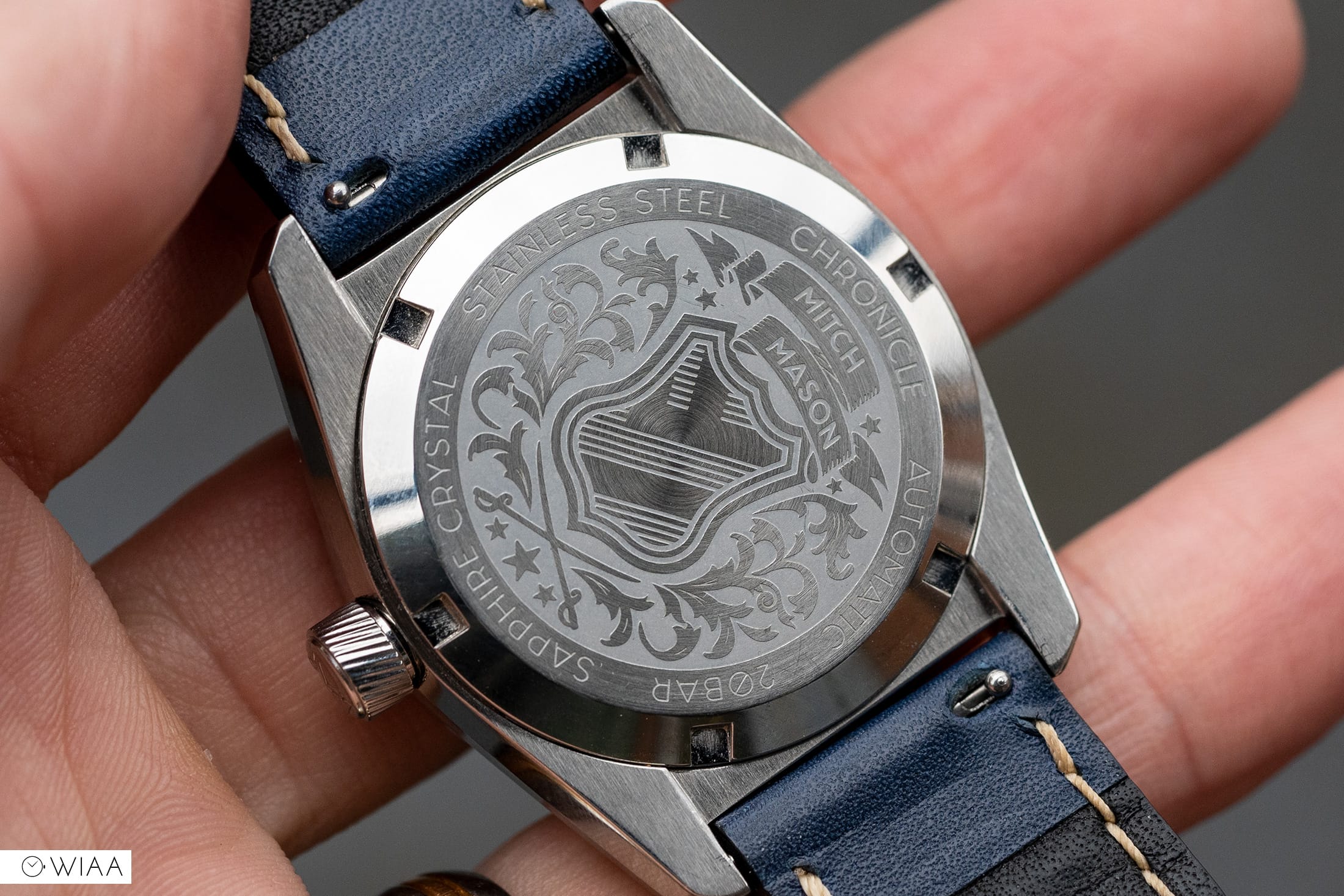
It’s a fair amount visually to take in, but so well one and I really appreciate that they’ve carried the symmetry that was so prevalent in the dial and implemented it here.
We sometimes see that straps – in-particular leather ones fall by the wayside and get overlooked in favour of some off the shelf affair, but that isn’t the case here. Mitch Mason have gone that extra mile and provided a strap that is both well made and attractive. The blue leather we have is lovely, starting with a shade of blue that almost perfectly matches the dial, the ever-so-slightly textured outer layer, the smooth inner layer and some neatly done yet imperfect stitching that shows it’s hand-done; it’s brilliant. I also really appreciate the taper that gives the design some character and well class too. The buckle is top-notch as well and has elements that mimic the case, again another little detail that shows they care. The finishing is great and the buckle and tongue feel sturdy and solid. The final plus point is the inclusion of quick release spring bars, a real must-have for any strap in my opinion.
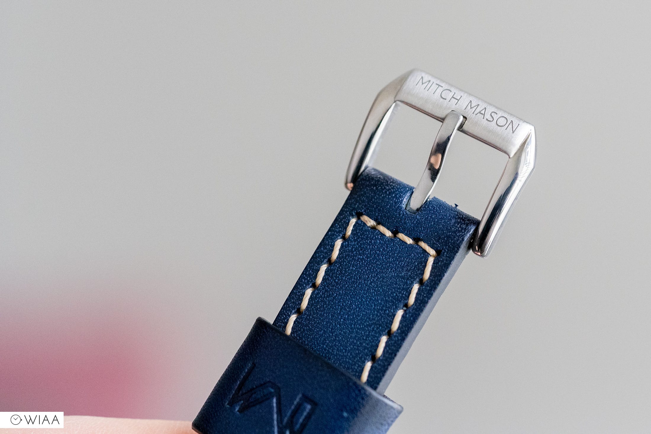
The only slight criticism of the strap I have found is with the solitary keeper, I’m just not a personal fan, don’t get me wrong it’s well done, I just prefer having two than one large. So, nothing against it, just a personal preference.
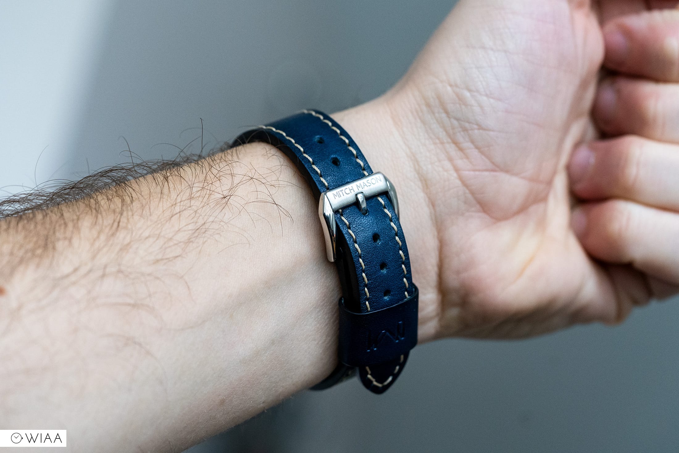
So, the style and build are great and I have no complaints on either front, however, it’s the size where I find it’s ever-so-slightly let down. I have a six-inch wrist and it does fit though I noticed it is quite tight, this isn’t helped as the next adjustment hole down is just a smidge too loose. Again this is a personal issue and won’t affect all, but it did need mentioning. I would also like to add that I think one extra hole would be great too as then those with slimmer wrists could enjoy the strap and not feel the need to swap it out.
Using the Chronicle daily has been mostly great, but with this prototype, I have one slight issue that I hope gets resolved, so let’s start with that. I found that the crown action doesn’t feel all that nice, it’s a touch rough feeling and a bit gritty; it could just be the prototype though it just doesn’t feel nice. It’s weighty too though that is more reassuring than concerning. Its again another area I can’t dive too deep as the movement, crown and stem mechanism will all change, so take this with a pinch of salt as it’ll be changing. Speaking of the crown I actually like it, it has plenty of grip and is a nice size to get a solid connection with it. This will change in the final model, though again I can’t really comment on that.
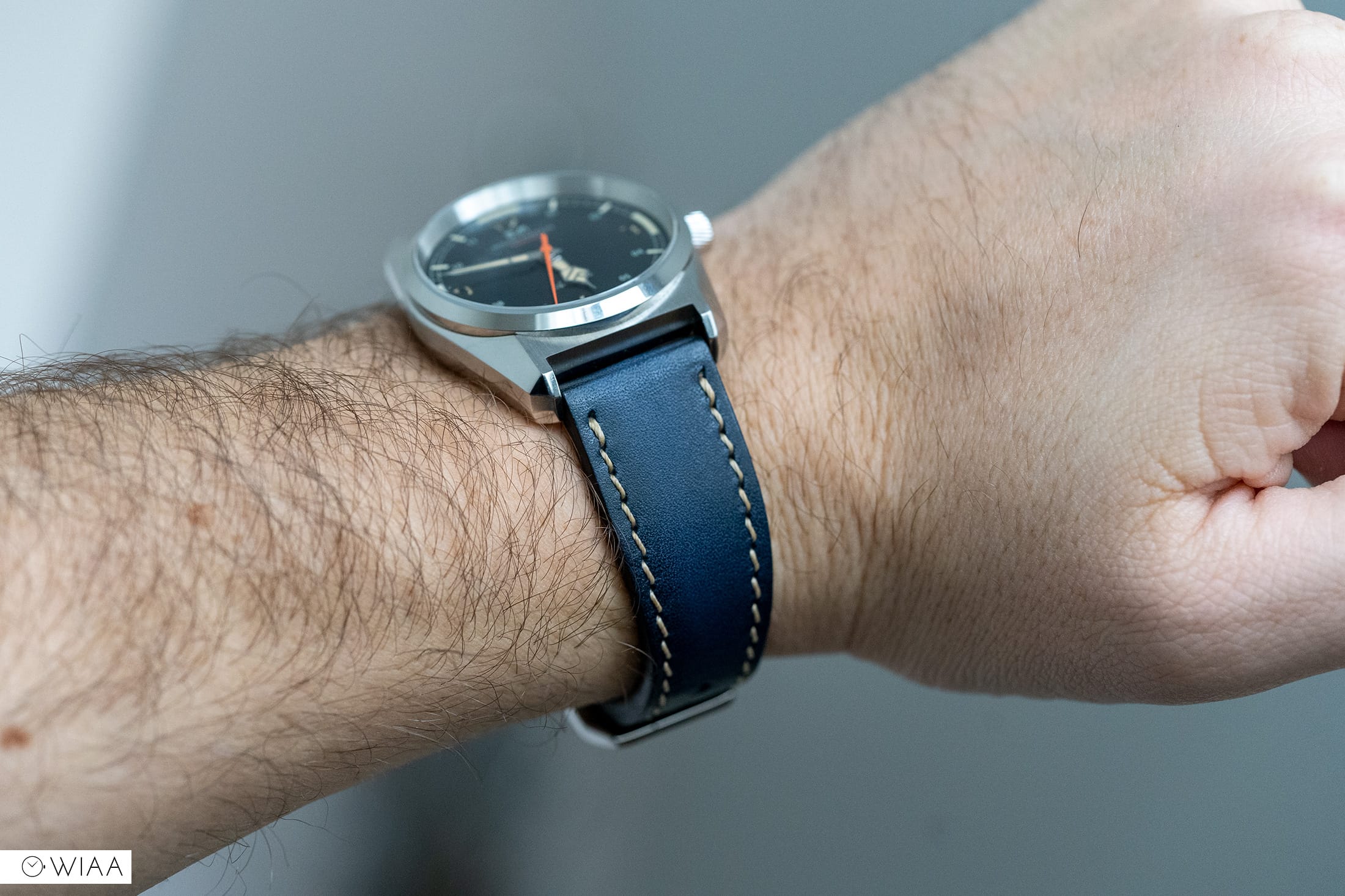
One thing that will not be changing is the comfort and well it scores highly. I know I said that the strap is a touch too tight and too loose but on the looser size it was extremely comfortable to wear. The strap wasn’t so loose that it moved freely, it just wasn’t as snug as I’d personally like, given that though, the strap is smooth, flexible and supple providing a really nice feel on the wrist, it’s one that I can comfortably say I’d be happy keep if a few minor tweaks were made. Of course, comfort is highly subjective as we’re all different, so it’s always worth having a backup if you need. The watch head is pretty spot on too, it’s not as curvy as some and the profile is the same, yet it conforms really well to my wrist shape and size. Speaking to Benedict on this he stated he was a fellow slim wristed man and wanted to design a case that would suit us as well as everyone else, this is not an easy task though I can say for me, it wears great. Normally watchmakers design the watch for the many which makes sense, so it’s really nice to see when a watchmaker considers those outside the most popular range.
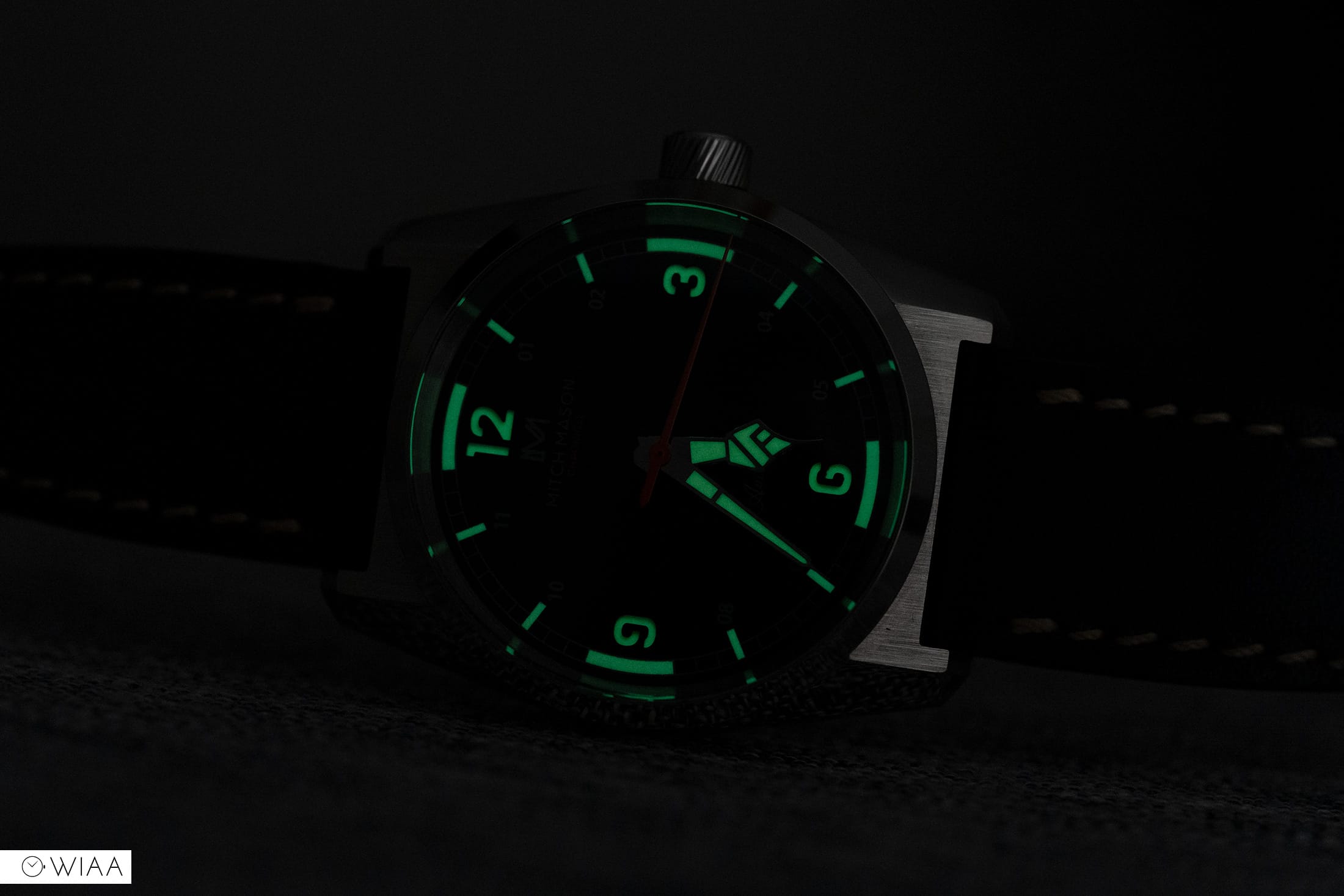
It’s pretty amazing how much emphasis is placed on lume with companies going to extra lengths to ensure it’s up to par or better, so how’s the Chronicle? Well in a word, great. Mitch Mason and Benedict decided to opt for an old-style Radium lume from the Swiss. This lume – in the day, has a vintage hue that works extremely well, usually, I like crisp white lume, but I honestly don’t think it would have worked here. As for the performance, I am again impressed, it’s not Seiko good but it is impressive. The lume has a distinct blue-green hue that is so visually appealing, it may not be as bright as BGW9 or Lumibrite, but I would happily sacrifice that for the visual look of it. So it might not be torch bright but it does have some good staying power and lasts a significant amount of time, plus with the two easily distinguishable hands its so easy to tell the time when the sunlight starts to fade.
As you’ve noted from the spec sheet the movement in the prototype will change in the final production model, the prototype we have on hand features the well respected Sellita SW-200-1 whereas the retail model will see somewhat of a down-grade and house the equally respected Miyota 9039. Why this was decided is quite simple as a Ben from Mitch Mason kindly explained. Paraphrasing from our discussion, he said that Sellita movements are in high demand at the moment and are thus hard to obtain, they are considerably more expensive too. It also has a date wheel making it thicker and heavier than the Miyota, as well as having a phantom date position. As the Miyota has no date function this aligns perfectly with our model. The Miyota 9039 is a respected movement and the microbrand community appreciate that.
In terms of performance, both the Sellita and Miyota perform superbly as they both have fantastic levels of feedback which gives you a reassuring sense of longevity and durability. The Sellita does edge it however offering just a slightly heightened sense of this, though there isn’t much in it. I also noted that previous 9 series Miyota’s I’ve had experience with seem to have less resistance when turning the crown, this particular Sellita feels a touch more resistive though to be noted – it is a prototype.
Both the Sellita and Miyota are hi-beat (28,800bph) which provides a lovely sweep to the seconds hand that is just so nice to see, they also share more similarities and feature manual and automatic winding and hacking seconds. Where they differ is that the Sellita has 26 jewels whereas the Miyota has 24, the Sellita has a power reserve of 38 hours which is less than the Miyotas 42. The Sellita also has a date position which the Miyota does not, this is perfect as on the retail version there will be no ghost date position. In reality, the Miyota may feel like a step in the wrong direction, but on paper and the real world, there honestly isn’t that much in it, plus if anything was to go wrong down the line, a 9039 would be cheaper to repair or replace than the Sellita.
It’s clear that Benedict wanted to make an impact with his debut and it’s certainly left an impression on me. There’s honestly a lot to like about the Chronicle and only a few key areas of concern which are getting fixed with the final production model. As is, the Chronicle is such a strong offering for a very fair price, it manages to successfully merge its vintage-inspired past and all the new elements to create a watch that hasn’t been done before.
I’ll say it again, it’s so refreshing that Benedict hasn’t fallen into the safe zone and done something a little more daring and I respect him for that. I can imagine it’s a tough call to make, deciding to play it safe or risking it all and I’m glad that he’s took the risk and tossed out the rule book if you will, the industry needs more newcomers that aren’t scared to venture out of the safety zone and give us something new because, without brands like this, the industry would be a little stale. Hopefully, we’ll get hands-on with the production model and see how or if it’s been improved, but I have to say, Mitch Mason and Benedict are ones to keep a close eye on.
Words by Weston Dakin
Pictures by Joshua Clare-Flagg