When I first cast eyes upon the Super Compressor, I’ve got to admit it didn’t really jump out at me. Build quality and value for money would have never been in doubt; I’m just not that crazy about vintage-inspired watches.
But, as they started to get into other people’s hands and the positive reviews started bellowing out, I decided to take another look.
There are three key talking points with the Super Compressor.
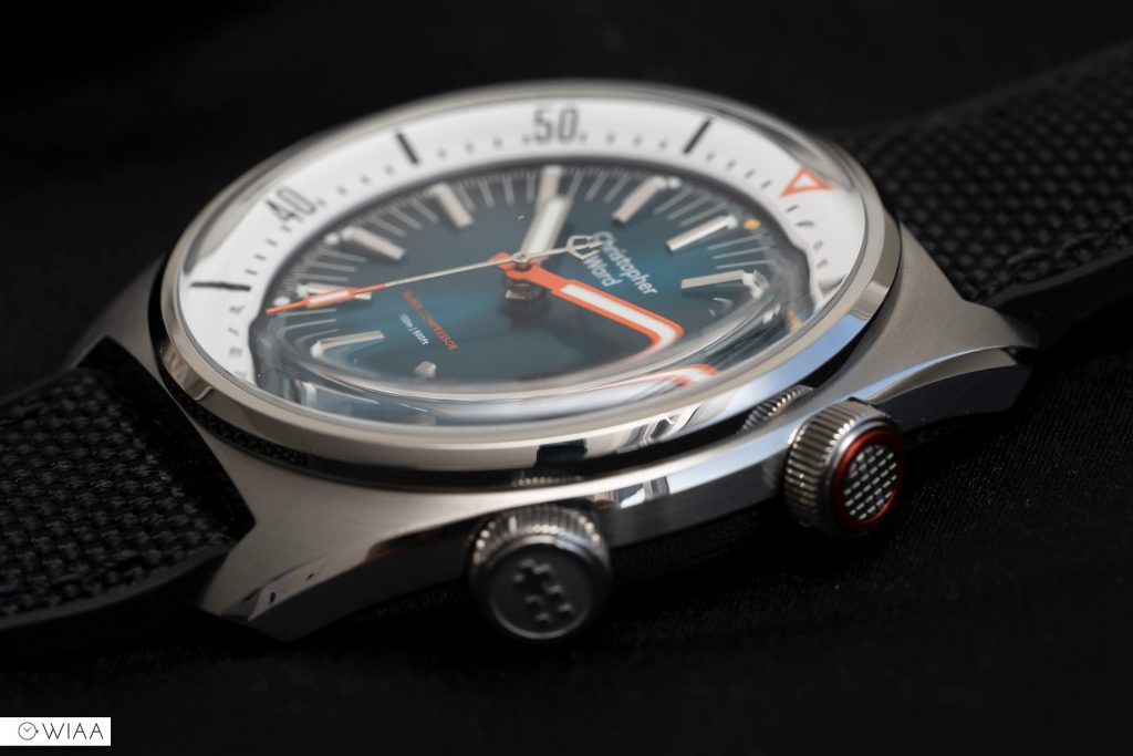
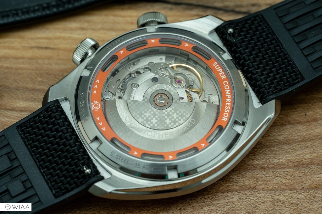
Firstly, the case. I know what you’re thinking: so what? There’s loads of super compressor watches out there. Some are dead cheap! However, they’re not real super compressors. They just mimic the internal rotating bezel with a crown at 2.
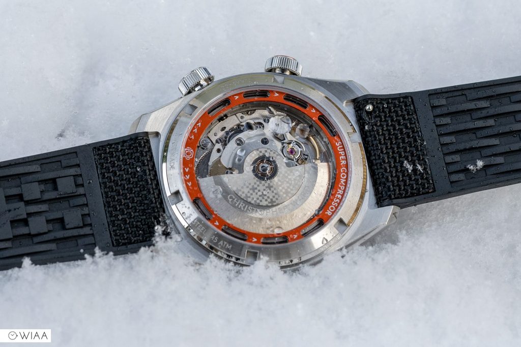
It’s the first real Super Compressor in 50 years, according to Christopher Ward. It’s also the first genuine super compressor case with an exhibition caseback. So what is a super compressor I hear you ask? It’s a mechanism inside the case that increases the water-resistance the further down you dive. But hang on, this watch only has 150m water resistance. Is there any point? Well, in a word, no. But for many things in the horological world, most of the time these impressive elements are done just because they can. No one really needs a double tourbillon, but it doesn’t stop Breguet and Greubel Forsey from making them for an eye-watering amount.
The second and third talking points are surrounding the dial: one positive, one negative. A double-edged sword, if you will.
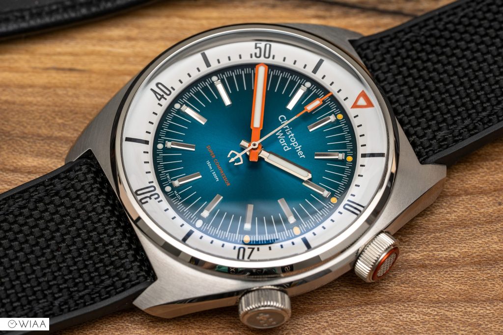
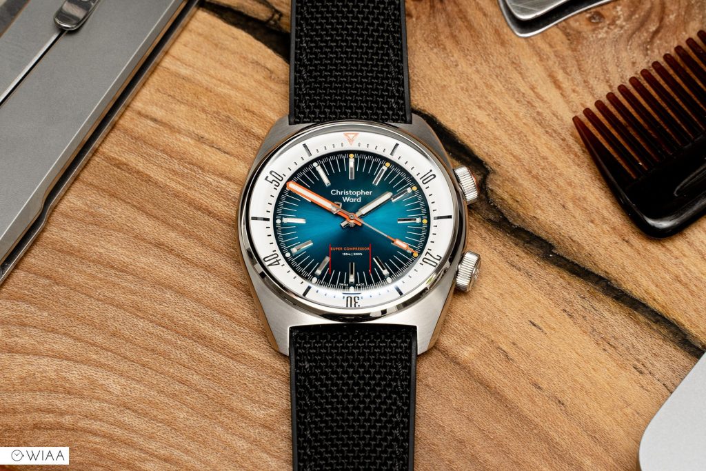
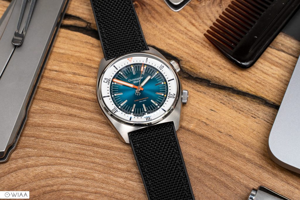
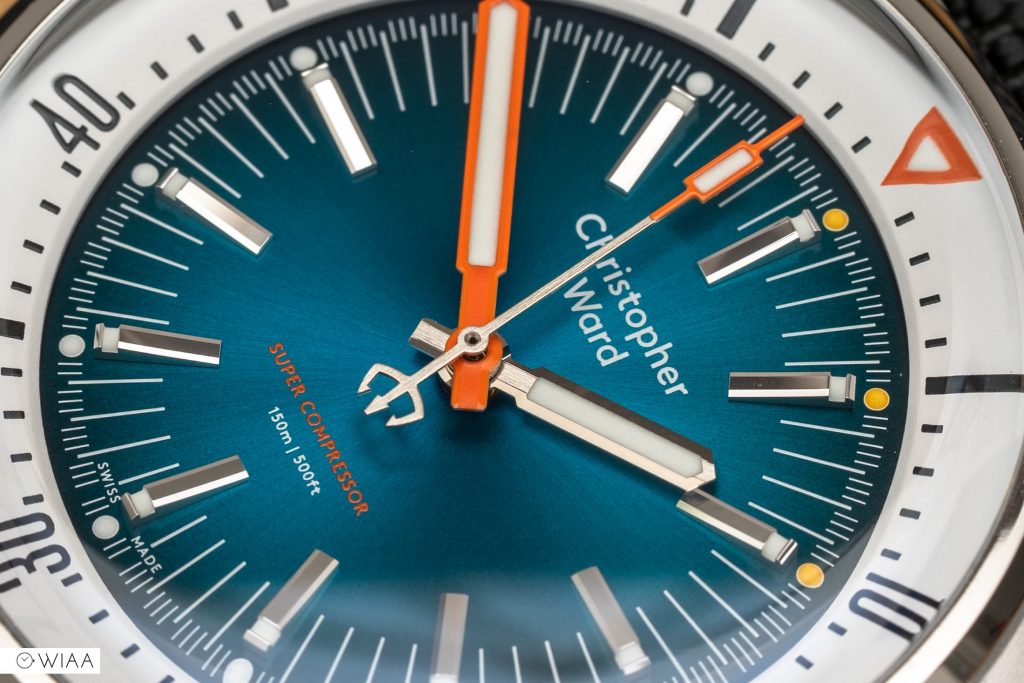
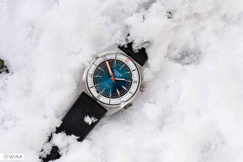
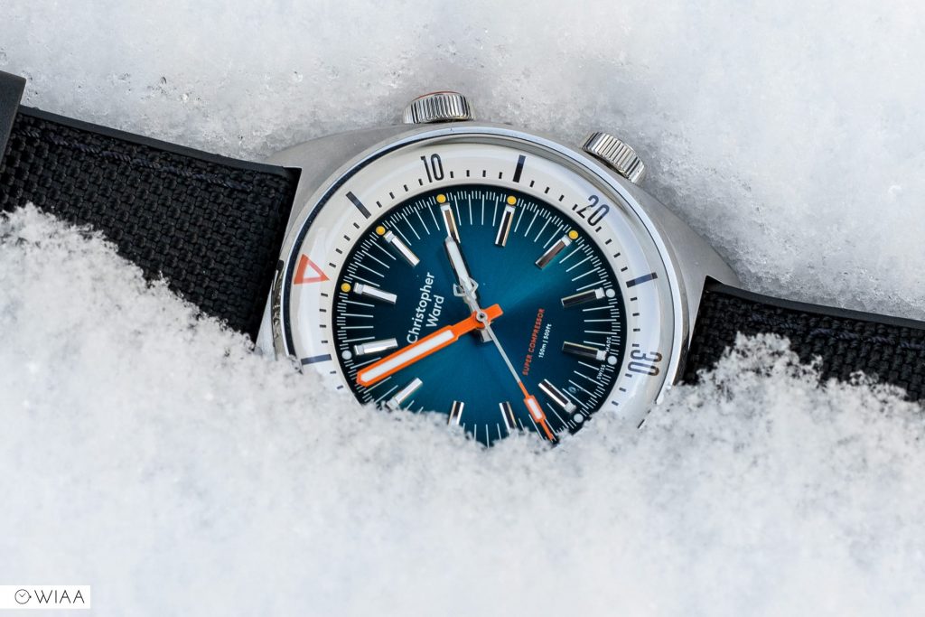
The positive? Just look at it. It’s gorgeous. And it’s so much nicer in the metal than the pictures suggest. The colours are dreamy and the finishing is delightful. This model is the “Ocean Blue”, and I do feel transported to a beach in Barbados or Seychelles. Not in dreary ol’ Warwickshire, the furthest place you could be to a beach in the U.K.
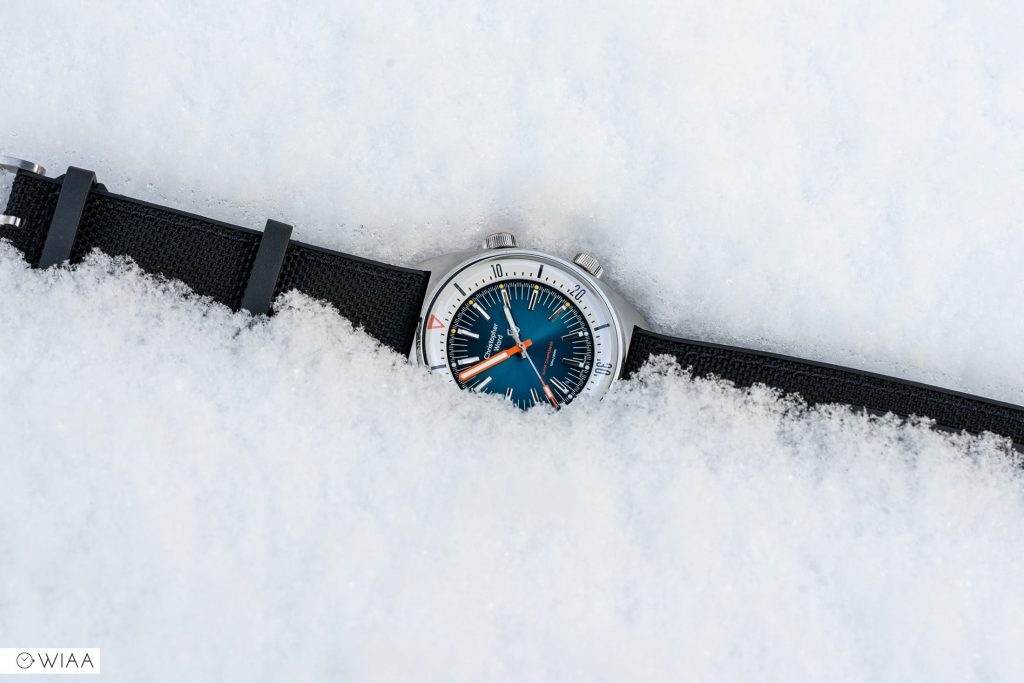
However, not all is hunky-dory in the land of the Christopher Ward Super Compressor. Somehow, they’ve managed to misalign some text at the bottom of the dial (note the red lines on the photo below). Now before we get into that, it’s nowhere near as bad as I was expecting with the watch in my hand. It’s barely noticeable unless you’re staring right at it. A big boo-boo for sure, but it doesn’t stop me from enjoying the watch.
The video review
Before we dig into the rest of the watch, let’s consider a quick spec check:
The specs
- Dimensions: 41mm diameter x 13mm height x 47mm lug to lug
- Weight: 94g
- Water resistance rating: 15ATM / 150m
- Movement: Sellita SW200-1
- Accuracy: +17.6 sec/day
- Lug width: 22mm
- Warranty: 5 years
- Price: £895
- Buy here: https://www.christopherward.com/retro-dive/c65-super-compressor/C65-41ASC1-S0WB0-RK.html
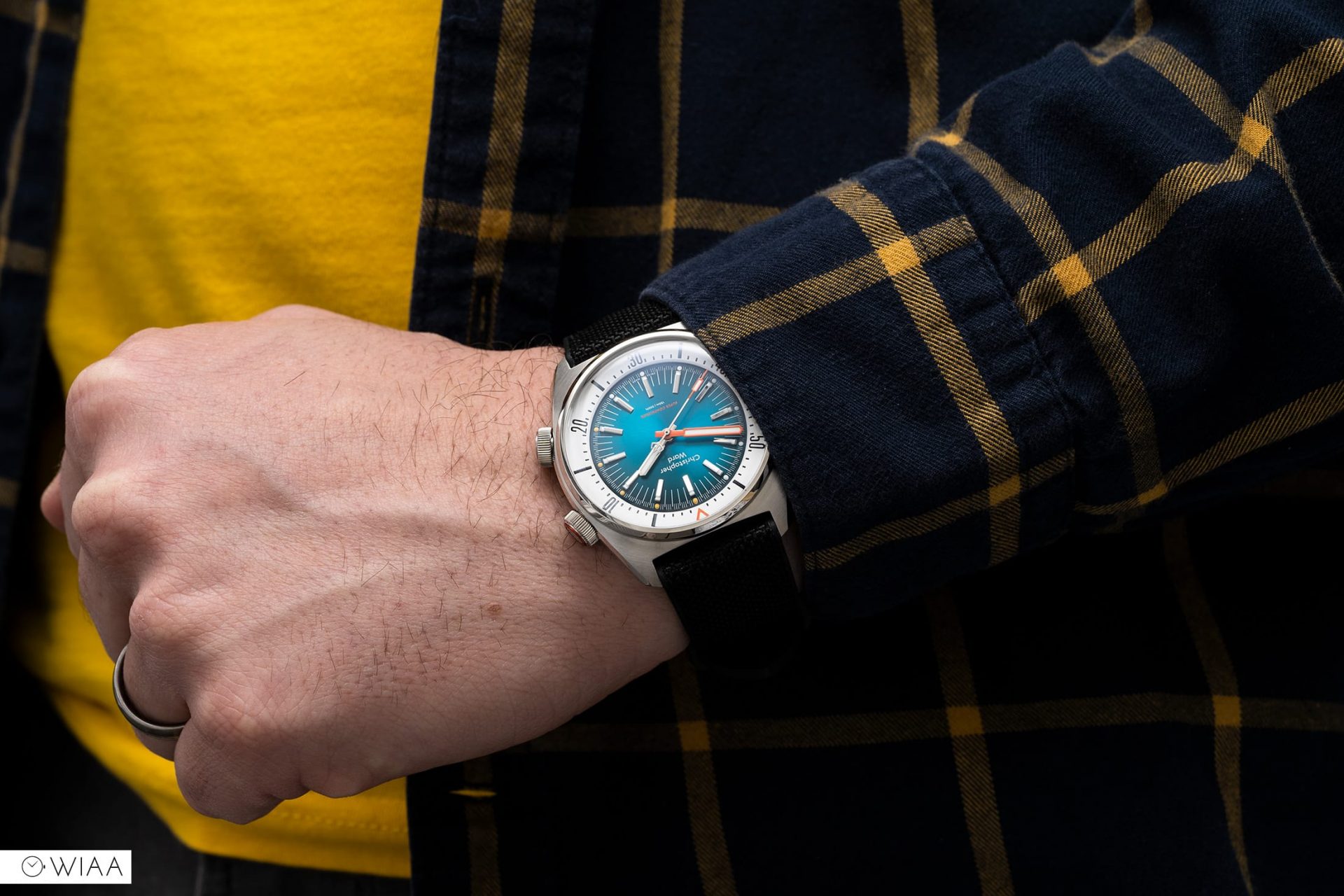
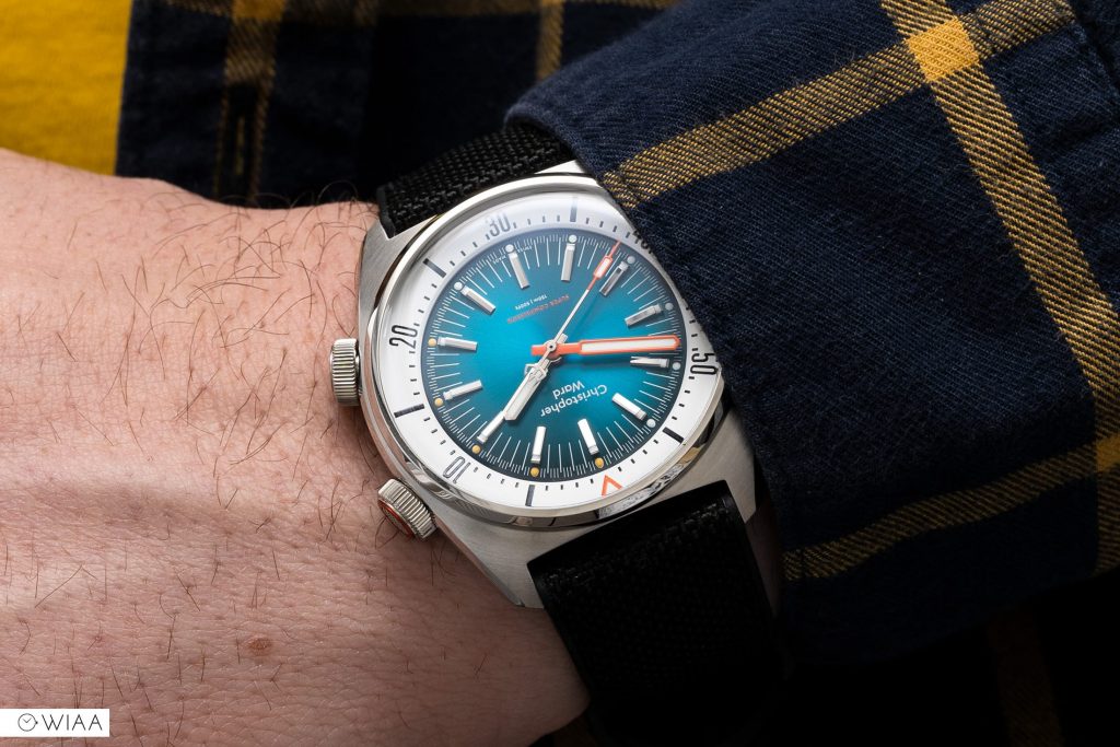
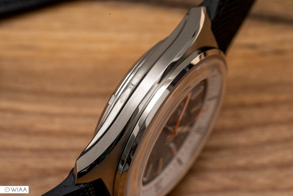
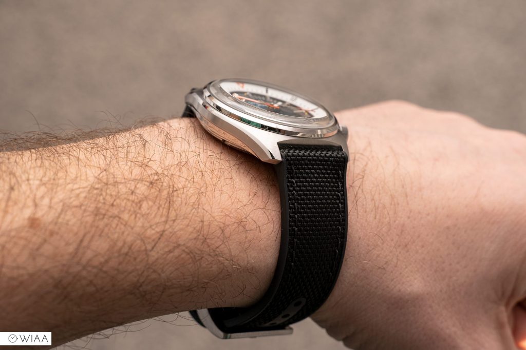
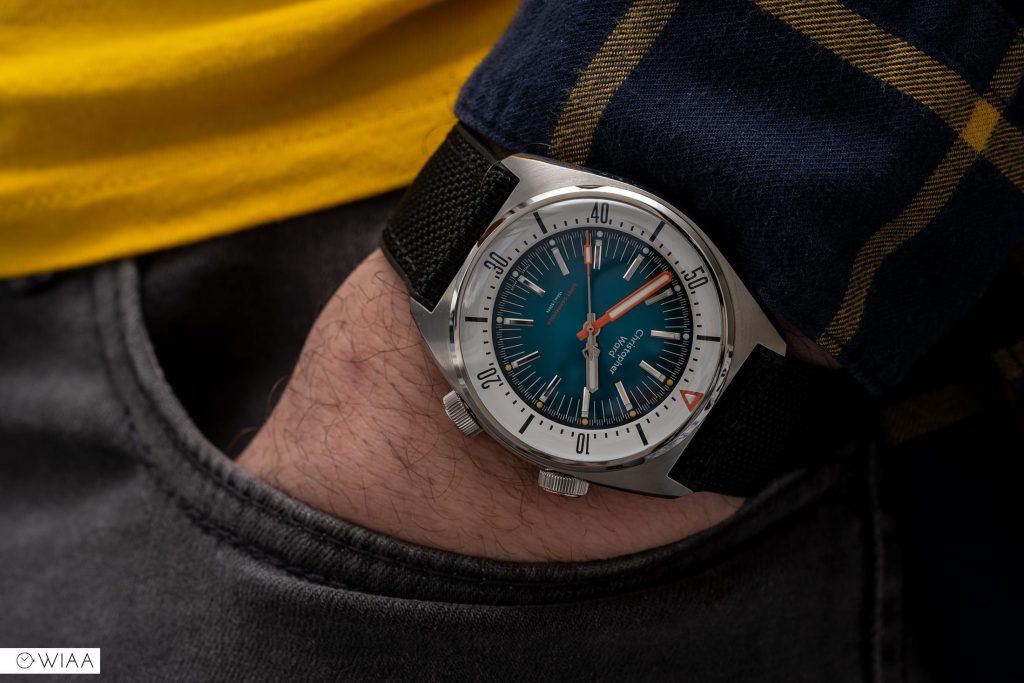
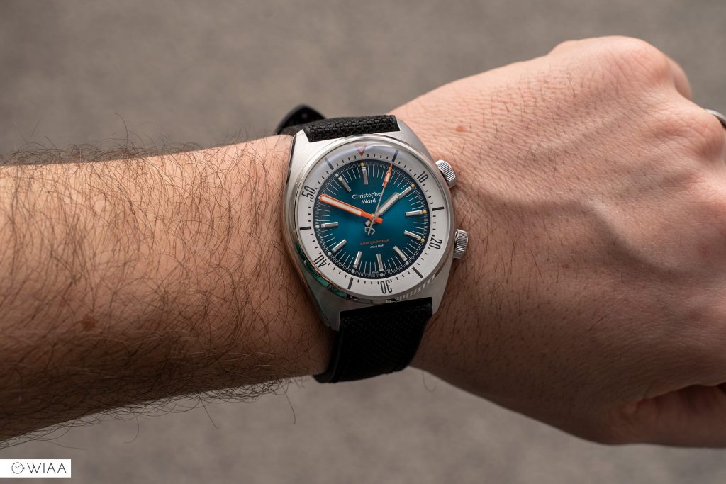
The Christopher award Super Compressor utilises the brands tremendous “light catcher” case. Let me tell you, it’s magnificent for a watch under £1000. Multifaceted, sleek lines, with plentiful bevelling and contrasting finishing, it’s a sight to behold at every angle. It’s because of this slender appearance that it wears so much sweeter than the 41mm diameter and 13mm height (on my 7” wrist).
Of course, due to the popularity of this style of watch (with the dual crowns and internal bezel), in the ’70s, this just naturally becomes a vintage-inspired piece.
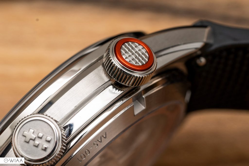
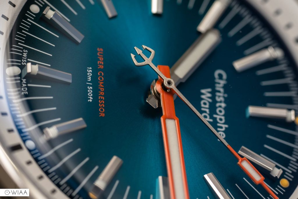
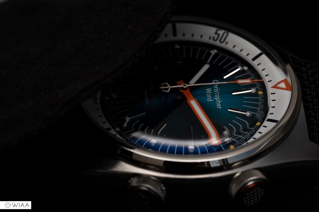
The top crown rotates the 120-click inner bezel. On cheaper watches, this always tends to be free-flowing clockwise and anti-clockwise. However, here, it only rotates anti-clockwise like your normal diving bezel and it also has a lovely subtle click at each half minute which was a pleasant unexpected touch. I love the orange ring flanking the crosshatch pattern on the end of the crown, providing a splash of colour that ties in with the hands, arrow at 12, and the compression spring at the rear of the case.
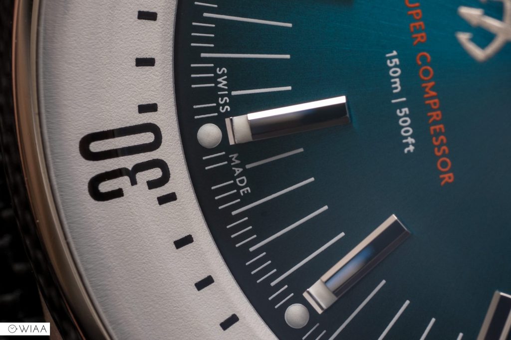
The dial has that gorgeous sunray ocean blue, which works well with the orange accents. The colour scheme is another retro nod.
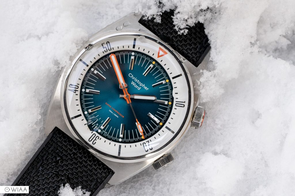
The handset, in particular the bold orange minute hand, is reminiscent of the Omega Ploprof, a diving icon from the 70s. The trident counterweight on the second’s hand is ever-present throughout the Trident range, delicately and impressively formed.
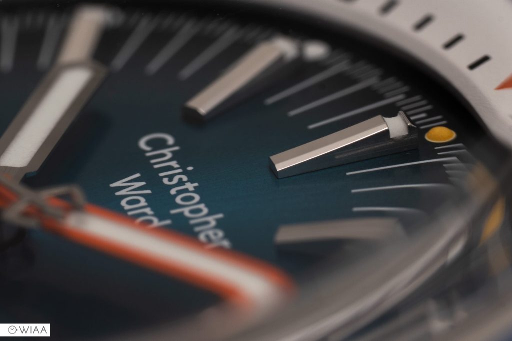
The applied hour markers are a three-dimensional delight, taller at the outer edge with a lume filled channel than the inner, it slopes down with bevelled edges and a spotless polished finish.
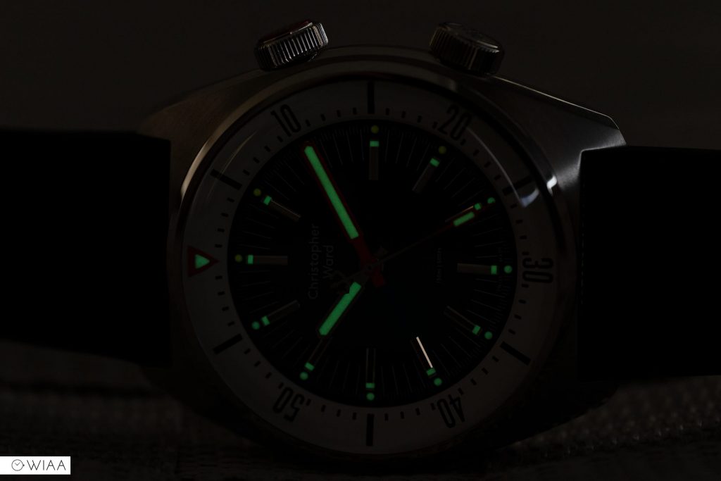
Super-LumiNova® Grade X1 GL C1 has been used across the watch, and is reasonably well applied and is effective at viewing the watch in the dark. There was a day when Christopher Ward watches had terrible lume; those days have now long gone.
There are cute pips located at the ends of the hour markers. Interestingly, they are orange up to 4, then white for the rest of the hours. This will be to mimic the usual way a divers bezel has the first 15-20 mins highlighted in some way or another, which originates from the 50s and would be used as timing decompression stops as a diver resurfaced – to avoid the bends.
The ‘glass box’ sapphire crystal with a ‘bubble’ edge maximises the vintage 1960s feel even more. It has excellent clarity but a distinctive mellow distortion at shallow angles.
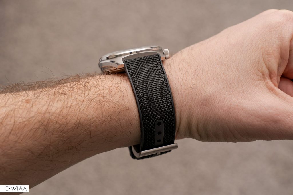
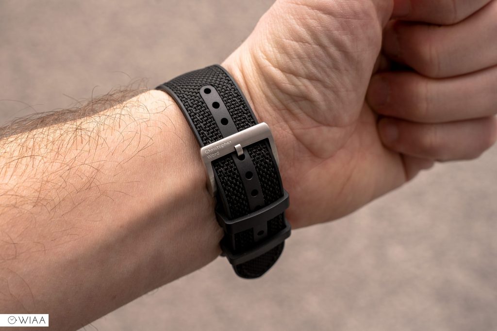
This particular model comes loaded with Christopher Ward’s excellent hybrid strap. Comprised of rubber and Cordura nylon, it’s soft and supple out of the box and easy on the wrist. It also has quick-release pins so it’ll be quick and easy to switch over.
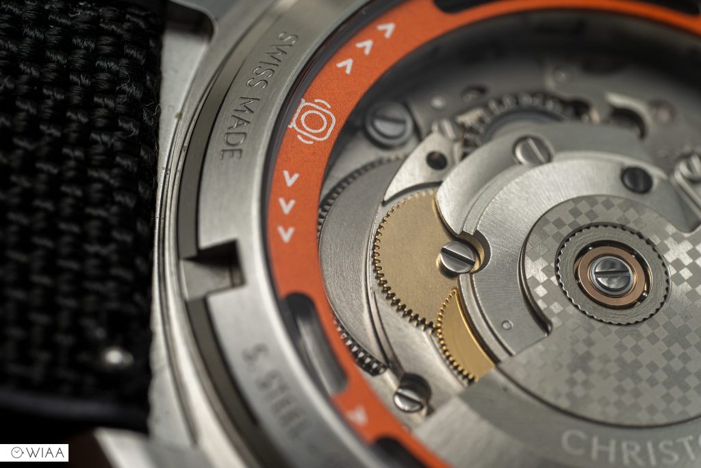
Finally, let’s mention the movement – the Sellita SW200-1 is pretty much a clone of the ETA 2824-2, but with a cheeky extra jewel. It boasts a pleasant twin-flag engraving over a ‘Colimaçoné’ finish on the rotor; I’m not sure what that means exactly – they could have made that word up. 26 jewels, a high beat rate of 28.8k bph (8 ticks per second), 38-hour power reserve, hand and automatic winding, and a hacking seconds hand.
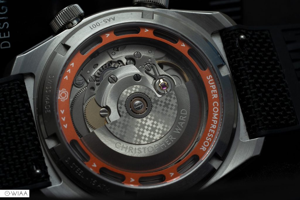
This one is coming in at a rather wild +17.6 seconds a day which is a little disappointing.
Final comments
That text alignment. Ooh boy. How did that get through QA? It’s a shocker for sure, but I’ve got to be honest, I’ve not even noticed it whilst wearing it. Only when you pay close attention can you see it. I understand the latest batch and models have had the issue fixed.
It just has a charm, a coolness about it that’s hard to put my finger on. I guess that means it’s well balanced, effortless and purposeful in design. Which is a hard balance to achieve.
The build quality is tremendous, it’s a delight to wear. The light catcher case is one of the best I’ve ever come across on a watch under £1000.
Can you look past the text alignment? If so, this is a serious watch that all fans of retro divers should consider.


Richard Dolinski
11 March, 2021 at 2:24 pm
I first saw this watch in February 2000 and wasn’t overly excited. Today my thoughts haven’t changed. Forgetting the misaligned text, clearly QC was left wanting, I just can’t get by what I see as a ‘fussy dial’. A design feature that seems to have crept into the current CW model range. As for the review, again a throughly enjoyable read. Thank you.
Barrie Cree
11 March, 2021 at 10:06 pm
One of my absolute favourites from the current CW range.
As an ‘every day’ casual wearer it works perfectly. One of those rare pieces that makes you smile every time you look at it and that makes you sit there slowly rotating the face in the sun to catch different reflections from the case and gorgeous tones from the lovely blue dial.
CW seem to have really upped their game, from an already high base, in the last year or so and remain one of the best designed brands available in the UK.
How they produce such good quality at these prices never ceases to amaze me – especially in the light of some recent competitors launching at much higher prices with significantly less inspiring designs.
Dennis Kwok
11 March, 2021 at 10:28 pm
This watch is technically way beyond anything that Tribus have produced though.
Barrie Cree
11 March, 2021 at 10:43 pm
Richard – when you’ve finished with your time machine can I borrow it please?
There are so many things I’d like to change from 22 years ago ?
Mark Voutt
19 March, 2021 at 4:12 pm
A good review as always Joshua. Glad you liked the SC. Like you I wasn’t overly excited when I first saw it advertised, then it started to grow on me a bit, then when it was 40% off in the sale for the black sand model I thought I’d try it. Can always return it under 60/60 if I don’t like it. No way! I love it! As you’ve said, it’s so much better in the metal. Not just one of my favourite CWs – I have another 4 – but one of my favourite watches in my entire collection.
Rich Brooks
30 March, 2021 at 9:11 pm
I was lucky enough to receive the same Ocean Blue for Christmas and it does not disappoint. The text is perfectly aligned too, so that’s been addressed.
The photography in this review is lovely, but it’s a shame you were stuck with the black hybrid strap. This watch looks so much better on the orange and blue tibers, the vintage oak and the excellent bracelet. The versatility of the watch is just another string in its bow, it can be dressed up or down to suit.
Fergal Mc Dermott
30 March, 2021 at 9:57 pm
I also saw this watch in February 2020 before it’s release. It immediately appealed to me, the whole story of bringing back a proper Super Compressor, the retro look of it, the fantastic dial colours but the details on the watch are the standout. The applied hour markers, the case design etc.
I bought the Deep Blue colourway and I adore it, so much so that I have just bought the Black Sand colourway also !
As always Josh, an excellent review, excellent photos too.
Keep up the good work.