
On June 9th 2016 the Christopher Ward Forum has their annual “chat with Chris”. Many thanks to forum member IanBlythe for creating the transcript.
@ Kip – Thu Jun 09, 2016 8:57 pm
Reminder….This is an open chat. You may ask your questions at any time, but please let’s not rapid fire questions. Give Chris and Mike a chance to respond. Mike only types with 1 finger and Chris with 2. I will start it off and ask the first question……the rest is up to you guys….
@ Meuuu – Thu Jun 09, 2016 8:57 pm
Good evening everybody!
@ Kip – Thu Jun 09, 2016 8:57 pm
We will start in a couple minutes….
@ Ranger – Thu Jun 09, 2016 8:58 pm
Greetings From Stenhousemuir.
@ Amor Vincit Omnia – Thu Jun 09, 2016 8:58 pm
I’m in Norfolk – I type with al 13 fingers!
@ MiniMpi – Thu Jun 09, 2016 8:58 pm
Good Evening everyone
@ Kip – Thu Jun 09, 2016 8:58 pm
Chris…are we waiting for Mike?
@ Clach77 – Thu Jun 09, 2016 8:58 pm
I made it! Hello all.
@ Christopher Ward – Thu Jun 09, 2016 8:58 pm
no mikes just come in with 3 coronas
@ Thegreyman – Thu Jun 09, 2016 8:58 pm
So any tough questions, Mike will give us a 1 finger response, Chris a 2 fingered one?!
@ Christopher Ward – Thu Jun 09, 2016 8:59 pm
to make it easier than last time
ie mike cant type fast i will type all through my login for both of us but let you know who is chatting
i aslo have adrian here too
@ Meuuu – Thu Jun 09, 2016 9:00 pm
Hello I’m Adrian
@ Christopher Ward – Thu Jun 09, 2016 9:00 pm
meuuu thats him…. don’t ask
@ footycrazy – Thu Jun 09, 2016 9:00 pm
Evening Chris,Adrian Mike,Wera and forum
@ Amor Vincit Omnia – Thu Jun 09, 2016 9:00 pm
French cow sound!
@ MiniMpi – Thu Jun 09, 2016 9:01 pm
Hi Chris, Mike and Adrian
@ Kip – Thu Jun 09, 2016 9:01 pm
On behalf of the forum, I want to welcome Chris, Mike and Adrian to the chat. Thank you very much for taking the time to share with us. We really do appreciate it.
@ Meuuu – Thu Jun 09, 2016 9:01 pm
Amor> Seems you speak my swiss french
@ Amor Vincit Omnia – Thu Jun 09, 2016 9:01 pm
Bah, ouais!
@ Kip – Thu Jun 09, 2016 9:01 pm
Are you ready? Let’s have some fun……I hope. Here we go
@ Christopher Ward – Thu Jun 09, 2016 9:01 pm
alright la… and bon soir from him
crack on
@ Bahnstormer_vRS – Thu Jun 09, 2016 9:02 pm
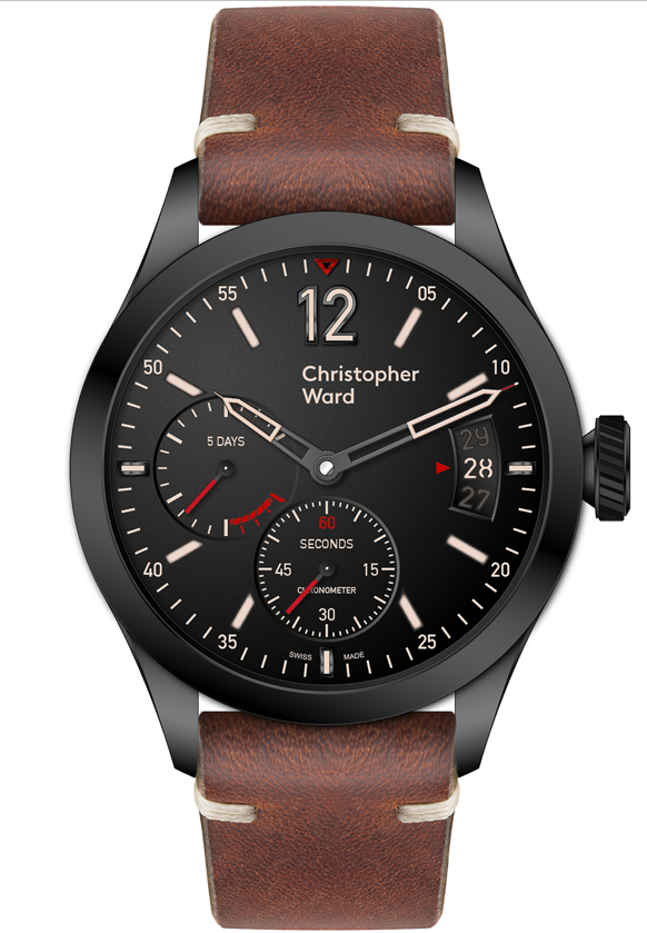
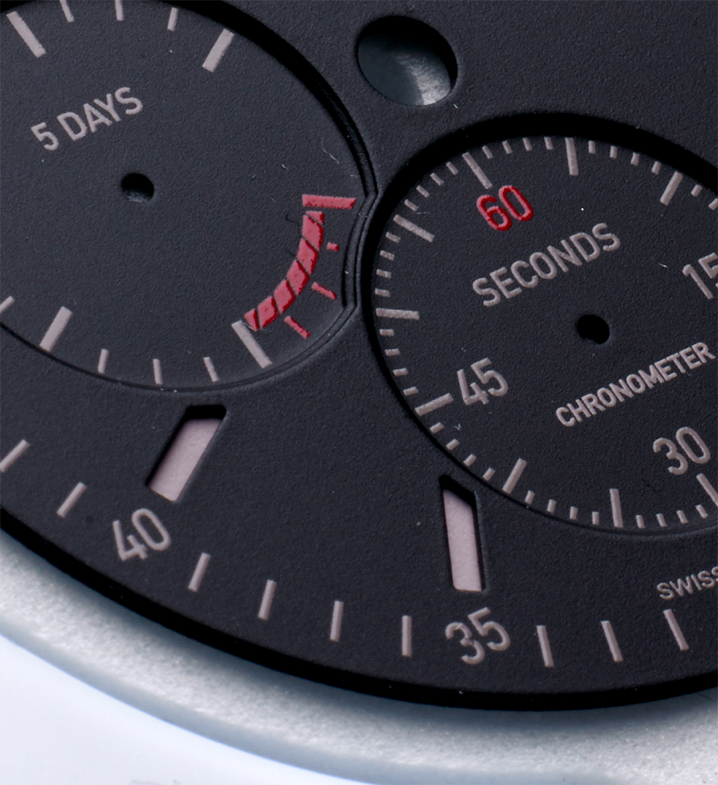
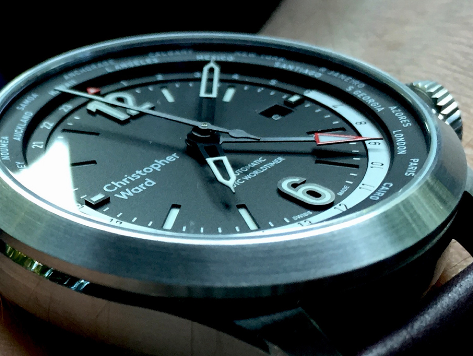
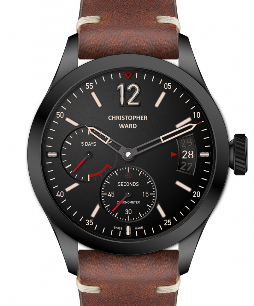
OK; In the recent edition of Loupe you outlined some pending new releases; 2 x Art Metal pieces and the C8 Flyer with SH21 power reserve, due later in the year, if I recall correctly, November at SalonQP. Are there any others due before then and if so what?
@ Kip – Thu Jun 09, 2016 9:02 pm
Despite the reasons and explanations given in Loupe Magazine and Mike’s interview with Josh of Watchitallabout, the seemingly overwhelming public response on the CW Forum and many others has been very negative to the re branding. Much more so than the last iteration. The fact that the website upgrade was also quite a fiasco combined with, what the vast majority of members feel, is a load of patronizing rhetoric on the website has resulted in, what appears to be an alienation of the existing loyal customer base.
@ Viognier – Thu Jun 09, 2016 9:02 pm
Hello All. Thanks for doing this Chris and Kip for setting it up
@ Kip – Thu Jun 09, 2016 9:03 pm
This leads to several questions…….
@ Christopher Ward – Thu Jun 09, 2016 9:03 pm
go on..
@ Kip – Thu Jun 09, 2016 9:03 pm
Given your internet dependent status and the fact that all but a few sales will come through your website, can you explain how and why you & your advisors managed to get so many aspects of your website re-launch badly wrong?
@ Christopher Ward – Thu Jun 09, 2016 9:03 pm
Ok….There are a number of issues here…
firstly pre launch the site was testing fine and the catalogue…
and most of the problems happened as the Magento import routines started to fall over just before launch..
so bad was this
Magento Corp… not a small company …..
have rolled out the fix (to the big gremlin) into their core code for all v1.14 users…
maybe we should charge them
Since then
we have had to play catch up as the imports were corrupted even thought our files were correct
Not the best night (and day) we have had at CW towers.
As we are not Amazon its difficult with the resource we have to recover quickly from those sort of events…
@ Meuuu – Thu Jun 09, 2016 9:06 pm
I confirm that
@ Christopher Ward – Thu Jun 09, 2016 9:06 pm
So at launch…
yes we were sub-optimal…
and still have some issues to resolve that we couldn’t do pre launch as we were fighting fires…
but post launch we are pleased to report an increase in £AOV and conversion….
We still have a snagging
list that we are working through and we will be moving into user testing mode once this is completed.
@ ianblyth – Thu Jun 09, 2016 9:08 pm
What is – £AOV and conversion
@ Christopher Ward – Thu Jun 09, 2016 9:08 pm
Seeing how users use the site will no doubt give rise to a raft of improvements and the
real testing these days normally happens post launch
in real time///live situ
we wanted to test the new journey which is successful for new visitors but for the likes of
yourselves it perhaps missed the view all approach…
we had kept this to one side in anticipation and with your reaction it is now back and there are two routes to a product.
@ MadMrB – Thu Jun 09, 2016 9:09 pm
Will you be looking at ease of navigation? Far too many clicks and too much scrolling now to see all collections and models.
@ Christopher Ward – Thu Jun 09, 2016 9:09 pm
We believe the new customer story or route
is what is driving up the conversion… we know its not the product because that hasn’t changed….
ease of navigation …for sure
make sense?
@ Kip – Thu Jun 09, 2016 9:10 pm
Why are the same type of inaccuracies (product descriptions/specs/broken links) continually still repeated on the website?
@ Christopher Ward – Thu Jun 09, 2016 9:11 pm
the View All I hope now eases the navigation
@ jtc – Thu Jun 09, 2016 9:11 pm
It’s quite “big” – I browse it at 75% on a normal/common laptop browser – any plans to make the sizing customisable?
@ Christopher Ward – Thu Jun 09, 2016 9:11 pm
for people who need or want quick routes
@ Kip – Thu Jun 09, 2016 9:12 pm
The View All was a nice put back IMO.
@ Christopher Ward – Thu Jun 09, 2016 9:12 pm
its fully responsive at the moment
current trends are like this…apple etc
but user testing will also give us some feedback too
…as well as yours of course
x
@ Tyke – Thu Jun 09, 2016 9:13 pm
Given that the company has had 3 branding iterations in 11years, does CW Ltd have an identity crisis and how long do you expect the current branding to last
@ Thegreyman – Thu Jun 09, 2016 9:13 pm
Chris was looking just now and for example the strap sizing FAQ link is (still) broken
@ MadMrB – Thu Jun 09, 2016 9:13 pm
the view all will be good… but just tried it and then clicked Dive and got a page not found error….
@ Christopher Ward – Thu Jun 09, 2016 9:13 pm
hopefully forever tyke
@ Kip – Thu Jun 09, 2016 9:14 pm
Why are the same type of inaccuracies (product descriptions/specs/broken links) continually still repeated on the website?
@ Christopher Ward – Thu Jun 09, 2016 9:14 pm
will take a look at that link…it was ok this morning…groan
@ Amor Vincit Omnia – Thu Jun 09, 2016 9:15 pm
Wondering about the rhetoric/blurbs on new site, what you will. Struck me as a bit patronising, esp. the Jane Fonda 70s stuff. Any comments?
@ Tyke – Thu Jun 09, 2016 9:15 pm
So the overall response to this rebrand fills you with confidence for its longevity?
@ jtc – Thu Jun 09, 2016 9:16 pm
.. not to mention maxing out our hatchbacks
@ Christopher Ward – Thu Jun 09, 2016 9:16 pm
as above… we still are finding errors
from that initial launch///
@ ianblyth – Thu Jun 09, 2016 9:16 pm
All brands change and tweak their logs.
@ Thegreyman – Thu Jun 09, 2016 9:16 pm
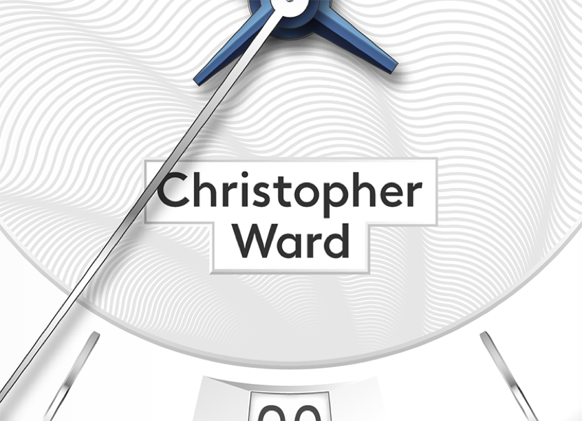
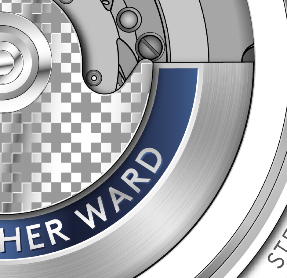
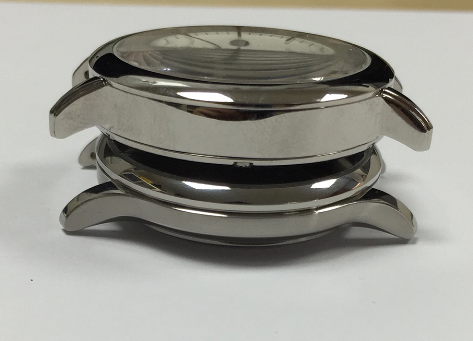
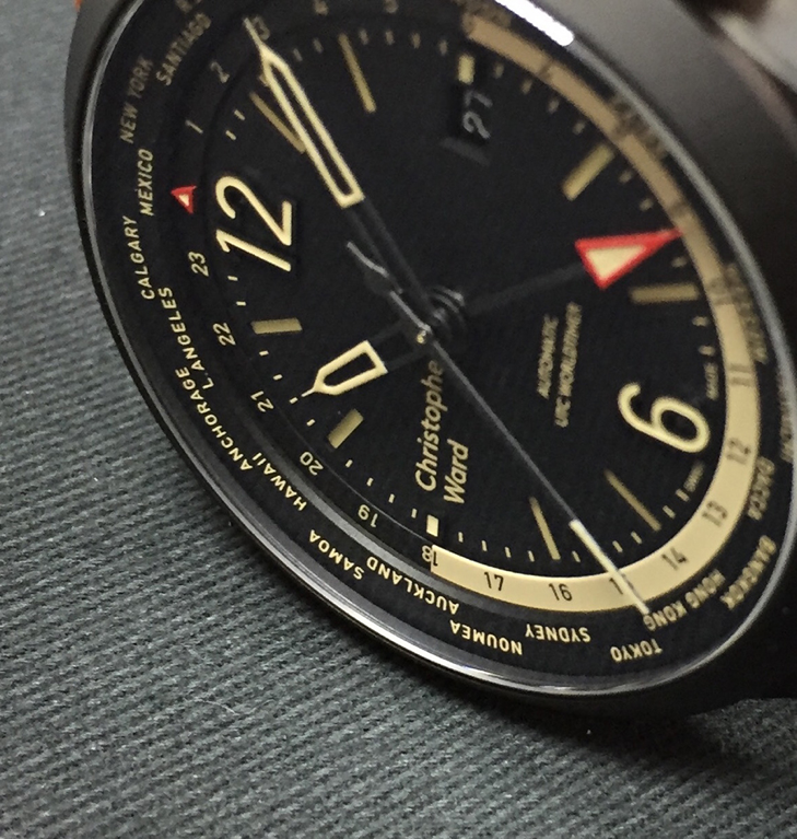
The new logo’d watch on the site looks a little bare with nothing below the 12 or above the 6, the logo being so long has to be put to the left to fit in, how do you are you going to incorporate this in new watches and keep the design aesthetic?
@ Christopher Ward – Thu Jun 09, 2016 9:16 pm
all we can do is try and fix them as we go… believe us
@ tempus fugit – Thu Jun 09, 2016 9:16 pm
…or loving WWII
@ Christopher Ward – Thu Jun 09, 2016 9:17 pm
we hate it too
@ stefs – Thu Jun 09, 2016 9:17 pm
How do you feel about our massive negativity to the rebrand and particularly the logo
@ Christopher Ward – Thu Jun 09, 2016 9:17 pm
ian – all brands do change their logos
re the logo let Mike have a word
@ Ranger – Thu Jun 09, 2016 9:18 pm
@ jtc – Thu Jun 09, 2016 9:19 pm
Was the new logo always going to be text, or did you consider a “logo” as well as the historical font; you referred to Apple above for emulating their web site – probably one of the most iconic logos in their sector too …
@ Kip – Thu Jun 09, 2016 9:19 pm
…awaiting Mike….
@ MadMrB – Thu Jun 09, 2016 9:19 pm
I totally understand your rebrand, and makes sense given the merger. However I believe most people (me included) have issues with the logo and the placement of in on the dial.
@ Christopher Ward – Thu Jun 09, 2016 9:20 pm
MF –
tech glitch
Clearly the new logo has caused a lot of comment…
negative..
@ MadMrB – Thu Jun 09, 2016 9:20 pm
Looking at the new C65 the logo text just seems to pop out screaming at you… it’s too prominent and detracts from the watch face IMO
@ Christopher Ward – Thu Jun 09, 2016 9:20 pm
on the forum ..
I should say
we actually love it .. because as well as being
extremely well crafted it is straightforward
honest
and contemporary
everything we try to be a s a brand
@ Amor Vincit Omnia – Thu Jun 09, 2016 9:22 pm
Not classy though!
@ Christopher Ward – Thu Jun 09, 2016 9:22 pm
in terms of the font itself
@ The Naf – Thu Jun 09, 2016 9:22 pm
That’s the problem. Contemporary now…perhaps stale later?
@ neil8fletcher3 – Thu Jun 09, 2016 9:22 pm
What feedback has there been on the logo change on social media?
@ Christopher Ward – Thu Jun 09, 2016 9:22 pm
Sometimes things that seem simple have taken the most effort… our Logo which is owned
@ tempus fugit – Thu Jun 09, 2016 9:22 pm
contemporary is at risk of being faddish. do you change it again when the fashion changes
@ stefs – Thu Jun 09, 2016 9:22 pm
Contemporary surely will mean constant change
@ Isis – Thu Jun 09, 2016 9:22 pm
Are you asserting that you all love it?
@ Christopher Ward – Thu Jun 09, 2016 9:22 pm
by us has been crafted in great detail so that it even down to 7mm in length…like on a dial…it is legible etc…
rather important we thought.
@ Ranger – Thu Jun 09, 2016 9:23 pm
As long as you like it…
@ nbg – Thu Jun 09, 2016 9:23 pm
Can you confirm that the default position of the logo will be at 9 left justified?
@ Christopher Ward – Thu Jun 09, 2016 9:23 pm
The roots of the new logo are award winning and capture for us the Swiss precision aspect
LL Brown…
but also the English roots too…as it eminates form the London Underground font…
every brand across time changes
elements of its logo
eg
Rolex didn’t come up with
@ tempus fugit – Thu Jun 09, 2016 9:24 pm
great…look forward to 2020 when the new’ contemporary’ logo comes in
@ Christopher Ward – Thu Jun 09, 2016 9:24 pm
the crown immediately and
@ jtc – Thu Jun 09, 2016 9:24 pm
Was the underground not built by slavery? ….
@ jtc – Thu Jun 09, 2016 9:24 pm
sorry – off topic a bit!
@ Christopher Ward – Thu Jun 09, 2016 9:25 pm
subsequently have changed its colour and character and shape many times
@ Meuuu – Thu Jun 09, 2016 9:25 pm
http://en.worldtempus.com/article/watch … es-2454614
@ Isis – Thu Jun 09, 2016 9:25 pm
The lack of imagination in the “logo” is staggering. It’s just a name written in plain script on a dial
@ Christopher Ward – Thu Jun 09, 2016 9:25 pm
Adrian has a nice piece of research he is dying to show you
@ Meuuu – Thu Jun 09, 2016 9:26 pm
Have a look it’s fascinating to see how brands evolve during time
@ stefs – Thu Jun 09, 2016 9:26 pm
It has changed so much in a short time. Heritage over contempary please. You are so much better than this fashionable font
@ Christopher Ward – Thu Jun 09, 2016 9:26 pm
CW – clearly some of you will not like it… I do,.we do… if you remember the CHR ward logo didn’t go
down to well at first…
@ footycrazy – Thu Jun 09, 2016 9:27 pm
Hi Chris. My question is regarding discontinued watches re. spare parts such as mk1 Trident cases and bezels as well as the other discontinued models.
@ Christopher Ward – Thu Jun 09, 2016 9:27 pm
MF – I must say we have had the benefit
@ Isis – Thu Jun 09, 2016 9:27 pm
Well it was faux apparently
@ Christopher Ward – Thu Jun 09, 2016 9:27 pm
of living and breathing this logo for many months now]
@ Thegreyman – Thu Jun 09, 2016 9:27 pm
Did you do any market research to get reaction to the brand change?
@ DFEagle – Thu Jun 09, 2016 9:27 pm
I think the face you chose is quite lovely, but IMHO you buried the lead by not making the dual cross English/Swiss logo the prominent element.
@ Clach77 – Thu Jun 09, 2016 9:27 pm
Is the 9 o’clock position going to be the normal position?
@ jtc – Thu Jun 09, 2016 9:28 pm
Yes, really like the Swiss/English thing – clever bit of design
@ Christopher Ward – Thu Jun 09, 2016 9:28 pm
and we believe many of the detractors may well come around as some already have done in the last month
@ Amor Vincit Omnia – Thu Jun 09, 2016 9:28 pm
CHR> was the best!!!
@ gbbird – Thu Jun 09, 2016 9:28 pm
Hi. Did you accept beforehand that the new logo and branding would potentially alienate some die hard CW fans?
@ Christopher Ward – Thu Jun 09, 2016 9:28 pm
MF – one of the issues with Chr
was that many newcomers to the brand …had no idea it was short for Christopher..
@ DFEagle – Thu Jun 09, 2016 9:29 pm
Putting the graphic representation of the brand aside, do you think that the brand essence is going to change? I’ve only recently come to the brand, but after this month’s post I’ll have six and I kinda felt slapped by the faux luxury idea.
@ MadMrB – Thu Jun 09, 2016 9:29 pm
Will you consider different implementations of the logo, e,g, use the curved style you have designated for the case back, or center aligned at 12 o’clock?
@ Christopher Ward – Thu Jun 09, 2016 9:29 pm
CW – especially the Chinese.
it was in fact manufactured any way
@ tempus fugit – Thu Jun 09, 2016 9:30 pm
Why on earth didn’t you choose the combined British + Swiss logo and the CHRISTOPHER WARD font off the rotor?
@ jtc – Thu Jun 09, 2016 9:30 pm
Can you share any of the prototype/design phase drawings or images? It would be really interesting if so
@ Christopher Ward – Thu Jun 09, 2016 9:31 pm
About the 9hr position
@ jtc – Thu Jun 09, 2016 9:31 pm
especially if you ever considered the logo as “the one” over the text
@ Christopher Ward – Thu Jun 09, 2016 9:31 pm
as we have said it is the default position where appropriate
@ OllyW – Thu Jun 09, 2016 9:31 pm
I agree the new logo is very legible but I don’t find it at all stylish. Especially left justified at nine o’clock.
@ Christopher Ward – Thu Jun 09, 2016 9:31 pm
some dials are better served with differing positions and mods the LHS justification.
will become evident over time… but here is a moonphase example
@ nbg – Thu Jun 09, 2016 9:32 pm
Will the default position of the logo be at 9 left justified?
@ Christopher Ward – Thu Jun 09, 2016 9:32 pm
Aid..
@ Meuuu – Thu Jun 09, 2016 9:32 pm
@ Christopher Ward – Thu Jun 09, 2016 9:32 pm
whoa big pic
@ matengawhat – Thu Jun 09, 2016 9:32 pm
It’s not that bad when centered
@ Christopher Ward – Thu Jun 09, 2016 9:32 pm
thoughts
@ Isis – Thu Jun 09, 2016 9:32 pm
Better with the Ward central certainly
@ jtc – Thu Jun 09, 2016 9:33 pm
Definitely better with space around it
@ MadMrB – Thu Jun 09, 2016 9:33 pm
Yeah, that works much better IMO
@ sproughton – Thu Jun 09, 2016 9:33 pm
10x better
@ Isis – Thu Jun 09, 2016 9:33 pm
Still very dull though
@ tempus fugit – Thu Jun 09, 2016 9:33 pm
Better
@ DFEagle – Thu Jun 09, 2016 9:33 pm
Centered has greater balance
@ gbbird – Thu Jun 09, 2016 9:33 pm
looks good
@ Renton – Thu Jun 09, 2016 9:33 pm
Looks good to me – just like it does on the new C65!
@ Christopher Ward – Thu Jun 09, 2016 9:33 pm
yes we agree… as this
@ jtc – Thu Jun 09, 2016 9:33 pm
On the latest C65 it almost looks squashed between the 9 o’clock and hands
@ DFEagle – Thu Jun 09, 2016 9:33 pm
and more class
@ Amor Vincit Omnia – Thu Jun 09, 2016 9:33 pm
Sort of font you get in pre-school readers…sorry!
@ Tyke – Thu Jun 09, 2016 9:33 pm
That looks instantly better
@ Thegreyman – Thu Jun 09, 2016 9:33 pm
++
@ Christopher Ward – Thu Jun 09, 2016 9:33 pm
watch is a very traditional design
@ sproughton – Thu Jun 09, 2016 9:33 pm
But still uninspiring
@ OllyW – Thu Jun 09, 2016 9:33 pm
Looks a lot better like that than the left justified on the C65 Tridents
@ hughesyn – Thu Jun 09, 2016 9:33 pm
Does it worry you that 90% of existing customers don’t like the new logo, especially 9 location? Judging by social media comments.
@ Christopher Ward – Thu Jun 09, 2016 9:33 pm
where our new c8 flyers we think
@ Macdaz – Thu Jun 09, 2016 9:34 pm
So, much better!
@ Clach77 – Thu Jun 09, 2016 9:34 pm
It looks really good like that.
@ stefs – Thu Jun 09, 2016 9:34 pm
Still dreadful but in a better position
@ Bahnstormer_vRS – Thu Jun 09, 2016 9:34 pm
9 o’clock logo is fine by me!
@ tempus fugit – Thu Jun 09, 2016 9:34 pm
Does look eerily like the Early Learning Centre font tbh, whichever way justified. Any coincidence?
@ Christopher Ward – Thu Jun 09, 2016 9:34 pm
the logo is better as a LHS justified as the c65
@ The Naf – Thu Jun 09, 2016 9:34 pm
C8 flyers with SH21?
@ Meuuu – Thu Jun 09, 2016 9:34 pm
(Not sure if this is the correct photo for here or maybe it is the next one? – IB)
@ Christopher Ward – Thu Jun 09, 2016 9:34 pm
Aid
@ Christopher Ward – Thu Jun 09, 2016 9:34 pm
horses for courses
@ tempus fugit – Thu Jun 09, 2016 9:35 pm
wow that’s awful
@ The Naf – Thu Jun 09, 2016 9:35 pm
Please tell me you have some info to share?
@ tempus fugit – Thu Jun 09, 2016 9:35 pm
so unbalanced
@ sproughton – Thu Jun 09, 2016 9:35 pm
That’s the worst one yet
@ Amor Vincit Omnia – Thu Jun 09, 2016 9:35 pm
Noooo!
@ Ranger – Thu Jun 09, 2016 9:35 pm
What Is That!
@ Christopher Ward – Thu Jun 09, 2016 9:35 pm
MF- One of the key principles we adopt with our designs going forward is that
@ Tyke – Thu Jun 09, 2016 9:35 pm
No it’s not, that just looks lopsided
@ MadMrB – Thu Jun 09, 2016 9:35 pm
Yes not a fan of the new C65 it looks unbalanced, brought one of the last old C65s and just brought the C65 LE, love both.
@ Christopher Ward – Thu Jun 09, 2016 9:35 pm
the logo should add something to the design
@ Macdaz – Thu Jun 09, 2016 9:35 pm
Agreed, never put a logo there
@ tempus fugit – Thu Jun 09, 2016 9:35 pm
yes it adds something…bad
@ albionphoto – Thu Jun 09, 2016 9:35 pm
I like the left justification but would prefer centred under the 12
@ Christopher Ward – Thu Jun 09, 2016 9:35 pm
not just same old same old at 12hr
@ Meuuu – Thu Jun 09, 2016 9:35 pm
(Did not capture that photo – IB)
@ MadMrB – Thu Jun 09, 2016 9:35 pm
Oh no, don’t like the left justification at all
@ jtc – Thu Jun 09, 2016 9:36 pm
any plans to use the British-Swiss flag motif on a dial?
@ gbbird – Thu Jun 09, 2016 9:36 pm
No!
@ Isis – Thu Jun 09, 2016 9:36 pm
The “Ward” should awards be central, left justified is hideous
@ jtc – Thu Jun 09, 2016 9:36 pm
Like the watch design, logo looks wrong – sorry
@ Renton – Thu Jun 09, 2016 9:36 pm
That looks awesome
@ The Naf – Thu Jun 09, 2016 9:36 pm
Ceramic or dlc
@ Amor Vincit Omnia – Thu Jun 09, 2016 9:36 pm
Couldn’t wear that!
@ albionphoto – Thu Jun 09, 2016 9:36 pm
I’d still like to see CW on the crown. That’s classy.
@ sproughton – Thu Jun 09, 2016 9:36 pm
Cool watch, terrible logo placement and justification
@ Meuuu – Thu Jun 09, 2016 9:36 pm
DLC we try to improve treatments
@ The Naf – Thu Jun 09, 2016 9:37 pm
Maybe I’m weird but I LOVE IT!
@ hughesyn – Thu Jun 09, 2016 9:37 pm
The Moonphase looks ok because it’s centred, but the flyer…. hmm.
@ footycrazy – Thu Jun 09, 2016 9:37 pm
A cracking looking watch spoiled by NOT centering. sorry that’s awful.
@ Macdaz – Thu Jun 09, 2016 9:37 pm
Sorry that does not work, central is tolerable, just, because it’s balanced. I couldn’t look at that
@ OllyW – Thu Jun 09, 2016 9:37 pm
That logo looks awk-Ward
@ tempus fugit – Thu Jun 09, 2016 9:37 pm
The design of the whole watch is great, lovely…but the logo – good God no, Adrian…please
@ matengawhat – Thu Jun 09, 2016 9:37 pm
That watch look great except the logo left justified
@ Meuuu – Thu Jun 09, 2016 9:37 pm
Extra matt dial with a new manufacturing technique from our great dial maker
@ stefs – Thu Jun 09, 2016 9:37 pm
Oh god that is a good looking watch and terrible logo
@ Meuuu – Thu Jun 09, 2016 9:37 pm
@ Christopher Ward – Thu Jun 09, 2016 9:37 pm
The reaction from those that have seen the watch in the flesh is overwhelmingly positive
@ welshlad – Thu Jun 09, 2016 9:37 pm
Lovely watch, not sure about left-justified logo under the 12. I quite like it a 9 on the C65 and centred on the moonphase, but not left-justified under the 12.
@ gbbird – Thu Jun 09, 2016 9:37 pm
CW – did you try the new logo design on all models before going with it?
@ The Naf – Thu Jun 09, 2016 9:37 pm
Chris please tell me it has a display caseback
@ jtc – Thu Jun 09, 2016 9:37 pm
Can you humour us and replace the text “Christopher Ward” with the flag motif on that 5day flyer concept? Just curious …
@ Bahnstormer_vRS – Thu Jun 09, 2016 9:38 pm
C8 Flyer is fine by me. Left justified ‘logo’ is balanced by the available space from the large sub-second.
@ tempus fugit – Thu Jun 09, 2016 9:38 pm
Chris – yes because they like the watch itself- but I bet you’d get a better response with centre justification
@ Christopher Ward – Thu Jun 09, 2016 9:38 pm
try before….yes every single watch in every size imaginable
what I can see already is mixed response
as you can see it is very subjective.
@ gbbird – Thu Jun 09, 2016 9:38 pm
Did it suit some more than others? I can imagine it perhaps working on some designs, but not all
@ sproughton – Thu Jun 09, 2016 9:38 pm
Mixed is sugar coating it…
@ The Naf – Thu Jun 09, 2016 9:38 pm
No I’m the odd one out lol…
@ Christopher Ward – Thu Jun 09, 2016 9:39 pm
let me show you something
@ MadMrB – Thu Jun 09, 2016 9:39 pm
Have to admit that it works better on the C8 than the C65, and seeing it in the flesh or given time might like it
@ Christopher Ward – Thu Jun 09, 2016 9:39 pm
relates to sh21 in the flyers collection
@ hughesyn – Thu Jun 09, 2016 9:39 pm
Looking good in the flesh is not a great situation for an internet brand. Looking good in pictures is important!
@ Christopher Ward – Thu Jun 09, 2016 9:39 pm
the new bridge developed
@ stefs – Thu Jun 09, 2016 9:39 pm
Centre justify and a transformation
@ The Naf – Thu Jun 09, 2016 9:39 pm
Yes please
@ Christopher Ward – Thu Jun 09, 2016 9:40 pm
aid
@ Meuuu – Thu Jun 09, 2016 9:40 pm
@ Meuuu – Thu Jun 09, 2016 9:40 pm
More open caseback than ever
@ The Naf – Thu Jun 09, 2016 9:40 pm
Oooh!
@ albionphoto – Thu Jun 09, 2016 9:40 pm
I like this. Very technical.
@ Christopher Ward – Thu Jun 09, 2016 9:40 pm
aid … as in first not ADE
@ Amor Vincit Omnia – Thu Jun 09, 2016 9:40 pm
Like that!
@ The Naf – Thu Jun 09, 2016 9:40 pm
Shut up and take my money!…ok compose yourself
@ hughesyn – Thu Jun 09, 2016 9:40 pm
Looks good!
@ tempus fugit – Thu Jun 09, 2016 9:40 pm
Use the UPPER CASE on the dials
@ Amor Vincit Omnia – Thu Jun 09, 2016 9:40 pm
Font is fine in all U/C
@ Amor Vincit Omnia – Thu Jun 09, 2016 9:41 pm
Like TF sais!
@ The Naf – Thu Jun 09, 2016 9:41 pm
Pricing on these?
@ Kip – Thu Jun 09, 2016 9:41 pm
That looks great!
@ jtc – Thu Jun 09, 2016 9:41 pm
Agree on the uppercase comment
@ Christopher Ward – Thu Jun 09, 2016 9:41 pm
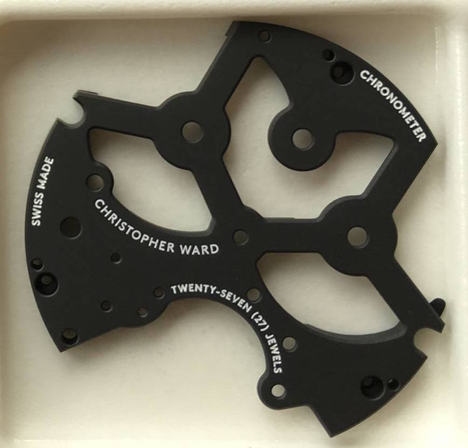
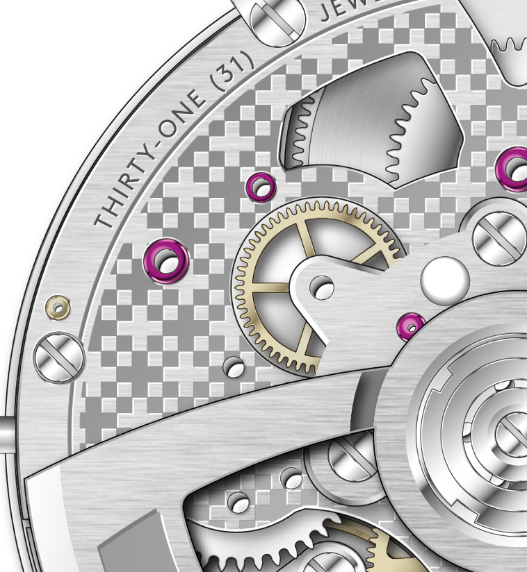
as you like it… here is the detail of the movement
@ Meuuu – Thu Jun 09, 2016 9:41 pm
@ The Naf – Thu Jun 09, 2016 9:41 pm
And please tell me ur not gonna stick it behind a solid caseback
@ tempus fugit – Thu Jun 09, 2016 9:41 pm
can you mock up the upper case on a design pic please?
@ Meuuu – Thu Jun 09, 2016 9:41 pm
The flyer DNA into the movement
@ OllyW – Thu Jun 09, 2016 9:41 pm
Like the uppercase logo much more
@ welshlad – Thu Jun 09, 2016 9:41 pm
Agree that upper case looks good.
@ MadMrB – Thu Jun 09, 2016 9:41 pm
That’s watch porn!
@ jtc – Thu Jun 09, 2016 9:41 pm
Lovely
@ jtc – Thu Jun 09, 2016 9:42 pm
Twin barrels on show?
@ Amor Vincit Omnia – Thu Jun 09, 2016 9:42 pm
Pretty but the dial needs to match!
@ jtc – Thu Jun 09, 2016 9:42 pm
I can think of some very expensive manufacturers who do the same …
@ Christopher Ward – Thu Jun 09, 2016 9:42 pm
farnbourough wind turbine design inspired…..of course
@ hughesyn – Thu Jun 09, 2016 9:42 pm
Yep, shame the uppercase didn’t make it onto the face (and centred at 12)
@ Christopher Ward – Thu Jun 09, 2016 9:42 pm
twin barrels on show yes
@ The Naf – Thu Jun 09, 2016 9:43 pm
So price?
@ gbbird – Thu Jun 09, 2016 9:43 pm
What is your target market now?
@ Amor Vincit Omnia – Thu Jun 09, 2016 9:43 pm
If you put U/C on the dials I’m a convert! Mixed U/L case…no.
@ The Naf – Thu Jun 09, 2016 9:43 pm
Ball park
@ Christopher Ward – Thu Jun 09, 2016 9:43 pm
1500
@ panos – Thu Jun 09, 2016 9:43 pm
have you considered applied SS logo fonts? I bet they would match the polished surfaces of the c60 for example
@ Christopher Ward – Thu Jun 09, 2016 9:43 pm
ish
@ tempus fugit – Thu Jun 09, 2016 9:43 pm
please confirm if you can mock up an U/C on the dial for us now?
@ tempus fugit – Thu Jun 09, 2016 9:43 pm
just for our quick and dirty feedback!
@ Christopher Ward – Thu Jun 09, 2016 9:43 pm
UC?
@ The Naf – Thu Jun 09, 2016 9:44 pm
Case? Ceramic?
@ tempus fugit – Thu Jun 09, 2016 9:44 pm
UPPER CASE
@ tempus fugit – Thu Jun 09, 2016 9:44 pm
like on the rotor
@ albionphoto – Thu Jun 09, 2016 9:44 pm
Upper case = UC?
@ tempus fugit – Thu Jun 09, 2016 9:44 pm
“CHRISTOPHER WARD”
@ jtc – Thu Jun 09, 2016 9:44 pm
You know what, I don’t think that flyer face even needs a logo on it … the big 12 and all the dials more than give enough to look at. With a signed crown and all the beauty round the back, you’d have a winner anyway
@ Amor Vincit Omnia – Thu Jun 09, 2016 9:44 pm
+1 JTC
@ MadMrB – Thu Jun 09, 2016 9:45 pm
Agreed!
@ Christopher Ward – Thu Jun 09, 2016 9:45 pm
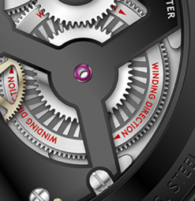
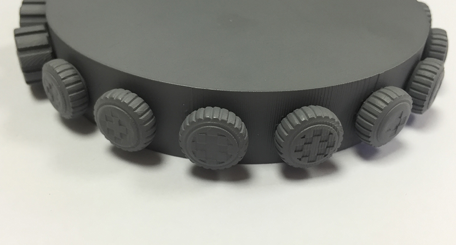
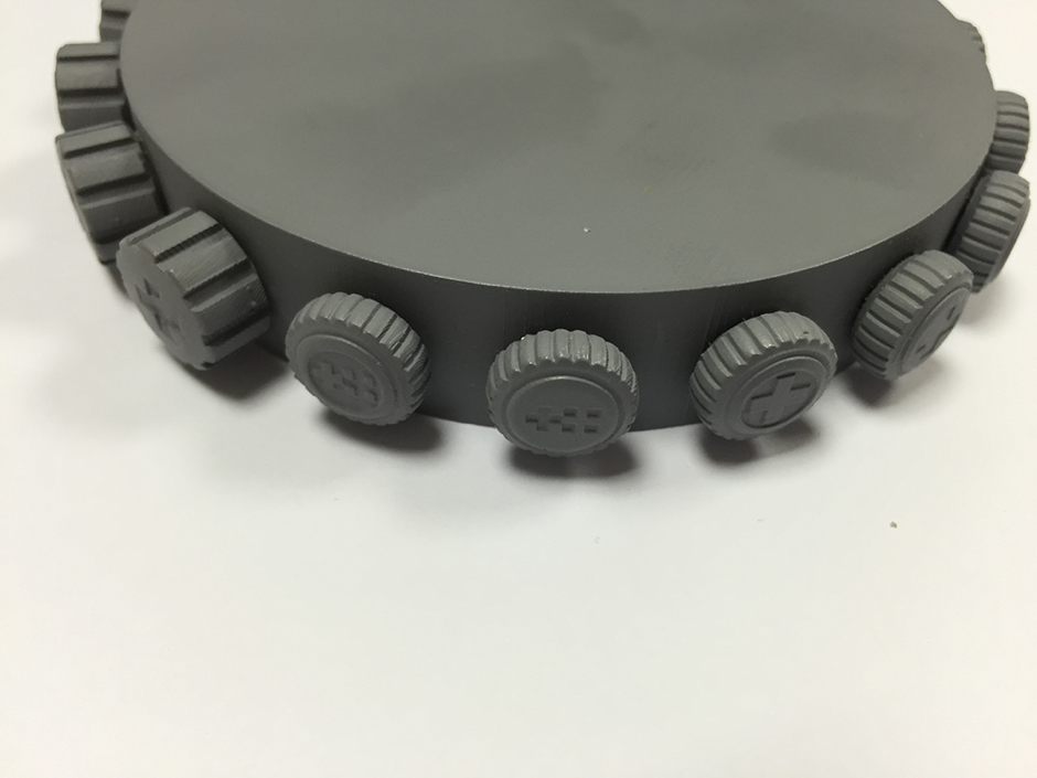
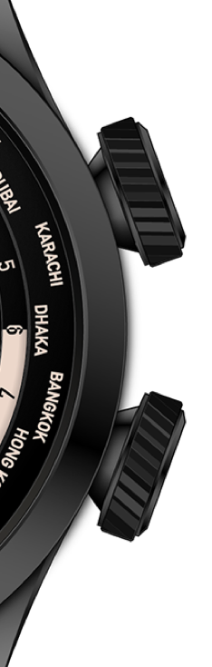
talking of signed crowns
coming down the line…
@ Kip – Thu Jun 09, 2016 9:45 pm
thank you…
@ Christopher Ward – Thu Jun 09, 2016 9:45 pm
ade?
@ Tyke – Thu Jun 09, 2016 9:45 pm
Would look like a faux, oops sorry , fake without the name
@ Meuuu – Thu Jun 09, 2016 9:45 pm
@ Meuuu – Thu Jun 09, 2016 9:46 pm
@ gbbird – Thu Jun 09, 2016 9:46 pm
I agree. Name needs to be on there somewhere
@ tempus fugit – Thu Jun 09, 2016 9:46 pm
need the name
@ Christopher Ward – Thu Jun 09, 2016 9:46 pm
3d printed for perusal
@ Kip – Thu Jun 09, 2016 9:46 pm
Will those who buy one of the new C65 mkII Tridents with unsigned crowns will be able to send them back and get the new crown fitted once they’re completed?
@ albionphoto – Thu Jun 09, 2016 9:46 pm
I still prefer CW on the crown.
@ gbbird – Thu Jun 09, 2016 9:46 pm
Like the crowns
@ welshlad – Thu Jun 09, 2016 9:46 pm
Crowns look good with those logos
@ Christopher Ward – Thu Jun 09, 2016 9:47 pm
Nope… I might sell you a crown though
@ Amor Vincit Omnia – Thu Jun 09, 2016 9:47 pm
Never look at crowns anyway!
@ tempus fugit – Thu Jun 09, 2016 9:47 pm
like the middle and the one to the left of middle
@ Tyke – Thu Jun 09, 2016 9:47 pm
Nice crowns
@ footycrazy – Thu Jun 09, 2016 9:47 pm
Mmmm very Swiss army imo
@ hughesyn – Thu Jun 09, 2016 9:47 pm
I like the big cross, the others look a bit fussy.
@ Macdaz – Thu Jun 09, 2016 9:47 pm
I do like them now, but contemporary not classy. I think they would date
@ Christopher Ward – Thu Jun 09, 2016 9:47 pm
I think you can see how opinions split…
@ albionphoto – Thu Jun 09, 2016 9:47 pm
have to agree with footcrazy
@ Renton – Thu Jun 09, 2016 9:48 pm
“like the middle and the one to the left of middle” Another like for those two crowns here
@ Meuuu – Thu Jun 09, 2016 9:48 pm
tempus fugit > you may like our choice
@ hughesyn – Thu Jun 09, 2016 9:48 pm
The old CW crown looks even better!
@ The Naf – Thu Jun 09, 2016 9:48 pm
Why aren’t any if these being Adopted as logos
@ Christopher Ward – Thu Jun 09, 2016 9:48 pm
shall we ask the Swiss to change their flag
give us a break
@ Kip – Thu Jun 09, 2016 9:48 pm
Will this design ever get incorporated on to the dials?
@ albionphoto – Thu Jun 09, 2016 9:48 pm
If you’re going with the noughts and crosses logo on the crown then the middle and one to the left.
@ Christopher Ward – Thu Jun 09, 2016 9:48 pm
logos or devices
we are not Nike yet
twin flag only
@ albionphoto – Thu Jun 09, 2016 9:49 pm
swoosh
@ The Naf – Thu Jun 09, 2016 9:49 pm
Lol
@ Christopher Ward – Thu Jun 09, 2016 9:49 pm
that might help
@ Tyke – Thu Jun 09, 2016 9:50 pm
As your co-founder expressed a view that quartz weren’t ‘proper watches’, will you continue to make this type of watch?
@ DFEagle – Thu Jun 09, 2016 9:50 pm
The twin flag is striking, distinctive, own–able and timeless.
@ albionphoto – Thu Jun 09, 2016 9:50 pm
would optional crown designs be too hard on the supply chain?
@ Christopher Ward – Thu Jun 09, 2016 9:50 pm
come on to proper
@ DFEagle – Thu Jun 09, 2016 9:50 pm
And would look grand on a dial
@ Christopher Ward – Thu Jun 09, 2016 9:50 pm
sticking to Branding
@ albionphoto – Thu Jun 09, 2016 9:50 pm
fair enough brand standards matter after all
@ Christopher Ward – Thu Jun 09, 2016 9:50 pm
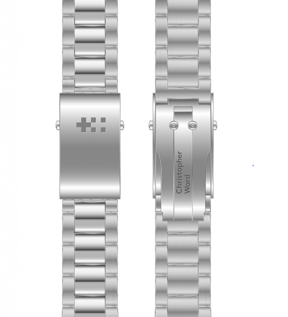
the full branding has yet to be seen by everyone …
eg on bracelets
back plates
@ Meuuu – Thu Jun 09, 2016 9:51 pm
@ Christopher Ward – Thu Jun 09, 2016 9:51 pm
rotors
@ Kip – Thu Jun 09, 2016 9:51 pm
I like that!
@ albionphoto – Thu Jun 09, 2016 9:51 pm
I can see it working on bracelets, yup nice.
@ Meuuu – Thu Jun 09, 2016 9:51 pm
@ The Naf – Thu Jun 09, 2016 9:51 pm
Hey reminds me lot of Tissot
@ Renton – Thu Jun 09, 2016 9:51 pm
Nice
@ Christopher Ward – Thu Jun 09, 2016 9:51 pm
what we are trying to do is create a distinctive CW signature / identity
@ albionphoto – Thu Jun 09, 2016 9:51 pm
rotors are cool, crowns not doing it for me.
@ Christopher Ward – Thu Jun 09, 2016 9:51 pm
MF – one of the key
@ MadMrB – Thu Jun 09, 2016 9:51 pm
Rotor looks great
@ Amor Vincit Omnia – Thu Jun 09, 2016 9:52 pm
Rotor – good!
@ Bahnstormer_vRS – Thu Jun 09, 2016 9:52 pm
Rotor – top notch.
@ welshlad – Thu Jun 09, 2016 9:52 pm
Rotors and bracelet logos look good!
@ MiniMpi – Thu Jun 09, 2016 9:52 pm
Like the rotor work guys !!
@ Christopher Ward – Thu Jun 09, 2016 9:52 pm
objectives was to have the branding form part of the design… for example as above the movement…
@ Kip – Thu Jun 09, 2016 9:52 pm
I like that too!
@ jtc – Thu Jun 09, 2016 9:52 pm
The distinctive signature on all the bits is great, the logo on the face lets it down for me
@ tempus fugit – Thu Jun 09, 2016 9:52 pm
rotor good – including device and upper case logo
@ Tyke – Thu Jun 09, 2016 9:52 pm
Like the rotor, good to see decoration again
@ matengawhat – Thu Jun 09, 2016 9:53 pm
Rotor and bracelets both good
@ Christopher Ward – Thu Jun 09, 2016 9:53 pm
and on sh21 we think it looks great
ade
@ Meuuu – Thu Jun 09, 2016 9:53 pm
@ tempus fugit – Thu Jun 09, 2016 9:53 pm
like the device on the bracelet, would work on crown too
@ MiniMpi – Thu Jun 09, 2016 9:53 pm
The bracelet work looks great too
@ MadMrB – Thu Jun 09, 2016 9:53 pm
The rotor is just so good it does highlight the dial problem.
@ Kip – Thu Jun 09, 2016 9:53 pm
Is this for SH21 only or across the brand?
@ Macdaz – Thu Jun 09, 2016 9:53 pm
Rotor design and font is good, like it. Trouble is I don’t spend the day in boring meetings staring at the rotor
@ Amor Vincit Omnia – Thu Jun 09, 2016 9:53 pm
Not as good as cotes de Genève or perlage, but pretty cool even so!
@ gbbird – Thu Jun 09, 2016 9:54 pm
Too much focus on rotors. Majority of models you won’t see them
@ welshlad – Thu Jun 09, 2016 9:54 pm
SH21 logos look excellent – very striking and unique to the brand
@ The Naf – Thu Jun 09, 2016 9:54 pm
Meh…sorry don’t like rotor or bridge
@ MadMrB – Thu Jun 09, 2016 9:54 pm
It’s unique very catching
@ albionphoto – Thu Jun 09, 2016 9:54 pm
I do like display case backs and this would look good.
@ Christopher Ward – Thu Jun 09, 2016 9:55 pm
Isn’t it often the craftsmanship unseen that gives a watch its real value
@ tempus fugit – Thu Jun 09, 2016 9:55 pm
can you tell us if this forum is just completely wrong-headed? You say mixed feedback here but you are getting an almost unanimous message that the lower case logo on the dial doesn’t work, but that the rotor with device and/or upper case does.
@ Christopher Ward – Thu Jun 09, 2016 9:55 pm
IMO
@ The Naf – Thu Jun 09, 2016 9:55 pm
Coates de Geneva or perlage for me
@ Christopher Ward – Thu Jun 09, 2016 9:55 pm
MF – for us this is about quality and our aiming to compete with the best
@ gbbird – Thu Jun 09, 2016 9:55 pm
But only to those who appreciate it. Back to target market….
@ Christopher Ward – Thu Jun 09, 2016 9:55 pm
attention to detail is critical and we hope we are getting much better at it
@ tempus fugit – Thu Jun 09, 2016 9:56 pm
what does your market research say re the upper and lower case logo. Rotors superb, dial is poor
@ Meuuu – Thu Jun 09, 2016 9:56 pm
We will have “colimaçonné” under the pattern which is a new type of finish which play nicely with the light
@ hughesyn – Thu Jun 09, 2016 9:56 pm
‘The best’ put their logos at 12, centred…
@ Christopher Ward – Thu Jun 09, 2016 9:56 pm
it researched well…. trust us if it didn’t we would have put a swoosh on the dial
@ The Naf – Thu Jun 09, 2016 9:56 pm
I’m the opposite. Like dial…not rotors…though I’d have to see rotors in real-life
@ jtc – Thu Jun 09, 2016 9:57 pm
Kip – you have PM on the “uppercase” argument
@ Christopher Ward – Thu Jun 09, 2016 9:57 pm
but we are different
@ Amor Vincit Omnia – Thu Jun 09, 2016 9:57 pm
colimaçonné…Spirals?
@ tempus fugit – Thu Jun 09, 2016 9:57 pm
sorry CWL guys, I really feel like the upper case question is being ducked
@ Renton – Thu Jun 09, 2016 9:57 pm
Such a shame these sexy pics keep getting in the way of some fascinating logo moaners
@ The Naf – Thu Jun 09, 2016 9:57 pm
Lol
@ albionphoto – Thu Jun 09, 2016 9:58 pm
I didn’t mind the logo, it works for me on the new designs
@ Meuuu – Thu Jun 09, 2016 9:58 pm
Ola Amor Vincit Omia! Yes it’s kind of spiral where the plate turn and a brush finish turn in an opposite direction
@ stefs – Thu Jun 09, 2016 9:58 pm
It didn’t research well with us and nobody loves your watches more than us!
@ matengawhat – Thu Jun 09, 2016 9:58 pm
Centered I have no issues
@ Christopher Ward – Thu Jun 09, 2016 9:58 pm
ade wants to talk Spanish
@ albionphoto – Thu Jun 09, 2016 9:59 pm
should be fun
@ Amor Vincit Omnia – Thu Jun 09, 2016 9:59 pm
Ojala!
@ albionphoto – Thu Jun 09, 2016 9:59 pm
showoff
@ Kip – Thu Jun 09, 2016 9:59 pm
Please talk about the rumoured “prestige” range. I know there won’t be details but do you have price points in mind, what is the vision for the prestige line.
@ Christopher Ward – Thu Jun 09, 2016 10:00 pm
ah kip
@ albionphoto – Thu Jun 09, 2016 10:00 pm
Great question
@ Christopher Ward – Thu Jun 09, 2016 10:00 pm
would love to
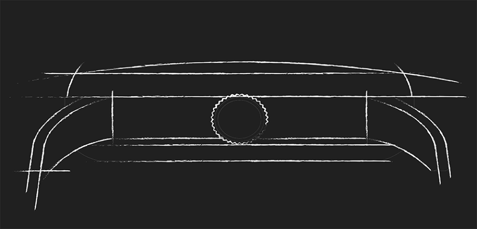
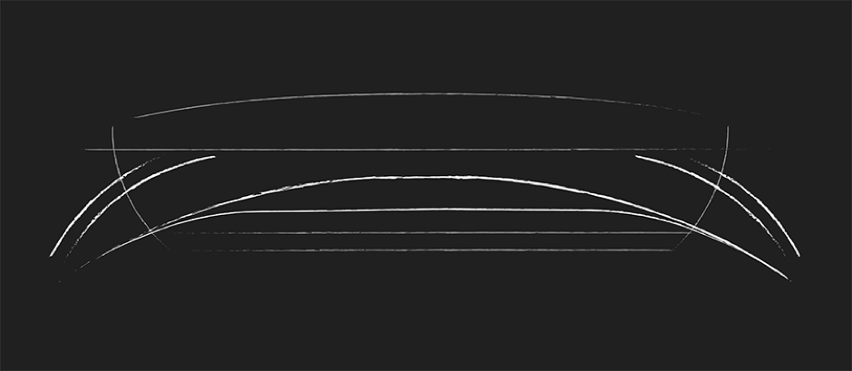
This will be under the C1 development…aid…sketches please…
@ Meuuu – Thu Jun 09, 2016 10:01 pm
Amor > Colimaçoné mira a MB&F Legacy Machine > in the dial
@ Christopher Ward – Thu Jun 09, 2016 10:01 pm
If anyone comes up with a name we take… you can have one FOC
@ Christopher Ward – Thu Jun 09, 2016 10:01 pm
first up case inspiration…
@ Meuuu – Thu Jun 09, 2016 10:01 pm
@ albionphoto – Thu Jun 09, 2016 10:01 pm
aston martin?
@ Christopher Ward – Thu Jun 09, 2016 10:01 pm
and shapely women
Mike likes Nicole
@ albionphoto – Thu Jun 09, 2016 10:02 pm
both great inspirations
@ Meuuu – Thu Jun 09, 2016 10:02 pm

@ Christopher Ward – Thu Jun 09, 2016 10:02 pm
Nicole K
but we are here
seriously the case
@ Meuuu – Thu Jun 09, 2016 10:02 pm
Currently C9
@ Meuuu – Thu Jun 09, 2016 10:02 pm
@ Amor Vincit Omnia – Thu Jun 09, 2016 10:02 pm
Amor > Colimaçoné mira a MB&F Legacy Machine > in the dial…VERY NICE!
@ Christopher Ward – Thu Jun 09, 2016 10:02 pm
early sketches
@ jtc – Thu Jun 09, 2016 10:03 pm
Can’t afford either of those two – so call it the Mirage
@ Christopher Ward – Thu Jun 09, 2016 10:03 pm
that’s the current
@ Meuuu – Thu Jun 09, 2016 10:03 pm
@ Christopher Ward – Thu Jun 09, 2016 10:03 pm
this is where we are going
@ Meuuu – Thu Jun 09, 2016 10:03 pm

@ albionphoto – Thu Jun 09, 2016 10:03 pm
second one looks a bit bowl like
@ MadMrB – Thu Jun 09, 2016 10:03 pm
Like it!
@ albionphoto – Thu Jun 09, 2016 10:03 pm
3rd is good
@ Meuuu – Thu Jun 09, 2016 10:03 pm
@ Thegreyman – Thu Jun 09, 2016 10:03 pm
a turtle head on?
@ Christopher Ward – Thu Jun 09, 2016 10:03 pm
launch scheduled…Nov 16….Salon QP….hopefully
@ Meuuu – Thu Jun 09, 2016 10:04 pm
@ albionphoto – Thu Jun 09, 2016 10:04 pm
always waiting…
@ Christopher Ward – Thu Jun 09, 2016 10:04 pm
The turtle….no cigar
@ Amor Vincit Omnia – Thu Jun 09, 2016 10:04 pm
36mm gold?
@ Christopher Ward – Thu Jun 09, 2016 10:04 pm
or maybe…
@ Bahnstormer_vRS – Thu Jun 09, 2016 10:04 pm
Shades of Bremont?
@ Devarika Woulf – Thu Jun 09, 2016 10:04 pm
Will there be a new CW watch that also doubles as a beard trimmer?
@ Kip – Thu Jun 09, 2016 10:04 pm
Engraving?
@ Christopher Ward – Thu Jun 09, 2016 10:04 pm
what – Bremont
@ Amor Vincit Omnia – Thu Jun 09, 2016 10:05 pm
PMSL JOe!
@ Christopher Ward – Thu Jun 09, 2016 10:05 pm
trimmer watch… yes Aug 2017.
@ nathanclarinet – Thu Jun 09, 2016 10:05 pm
Case looks lovely and shapely – The fat lady?
@ Meuuu – Thu Jun 09, 2016 10:05 pm
Won’t be anymore
@ Meuuu – Thu Jun 09, 2016 10:05 pm
slimmer than ever
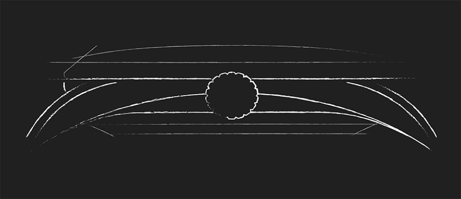
@ Christopher Ward – Thu Jun 09, 2016 10:06 pm
then from this slimmer *than ever C1
@ nathanclarinet – Thu Jun 09, 2016 10:06 pm
Watchy Mcwatch face?
@ albionphoto – Thu Jun 09, 2016 10:06 pm
complications?
@ Christopher Ward – Thu Jun 09, 2016 10:06 pm
we would love to show the actual case but the Telegraph want
exclusivity
but I can show you how it translates to the new mk3 c5 which
@ Amor Vincit Omnia – Thu Jun 09, 2016 10:07 pm
then from this slimmer *than ever C1….HE SAID C1!
@ albionphoto – Thu Jun 09, 2016 10:07 pm
we can keep a secret; honest!
@ Christopher Ward – Thu Jun 09, 2016 10:07 pm
is due for launch in Jan/Feb 17
@ Meuuu – Thu Jun 09, 2016 10:07 pm
The before/after effect
@ Meuuu – Thu Jun 09, 2016 10:07 pm
@ Christopher Ward – Thu Jun 09, 2016 10:07 pm
Mike cant
@ Bahnstormer_vRS – Thu Jun 09, 2016 10:07 pm
Easy AVO
LHS current
RHS new
@ Meuuu – Thu Jun 09, 2016 10:08 pm
@ stefs – Thu Jun 09, 2016 10:08 pm
Slim is good
@ Wiggy999 – Thu Jun 09, 2016 10:08 pm
sleek
@ albionphoto – Thu Jun 09, 2016 10:08 pm
certainly intriguing
@ Kip – Thu Jun 09, 2016 10:08 pm
Size?
@ Christopher Ward – Thu Jun 09, 2016 10:08 pm
MF – daddy what are the turtles doing
@ Devarika Woulf – Thu Jun 09, 2016 10:09 pm
Like the slim.
@ Meuuu – Thu Jun 09, 2016 10:09 pm
39 mm
@ Wiggy999 – Thu Jun 09, 2016 10:09 pm
making baby turtles
@ stefs – Thu Jun 09, 2016 10:09 pm
39 spot on!
@ welshlad – Thu Jun 09, 2016 10:09 pm
New C5 case looks very nice. Good curves!
@ Amor Vincit Omnia – Thu Jun 09, 2016 10:09 pm
39mm – please use 20mm lug gap!!
@ Kip – Thu Jun 09, 2016 10:09 pm
Movement planned?
@ OllyW – Thu Jun 09, 2016 10:10 pm
Cool. mchat.php#
@ welshlad – Thu Jun 09, 2016 10:10 pm
39mm = just right. But 20mm lugs, as AVO says! Please!
@ jtc – Thu Jun 09, 2016 10:10 pm
How will the contemporary fit in with the classic & slim?
@ Meuuu – Thu Jun 09, 2016 10:10 pm
We approached the design as in car design. And thanks to JJ we improved the thickness of the watch
@ Christopher Ward – Thu Jun 09, 2016 10:10 pm
fit in just fine
@ pEEk – Thu Jun 09, 2016 10:11 pm
The turtle should be named Michelangelo!
@ Meuuu – Thu Jun 09, 2016 10:11 pm
Of course 20mm
@ jtc – Thu Jun 09, 2016 10:11 pm
Also, you’ve teased the 5 day SH21 Flyer .. any chance of a GMT teaser? …
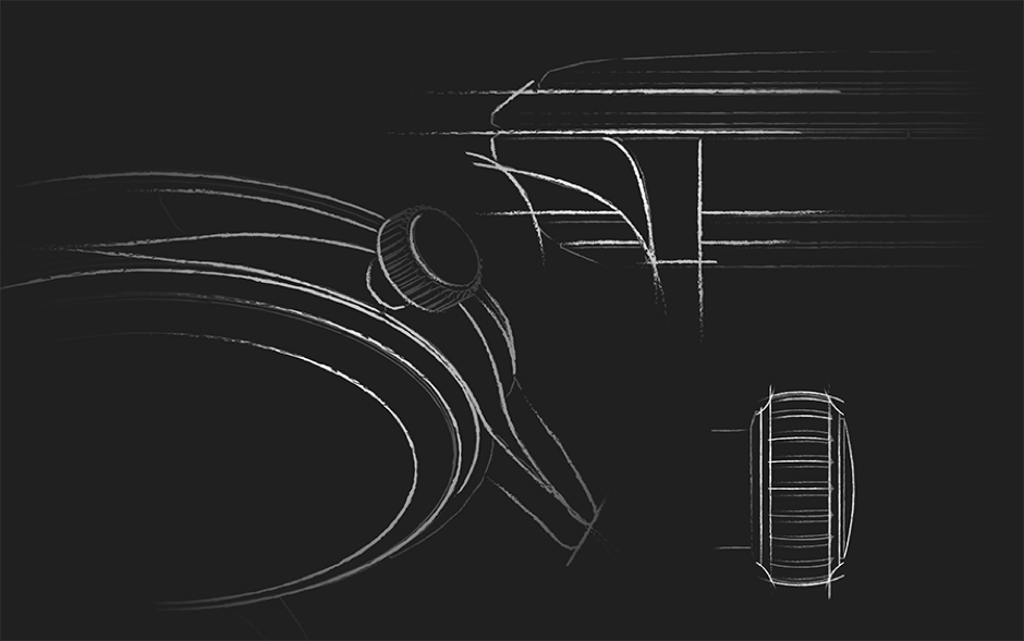
@ Christopher Ward – Thu Jun 09, 2016 10:12 pm
GMT teaser
@ Kip – Thu Jun 09, 2016 10:12 pm
Chris …..are you guys ok on time?
@ Christopher Ward – Thu Jun 09, 2016 10:12 pm
aid …do we have
@ gbbird – Thu Jun 09, 2016 10:12 pm
I can’t get excited about B&W sketches
@ The Naf – Thu Jun 09, 2016 10:12 pm
Yes and the case will it be ceramic of dlc/pvd
@ Christopher Ward – Thu Jun 09, 2016 10:12 pm
I know we do really
@ Meuuu – Thu Jun 09, 2016 10:12 pm
@ Meuuu – Thu Jun 09, 2016 10:12 pm
DLC going forward
@ Christopher Ward – Thu Jun 09, 2016 10:12 pm
dlc
@ albionphoto – Thu Jun 09, 2016 10:12 pm
Must start saving
@ jtc – Thu Jun 09, 2016 10:12 pm
Wow
@ sproughton – Thu Jun 09, 2016 10:12 pm
Stunning
@ Meuuu – Thu Jun 09, 2016 10:12 pm
as it’s the best coating we can have
@ Christopher Ward – Thu Jun 09, 2016 10:12 pm
this one in both DLC and SS
@ gbbird – Thu Jun 09, 2016 10:13 pm
That’s more like it
@ jtc – Thu Jun 09, 2016 10:13 pm
Is it a new case style?
@ Thegreyman – Thu Jun 09, 2016 10:13 pm
That looks great and tbh the logo works better with that design
@ The Naf – Thu Jun 09, 2016 10:13 pm
Power reserve in as?
@ Amor Vincit Omnia – Thu Jun 09, 2016 10:13 pm
Loce the cities! Pleeeease make logo U/C!!!
@ Christopher Ward – Thu Jun 09, 2016 10:13 pm
and the logo position chaps
@ welshlad – Thu Jun 09, 2016 10:13 pm
Looks interesting. Not sure about those condom hands though.
@ The Naf – Thu Jun 09, 2016 10:13 pm
Sorry power reserve in stainless steel?
@ Amor Vincit Omnia – Thu Jun 09, 2016 10:13 pm
Meant Love
@ albionphoto – Thu Jun 09, 2016 10:13 pm
I like the 9PM position here
@ jtc – Thu Jun 09, 2016 10:13 pm
Actually think the new logo looks ok on that, there’s plenty of other text to make it more subdued. Impressed so far
@ matengawhat – Thu Jun 09, 2016 10:13 pm
“A4 class” for the new watch after the great trains
@ ddav – Thu Jun 09, 2016 10:13 pm
evening folks. hope I’ve not missed too much
@ Macdaz – Thu Jun 09, 2016 10:14 pm
Didn’t want
@ sproughton – Thu Jun 09, 2016 10:14 pm
9 works because it balances the dial here
@ stefs – Thu Jun 09, 2016 10:14 pm
Centre justify a
@ Viognier – Thu Jun 09, 2016 10:14 pm
Does that say Calgary on the GMT outer dial??
@ Meuuu – Thu Jun 09, 2016 10:14 pm
Good spot already in resampling
@ Amor Vincit Omnia – Thu Jun 09, 2016 10:14 pm
Calm down Lance!
@ Macdaz – Thu Jun 09, 2016 10:14 pm
Didn’t want to mention it but since you ask, logo is still unbalancing the dial
@ albionphoto – Thu Jun 09, 2016 10:15 pm
Balanced by the date at 3PM
@ welshlad – Thu Jun 09, 2016 10:15 pm
True GMT a la Rolex/Omega? Or standard 2893 type functionality?
@ Bahnstormer_vRS – Thu Jun 09, 2016 10:15 pm
logo is fine
@ Meuuu – Thu Jun 09, 2016 10:15 pm
Steel or black DLC?
@ Meuuu – Thu Jun 09, 2016 10:15 pm
@ Christopher Ward – Thu Jun 09, 2016 10:15 pm
2893
@ nbg – Thu Jun 09, 2016 10:16 pm
Price?
@ albionphoto – Thu Jun 09, 2016 10:16 pm
surprisingly different in DLC. I preferred the lighter steel
@ Kip – Thu Jun 09, 2016 10:16 pm
Personally prefer SS
@ jtc – Thu Jun 09, 2016 10:16 pm
Yep, steel looks much better
@ Christopher Ward – Thu Jun 09, 2016 10:16 pm
just shy of !k
one K
@ Thegreyman – Thu Jun 09, 2016 10:16 pm
42mm?
@ Amor Vincit Omnia – Thu Jun 09, 2016 10:16 pm
Is that OR (Caramac) lume?
@ albionphoto – Thu Jun 09, 2016 10:17 pm
caramac lume – love it
@ Christopher Ward – Thu Jun 09, 2016 10:17 pm
OR
@ jtc – Thu Jun 09, 2016 10:17 pm
Lots of vintage going on in new models – will there be something between SS and vintage DLC?
@ Gramskii – Thu Jun 09, 2016 10:17 pm
love the logo
@ Christopher Ward – Thu Jun 09, 2016 10:17 pm
crowns?
@ Devarika Woulf – Thu Jun 09, 2016 10:17 pm
I like the DLC version actually. Both are nice.
@ Amor Vincit Omnia – Thu Jun 09, 2016 10:17 pm
Old Radium – hate it!
@ albionphoto – Thu Jun 09, 2016 10:17 pm
agree with AVO
@ Meuuu – Thu Jun 09, 2016 10:17 pm
@ Christopher Ward – Thu Jun 09, 2016 10:18 pm
sells 3:1 to white lume in the same watch
@ jtc – Thu Jun 09, 2016 10:18 pm
Display case back?
@ Renton – Thu Jun 09, 2016 10:18 pm
I like that
@ Kip – Thu Jun 09, 2016 10:18 pm
I guess OR wins.
@ Christopher Ward – Thu Jun 09, 2016 10:18 pm
we are also looking at treating the strap back differently
@ albionphoto – Thu Jun 09, 2016 10:18 pm
OR can suit some designs absolutely true but not a blanket solution surely
@ Christopher Ward – Thu Jun 09, 2016 10:18 pm
incorporating the size and the device pattern
@ Amor Vincit Omnia – Thu Jun 09, 2016 10:19 pm
I believe you Chris – just a personal thing. Old lume belongs on old watches, just my 2P.
@ Christopher Ward – Thu Jun 09, 2016 10:19 pm
noted AVO
@ Tyke – Thu Jun 09, 2016 10:19 pm
Got to hand it to you guys, you’re good bombarding us with goodies pictures to avoid answering the awkward questions is the slickest bit of PR to come out of CW towers this year.
@ albionphoto – Thu Jun 09, 2016 10:19 pm
like the crown treatment, again very technical and modern
@ Meuuu – Thu Jun 09, 2016 10:19 pm
@ albionphoto – Thu Jun 09, 2016 10:20 pm
the small squares would have to align perfectly, could be tricky on leather
@ Christopher Ward – Thu Jun 09, 2016 10:20 pm
Which awkward question is next …aid doesn’t want to show anymore
@ hughesyn – Thu Jun 09, 2016 10:20 pm
The cross pattern looks good on the back of the strap. Thanks for all the photos, very interesting.
@ jtc – Thu Jun 09, 2016 10:20 pm
On the world timer/GMT, the only text not in uppercase is the logo
@ Christopher Ward – Thu Jun 09, 2016 10:21 pm
correct
@ Devarika Woulf – Thu Jun 09, 2016 10:21 pm
@ Tyke, Majority of people on the forum don’t care for the new logo. Not much getting around that. Best not to answer?
@ Kip – Thu Jun 09, 2016 10:21 pm
When do you expect that all models will have been transitioned to the new logo/device?
@ Bahnstormer_vRS – Thu Jun 09, 2016 10:21 pm
@tyke – but this is traditionally what the chat is about. New developments etc. We are privileged to have it shared with us.
@ Christopher Ward – Thu Jun 09, 2016 10:21 pm
it will take some time
@ Tyke – Thu Jun 09, 2016 10:21 pm
Will you continue to make ‘not proper watches’ aka quartz? If so why since you are so disparaging about them
@ Amor Vincit Omnia – Thu Jun 09, 2016 10:21 pm
@Kip – after I buy a Moon Phase, hopefully!
@ tempus fugit – Thu Jun 09, 2016 10:21 pm
um, did anyone mention UPPER CASE?
@ Christopher Ward – Thu Jun 09, 2016 10:21 pm
probably late 17…
@ Christopher Ward – Thu Jun 09, 2016 10:22 pm
proper and quartz…
@ stefs – Thu Jun 09, 2016 10:22 pm
Embossing on underside of leather surely totally unimportant
@ albionphoto – Thu Jun 09, 2016 10:22 pm
interested to see how the new logo works on the trident chrono
@ Tyke – Thu Jun 09, 2016 10:22 pm
@Bahnstormer, it was billed as a chat about the rebrand
@ tempus fugit – Thu Jun 09, 2016 10:22 pm
+1 Tyke
@ Christopher Ward – Thu Jun 09, 2016 10:22 pm
MF – Proper watch is a colloquial term often used to differentiate beautifully crafted horologically sound watches from cheaply made ones
CW – Easy for Mike to say…difficult to type
@ tempus fugit – Thu Jun 09, 2016 10:23 pm
so how did you feel about the quartz amnesty from Hello?
@ footycrazy – Thu Jun 09, 2016 10:23 pm
Chris. My question is regarding discontinued watches re. spare parts such as mk1 Trident cases and bezel inserts as well as the other discontinued model spares.
@ Christopher Ward – Thu Jun 09, 2016 10:23 pm
MF – We are proud of all of our watches which serve as a great entry point to the CW brand…
quartz that is…
indeed many of you will
have noticed that we have added Quartz watches to ranges such as trident and flyers in the near past..
so we are not planning a phase out
CW -Although Mechanical watches are more than 80% of out t/o there is no Amnesty here
@ Amor Vincit Omnia – Thu Jun 09, 2016 10:24 pm
Your quartz has always been top-notch, esp Chronos.
@ hughesyn – Thu Jun 09, 2016 10:25 pm
Would you consider a thermocompensated quartz dress /normal watch, not just chronos?
@ Tyke – Thu Jun 09, 2016 10:25 pm
You sell a £2k+ plus quartz which isn’t entry level which is why I query the not proper designation?
@ Christopher Ward – Thu Jun 09, 2016 10:25 pm
yes proper good chronos
@ albionphoto – Thu Jun 09, 2016 10:25 pm
quartz is good for enticing folks into the brand, glad it’s being kept
@ Christopher Ward – Thu Jun 09, 2016 10:25 pm
us too
@ Devarika Woulf – Thu Jun 09, 2016 10:25 pm
Chris, will there be a new blue C60 as the PRO version has been discontinued? Was this answered already?
@ tempus fugit – Thu Jun 09, 2016 10:25 pm
ok that’s good to hear
@ Christopher Ward – Thu Jun 09, 2016 10:26 pm
I don’t think we have said Quartz isn’t proper.
@ eggtronics – Thu Jun 09, 2016 10:26 pm
Only just joined so not sure if covered already, but any thought given to the new Ronda automatic? Apparently a like for like to the ETA and Sellita and is cheaper.
@ Christopher Ward – Thu Jun 09, 2016 10:26 pm
in fact some of my faves are quartz
@ Amor Vincit Omnia – Thu Jun 09, 2016 10:26 pm
@CW – mine too…C1!!
@ Christopher Ward – Thu Jun 09, 2016 10:27 pm
Ronda auto
@ Kip – Thu Jun 09, 2016 10:27 pm
I just had a power outage so will do the best I can from phone.
@ Christopher Ward – Thu Jun 09, 2016 10:28 pm
In our opinion …it seems to be embedded in old tech… don’t wish to sound negative,,, but we are keen to test it out…. but …
@ ddav – Thu Jun 09, 2016 10:28 pm
Why was the c11 cases dropped? Not enough sales volume?
@ Devarika Woulf – Thu Jun 09, 2016 10:28 pm
The C11 was one of CW’s best cases. Sad to see it go.
@ Christopher Ward – Thu Jun 09, 2016 10:29 pm
sort of… but we also wanted to direct our efforts to the c60
much bigger and wanted to streamline
our ranging structure and focus
what’s next?
Euro 2016?
@ Tyke – Thu Jun 09, 2016 10:30 pm
Is the rebrand aimed at changing your target customer and if you are ‘going youth’ do you think that will work for a group that traditionally don’t wear watches?
@ Christopher Ward – Thu Jun 09, 2016 10:30 pm
ok….
@ ddav – Thu Jun 09, 2016 10:31 pm
A shame my two favorite watches are now discontinued Tri tech and Makaira
@ Christopher Ward – Thu Jun 09, 2016 10:31 pm
firstly…Take it form me chaps,….there is no change and certainly not going youth…
we continue as we have always done…making High quality watches accessible to everyone…
@ tempus fugit – Thu Jun 09, 2016 10:32 pm
OK but it can’t be me since I feel totally alienated since the re-brand and have seriously considered selling all my 6 CWs. Incidentally, I’m a mid-thirties professional who appreciates the finer things in life like nice watches but also have a young family; so while I’d love to blow cash on Rolexes and PPs, I have to balance that with desire with giving my kids nice holidays; I have met that need up to now with CWL. (And I don’t have a beard, but have been known to not shave for a week or two.)
@ Christopher Ward – Thu Jun 09, 2016 10:32 pm
and our values as a brand remain exactly the same…in fact..if anything the new branding is closer to those than old.
@ Thegreyman – Thu Jun 09, 2016 10:32 pm
Youth don’t have the cash to buy high end watches.in general
@ reded78 – Thu Jun 09, 2016 10:32 pm
How can you say there is no change??
@ Christopher Ward – Thu Jun 09, 2016 10:32 pm
What we do need to do however to keep growing …
to achieve that mission
The old branding wasn’t doing this as well as it might have..
Its early days but as we said just the initial results are very encouraging
@ Devarika Woulf – Thu Jun 09, 2016 10:34 pm
The new cover of the magazine with the young, tattooed, hipster kids was pretty contrasting to the usual image. Seems the company is going after a new market.
@ Mark78 – Thu Jun 09, 2016 10:34 pm
Did you ever consider a name change as part of a re-brand?
@ Christopher Ward – Thu Jun 09, 2016 10:35 pm
the loupe amg cover…
I think you meant the homepage
Mark78 > not at all
Jeremy is real… he works for us… why wouldn’t we put him on the cover?
he can’t help being cool
@ hughesyn – Thu Jun 09, 2016 10:36 pm
Lol
@ Kip – Thu Jun 09, 2016 10:36 pm
The Trident Pro line has been thinned quite a bit since last year. More changes in the wind?
@ Christopher Ward – Thu Jun 09, 2016 10:36 pm
by he way he is a top watchmaker being guided by JJ
@ reded78 – Thu Jun 09, 2016 10:36 pm
He was so not cool. Can you explain why the website changed after about a week?
@ Christopher Ward – Thu Jun 09, 2016 10:36 pm
C60… watch that space….
@ Devarika Woulf – Thu Jun 09, 2016 10:36 pm
The blue C60 PRO is no longer being sold. Will we be getting a new blue version?
@ hughesyn – Thu Jun 09, 2016 10:37 pm
Will we get a quartz Trident in the 600 style?
@ Christopher Ward – Thu Jun 09, 2016 10:37 pm
nothing stands still …..even the website… which changes most weeks far as long as I can remember
@ Kip – Thu Jun 09, 2016 10:37 pm
How about smaller case sizes? Seems to be a demand.
@ tempus fugit – Thu Jun 09, 2016 10:38 pm
I’m sure he is but the copy on the website was some of the most excruciatingly bad copy I’ve ever seen. Loving WWII, hatchbacks in car parks, aspiring to step up from Michael Kors, name dropping of celebrities etc.. How do you respond to this so UNcool
@ jtc – Thu Jun 09, 2016 10:39 pm
Will there be a greater focus on getting things “right first time” for future orders – several newbies to the forum have joined just to discuss problems with an order or watch. I myself ordered a C60 at Christmas and was sent the wrong model! I could appreciate things were just a bit manic then … but there seems to be a lack of overall QC before orders get sent out
@ Christopher Ward – Thu Jun 09, 2016 10:39 pm
smaller cases…. as volume increases we have more opportunity to add smaller case sizes…
@ Amor Vincit Omnia – Thu Jun 09, 2016 10:39 pm
@TF – the copy on the website was some of the most excruciatingly bad copy I’ve ever seen…It wasn’t that good!
@ stefs – Thu Jun 09, 2016 10:40 pm
It will be great to see more smaller case options
@ Tyke – Thu Jun 09, 2016 10:40 pm
Why did you look so pissed off in THAT picture?
@ sproughton – Thu Jun 09, 2016 10:40 pm
The website rhetoric was at best cringe worthy when first launched
@ pEEk – Thu Jun 09, 2016 10:40 pm
Can we have any sneak peaks of the coming C60’s?
@ Christopher Ward – Thu Jun 09, 2016 10:41 pm
We continue to work at improving our processes in all areas of the business… we do get it wrong form time to time,… but hopefully we work hard to get it right
@ Kip – Thu Jun 09, 2016 10:41 pm
Any last questions? About time to wrap this up. We have kept these guys long enough.
@ Christopher Ward – Thu Jun 09, 2016 10:41 pm
c60s…too early to show and they are a while off anyway
@ The Naf – Thu Jun 09, 2016 10:41 pm
Sorry last question re c8 power reserve
@ Christopher Ward – Thu Jun 09, 2016 10:41 pm
ok
@ MadMrB – Thu Jun 09, 2016 10:41 pm
A bit of levity… what about a wrist check from the CW guys?
@ footycrazy – Thu Jun 09, 2016 10:41 pm
Spares for discontinued watches ??????
@ The Naf – Thu Jun 09, 2016 10:41 pm
Any chance it will be offered in stainless steel?
@ Amor Vincit Omnia – Thu Jun 09, 2016 10:42 pm
Upper case logo?:D
@ jtc – Thu Jun 09, 2016 10:42 pm
… and not 44mm
@ Devarika Woulf – Thu Jun 09, 2016 10:42 pm
Just a suggestion. I’d like to see a vintage black leather option for the new C65 Vintage. That’s all.
@ Christopher Ward – Thu Jun 09, 2016 10:42 pm
Dlc as I said is 3:1… if it does well then we would consider… for sure
@ stefs – Thu Jun 09, 2016 10:42 pm
Chris if you have the chance could you review these questions and answer the stuff that passed by please?
@ tempus fugit – Thu Jun 09, 2016 10:42 pm
give it up AVO, we ain’t getting an answer…
@ jtc – Thu Jun 09, 2016 10:43 pm
Oh and well done finding some random watches and letting Kip know … I think poor Wera will have quite a few emails tomorrow morning
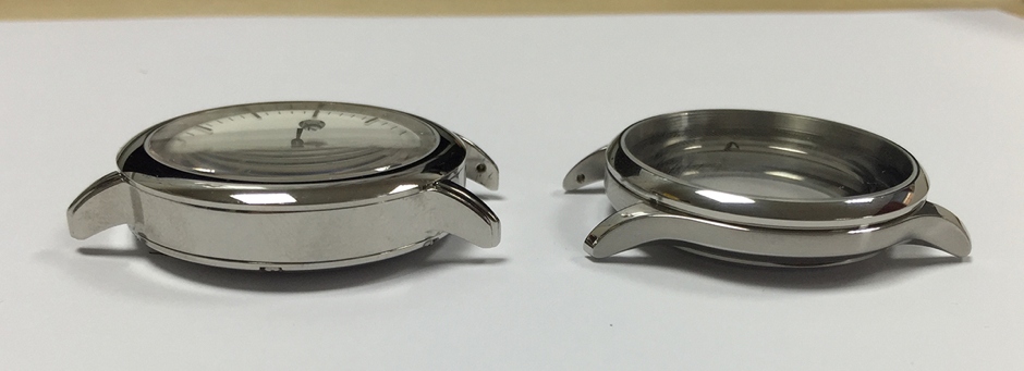
@ Christopher Ward – Thu Jun 09, 2016 10:43 pm
c65 vintage black– we can arrange…email Wera
UC logo….
not for us…
@ Tyke – Thu Jun 09, 2016 10:44 pm
Thanks for your time and answers, kudos to you for fronting up and answering the questions you probably didn’t want to hear.
@ Wiggy999 – Thu Jun 09, 2016 10:44 pm
thanks for doing this..
@ Christopher Ward – Thu Jun 09, 2016 10:44 pm
am I right in thinking you are talking UPPER CASE like this
@ Kip – Thu Jun 09, 2016 10:44 pm
A huge Thank you to Chris, Mike and Adrian for sharing this time with us.
@ jtc – Thu Jun 09, 2016 10:44 pm
Can I offer up a quick Photoshop of the flyer with an UC logo (wrong font though)? Conscious it’s your IP I’ve defaced ….
@ MiniMpi – Thu Jun 09, 2016 10:44 pm
Thanks Chris, Mike and Adrian
@ nathanclarinet – Thu Jun 09, 2016 10:45 pm
Thanks all
@ Amor Vincit Omnia – Thu Jun 09, 2016 10:45 pm
Fairy nuff! Thanks so much, guys – great to talk to you, UPPER CASE, Chris, yes!
@ Christopher Ward – Thu Jun 09, 2016 10:45 pm
yes please do… we’ve been around that block but please show the guys and discuss,
@ Bahnstormer_vRS – Thu Jun 09, 2016 10:45 pm
Thanks all; until next year? G’night all.
@ jtc – Thu Jun 09, 2016 10:45 pm
@ Christopher Ward – Thu Jun 09, 2016 10:45 pm
our finding was it didn’t work as well
@ MadMrB – Thu Jun 09, 2016 10:45 pm
Thanks guys, much appreciated
@ jtc – Thu Jun 09, 2016 10:45 pm
Just wanted to put that one to bed
@ Renton – Thu Jun 09, 2016 10:45 pm
Thanks guys
@ welshlad – Thu Jun 09, 2016 10:45 pm
Please answer footy’s question! He’s desperate!
@ Christopher Ward – Thu Jun 09, 2016 10:45 pm
see what I mean
@ Gramskii – Thu Jun 09, 2016 10:45 pm
Thanks – that was very interesting. First time listening in.
@ Amor Vincit Omnia – Thu Jun 09, 2016 10:45 pm
JTC – brilliant!
@ Tyke – Thu Jun 09, 2016 10:46 pm
Doesn’t need upper case, just needs centre justified
@ Meuuu – Thu Jun 09, 2016 10:46 pm
Thank you everybody was great to talk to you. Looking forward to see you in the showroom
@ Mark78 – Thu Jun 09, 2016 10:46 pm
Thank you for taking the time to do this, much appreciated.
@ Christopher Ward – Thu Jun 09, 2016 10:46 pm
thanks guys… it’s been emotional
@ Devarika Woulf – Thu Jun 09, 2016 10:46 pm
Like that JTC
@ Kip – Thu Jun 09, 2016 10:46 pm
We hope to have a transcript posted in a day or 2.
@ hughesyn – Thu Jun 09, 2016 10:46 pm
Thanks
@ Christopher Ward – Thu Jun 09, 2016 10:46 pm
al
@ Thegreyman – Thu Jun 09, 2016 10:46 pm
Thanks good night,
@ tempus fugit – Thu Jun 09, 2016 10:46 pm
JTC – thanks. an improvement for sure
@ eggtronics – Thu Jun 09, 2016 10:46 pm
Thanks for taking the time to speak to us
@ tempus fugit – Thu Jun 09, 2016 10:46 pm
thanks to CWL guys
@ stefs – Thu Jun 09, 2016 10:46 pm
Final thought……centre justify!
@ Christopher Ward – Thu Jun 09, 2016 10:46 pm
Thanks Kip….well done as ever
@ jtc – Thu Jun 09, 2016 10:46 pm
Will leave that with you – Kip has the URL as it’s internet hosted, so can be deleted
@ Christopher Ward – Thu Jun 09, 2016 10:46 pm
arranging this….
@ sproughton – Thu Jun 09, 2016 10:46 pm
I expect the transcript to be up in 10 minutes… Good luck guys
@ Macdaz – Thu Jun 09, 2016 10:47 pm
Thanks guys, goodnight all
@ Kip – Thu Jun 09, 2016 10:47 pm
Please let Wera get some rest.
@ OllyW – Thu Jun 09, 2016 10:47 pm
Thanks for the input. The new watches look great, just got to get my head around the iffy logo.
@ Amor Vincit Omnia – Thu Jun 09, 2016 10:47 pm
Good night all!
@ tempus fugit – Thu Jun 09, 2016 10:47 pm
Good night!
@ The Naf – Thu Jun 09, 2016 10:47 pm
Thanks for your time Chris. Much appreciated
@ Christopher Ward – Thu Jun 09, 2016 10:47 pm
Aid says ADIOS
@ Amor Vincit Omnia – Thu Jun 09, 2016 10:47 pm
ATE LOGO, Ade!
@ welshlad – Thu Jun 09, 2016 10:47 pm
Thanks Chris, Mike and Adrian. Much appreciated. Thanks to Kip too for sorting this.
@ Tyke – Thu Jun 09, 2016 10:48 pm
Cheers kip, well organised and free flowing chat, most illuminating.
@ Devarika Woulf – Thu Jun 09, 2016 10:48 pm
Bye Chris.
@ The Naf – Thu Jun 09, 2016 10:48 pm
Agreed
@ Christopher Ward – Thu Jun 09, 2016 10:48 pm
night night…as Zebedee said…time for bed
@ Meuuu – Thu Jun 09, 2016 10:48 pm
Buenas noches / Guten Nacht / Bonne nuit
@ Amor Vincit Omnia – Thu Jun 09, 2016 10:48 pm
Boa noite
@ Tyke – Thu Jun 09, 2016 10:49 pm
Ciao
@ Amor Vincit Omnia – Thu Jun 09, 2016 10:49 pm
Iyi geceler
@ Meuuu – Thu Jun 09, 2016 10:49 pm
Great fun to talk to you
@ jtc – Thu Jun 09, 2016 10:49 pm
Night! Dream in uppercase
@ Isis – Thu Jun 09, 2016 10:49 pm
Nos dda
@ Kip – Thu Jun 09, 2016 10:49 pm
Power still out and phone and iPad running low on power. Be back on soon….I hope.
@ Kip – Thu Jun 09, 2016 10:50 pm
We are done here….Thank you everyone that attended the chat.
@ Amor Vincit Omnia – Thu Jun 09, 2016 10:50 pm
Thank Kip – good luck with power!
@ Devarika Woulf – Thu Jun 09, 2016 10:50 pm
We should have asked if he’ll sleep on the left side of the bed.
@ Amor Vincit Omnia – Thu Jun 09, 2016 10:51 pm
That;s not justified, Joe!
@ Devarika Woulf – Thu Jun 09, 2016 10:52 pm
Only kidding.
@ footycrazy – Thu Jun 09, 2016 10:52 pm
I am staying here until i get an answer regarding discontinued spare parts (Stamping feet and tapping fingers) lol
@ ddav – Thu Jun 09, 2016 10:54 pm
Good luck Graham
@ Amor Vincit Omnia – Thu Jun 09, 2016 10:56 pm
Graham, discontinued spare parts is us, mate!

Giovanni E.
23 October, 2016 at 10:01 pm
Hey there,
Chris Ward hinted a couple times in this transcript that there would be exciting news coming to the C60 range. I am on the verge of buying one but wanted to understand if it was (sadly) better for me to hold back until the new models are announced? Are there any other news around regarding this matter?