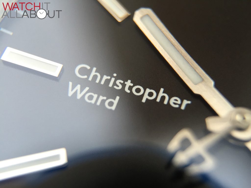
I’m extremely pleased to be the first watch review site to receive the brand new Christopher Ward C65 Trident mkII’s – with their radical rebrand. The new logo has caused quite a stir across all the major watch forums and social networks, receiving both positive and negative reactions. So let’s take a look at the 2 new watches that are the first to house the new typographic logo.
New Senior Designer Adrian Buchmann has been able to work on the C65 mkII, especially the Vintage – so let’s take a closer look at what you can get for £499 / £560 (the Classic on leather / bracelet) or £549 / £600 (the Vintage on leather / bracelet).
The specs
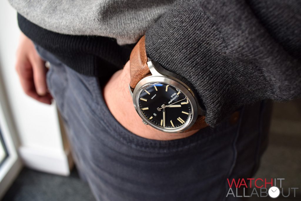
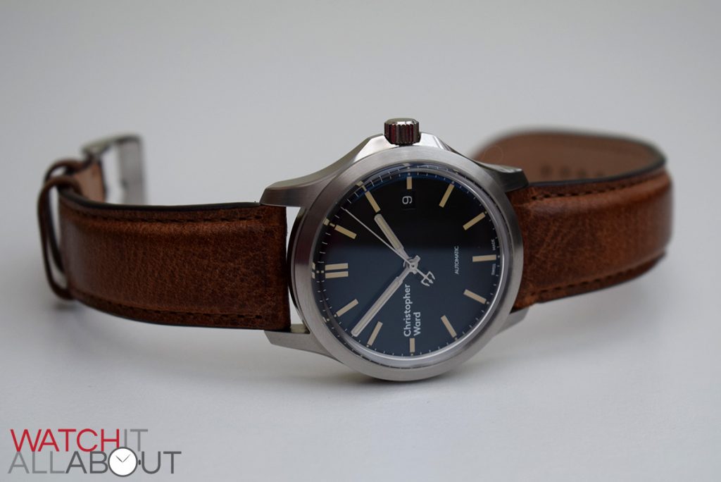
C65 mkII Vintage
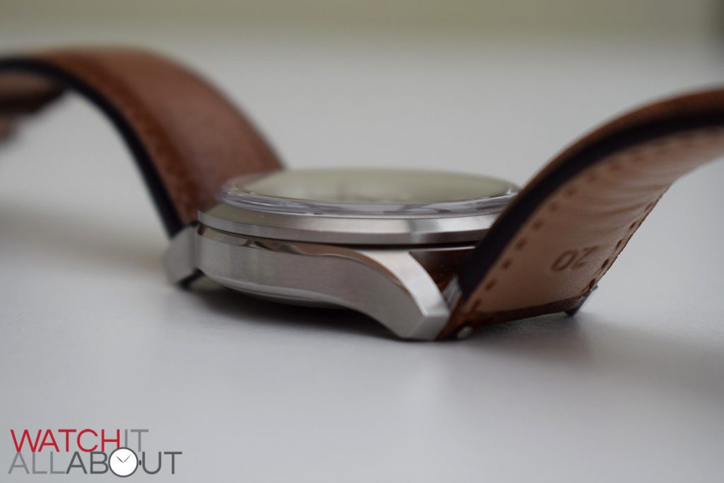
- Case size: 38mm diameter x 11.5mm height x 45mm lug to lug length
- Weight: 74g
- Lume: ‘Old Radium’
- Lug width: 20mm
- Crystal: raised and domed sapphire crystal
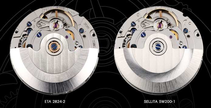
- Movement: ETA 2824-2 / Sellita SW200-1
- Strap: Tibor Leather brown
- Water resistance: 15ATM
- Warranty: 5 years
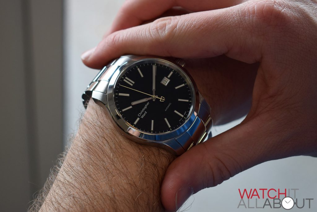
C65 mkII Classic
- Case size: 43mm diameter x 10.4mm height x 51.5mm lug to lug length
- Weight: 175g (no links removed)
- Lume: SuperLuminova
- Lug width: 22mm
- Crystal: 4mm thick sapphire crystal
- Movement: ETA 2824-2 / Sellita SW200-1
- Water resistance: 15ATM
- Warranty: 5 years
The logo
These watches are obviously the first Christopher Wards to house the new logo. There’s been plenty of discussion regarding this and whether it is suitable for the brand and their timepieces. Whilst I was initially quite disappointed with the new logo, with time, I’m starting to appreciate it more. I understand the ties the font family has with it’s British and Swiss background and why Christopher Ward chose it. Obviously it’s completely subjective if you like it or not so let’s not get too distracted with it, but rather let’s discuss the watches themselves.
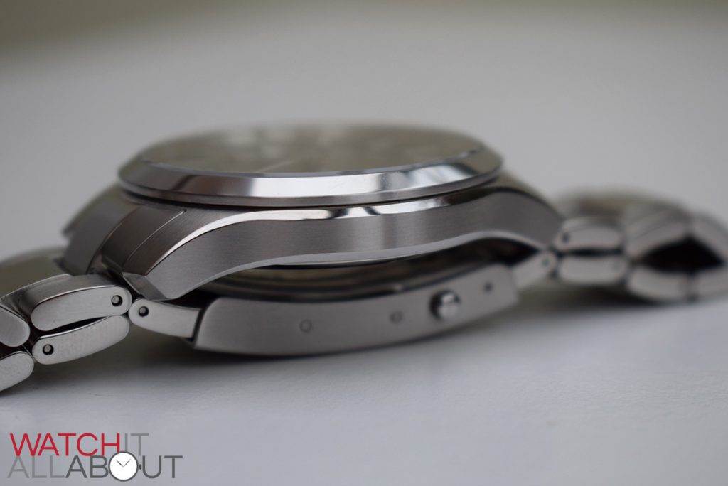
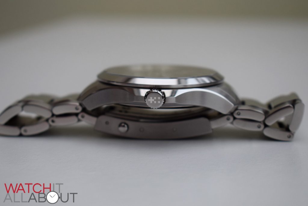
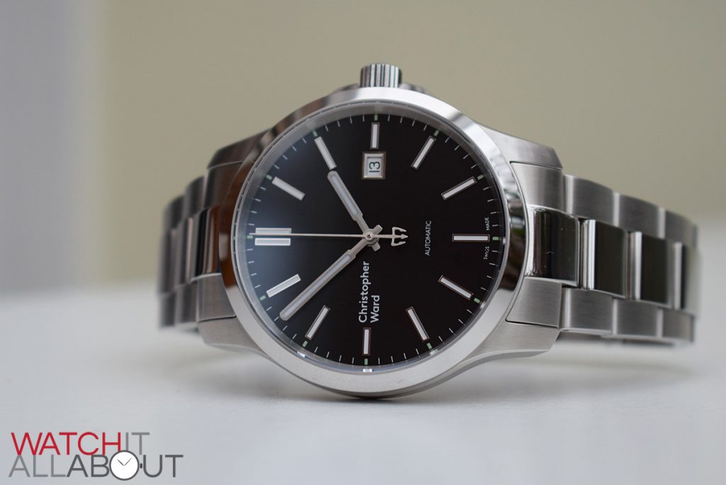
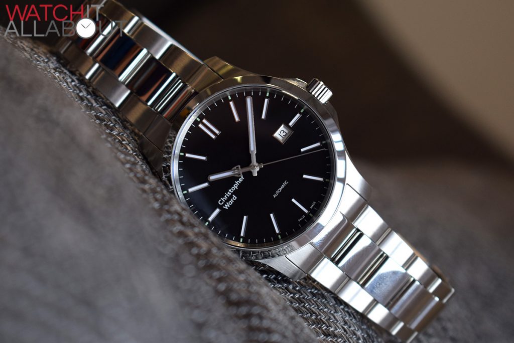
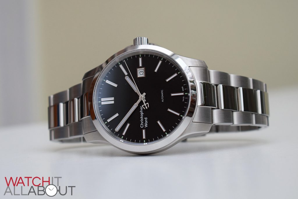
The case
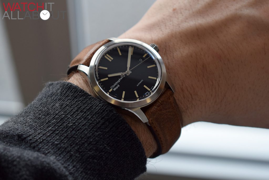
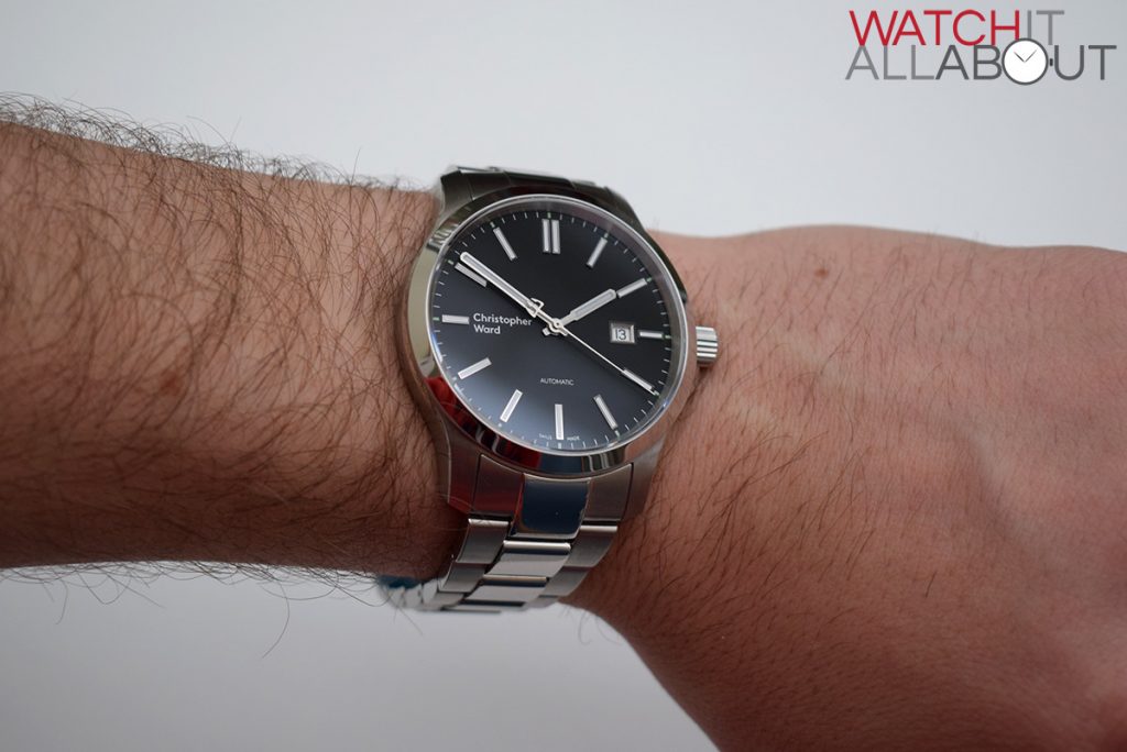
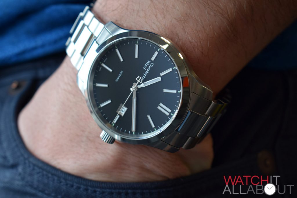
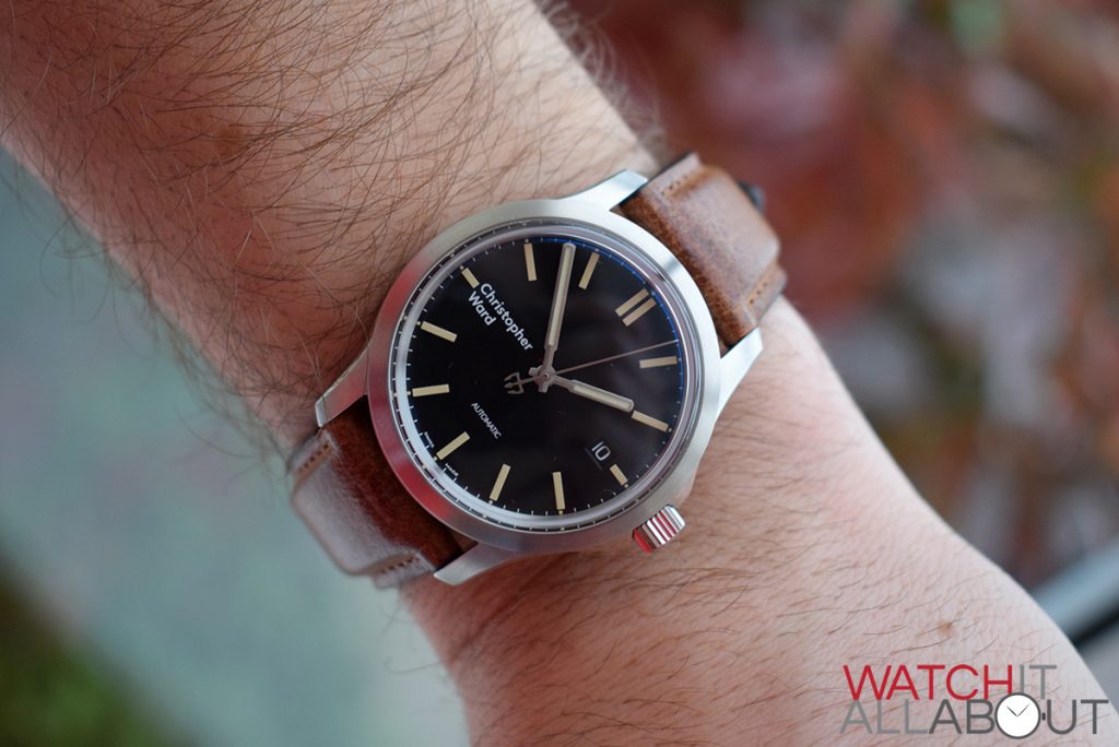
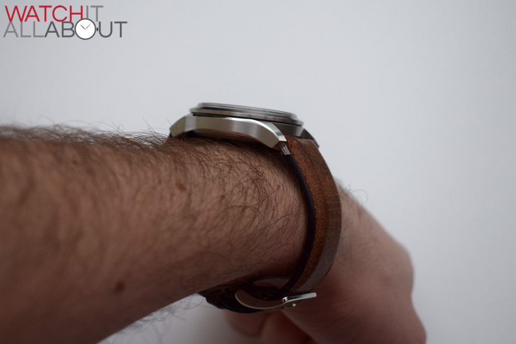
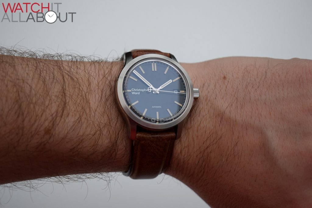
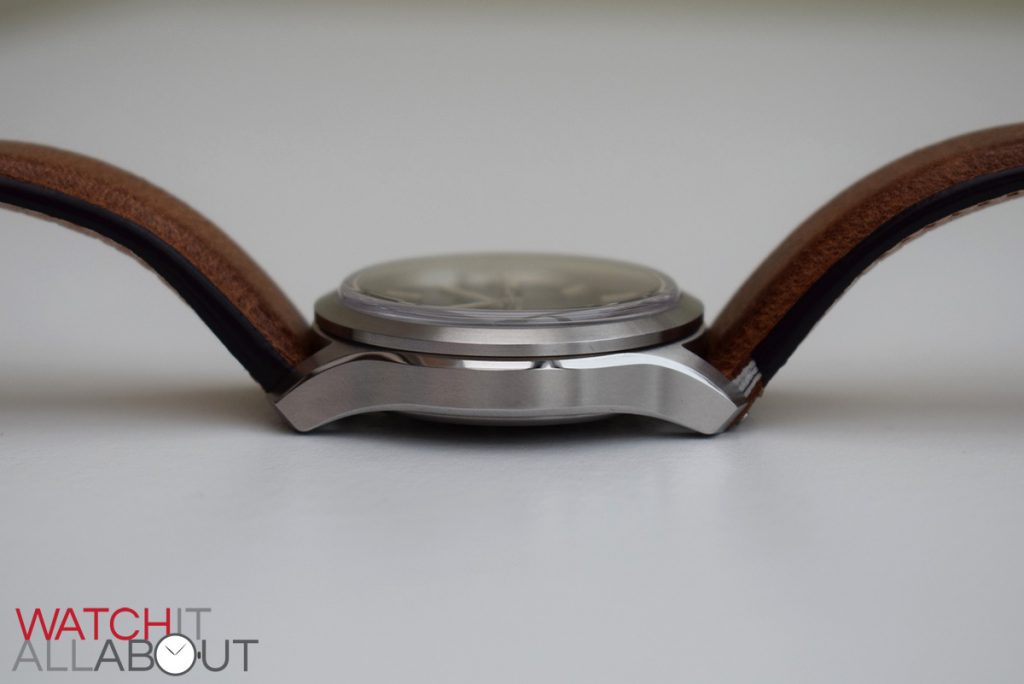
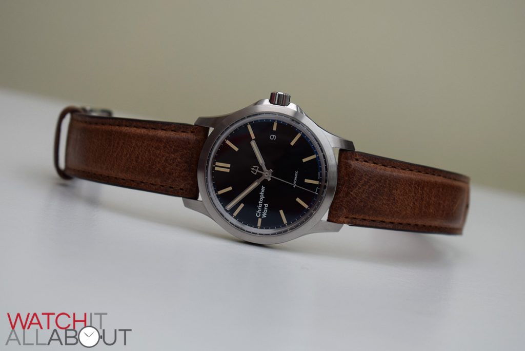
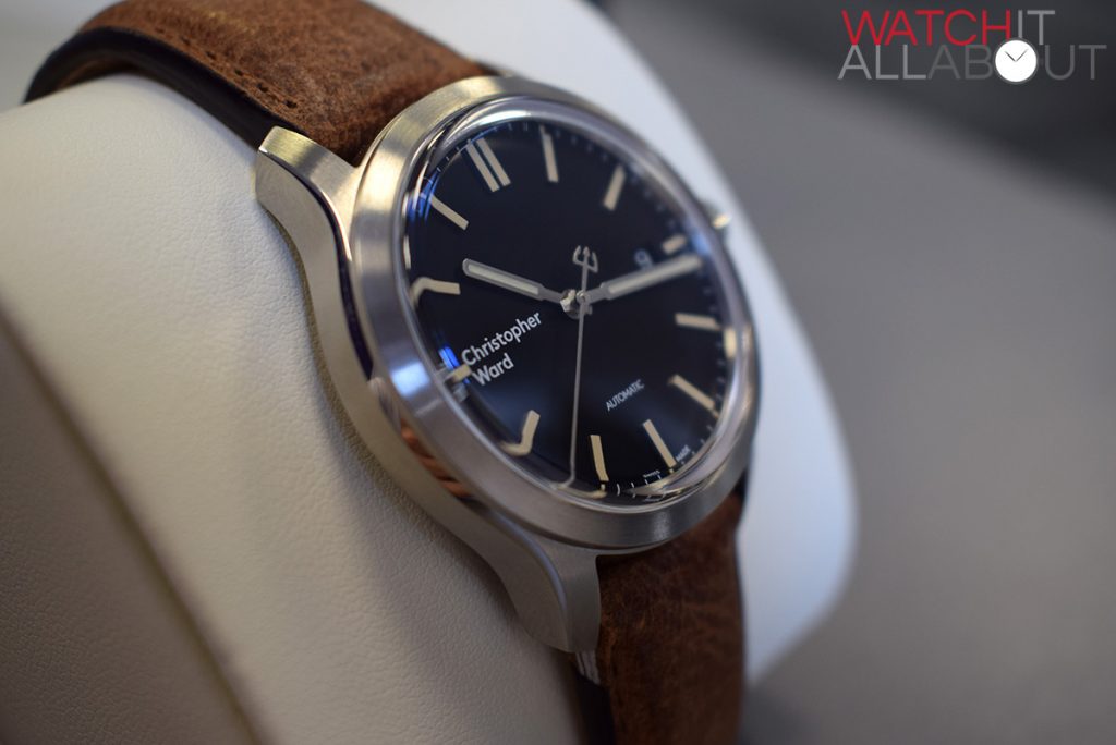
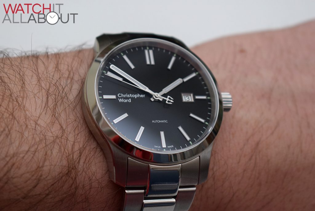
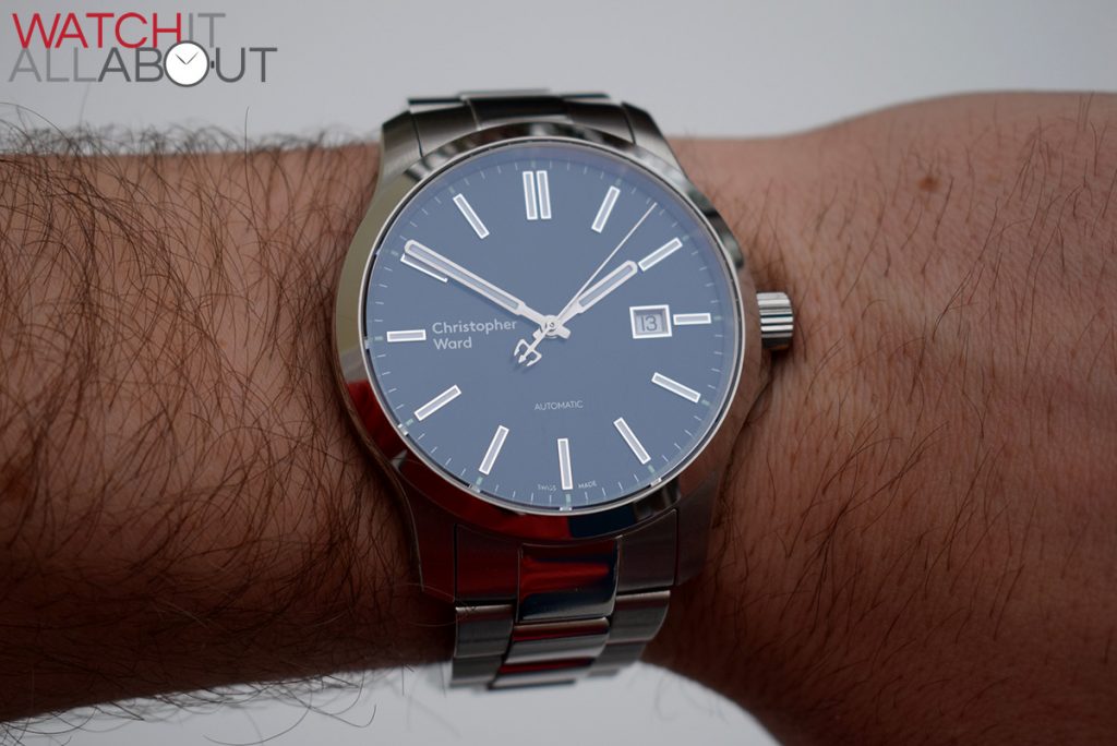
The case is more or less exactly the same on both watches, except for the size and the crystal. The Vintage measures 38mm in diameter, whilst the Classic is 43mm. I find the vintage to be the perfect size for me, it truly is wonderful to wear – whereas the Classic is a little bit on the large size for my 7.25” wrist.
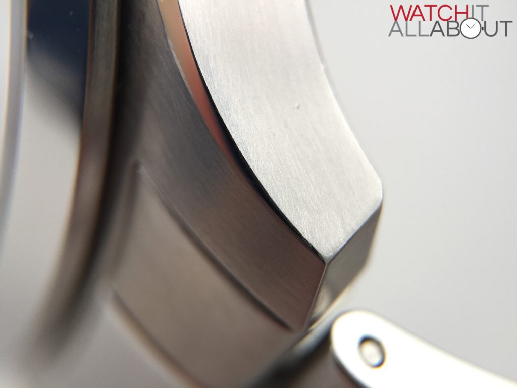
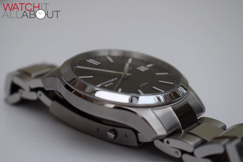
The main disappointment is the unsigned crown. It is screw-in, but they did not manage to get the final production crown completed before the watches were due to ship out. On one hand, I’m glad that they did not send out watches with a crown they were not happy with, but on the other hand it’s still a bit of a shame to see an unfinished watch be released. They plan to engrave the Swiss and British flag pattern as found on the front of the new Loupe magazine. In other news, this same pattern will be found eventually on the bridging and rotor of their in-house SH21 movement.
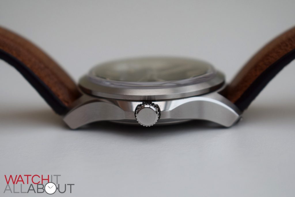
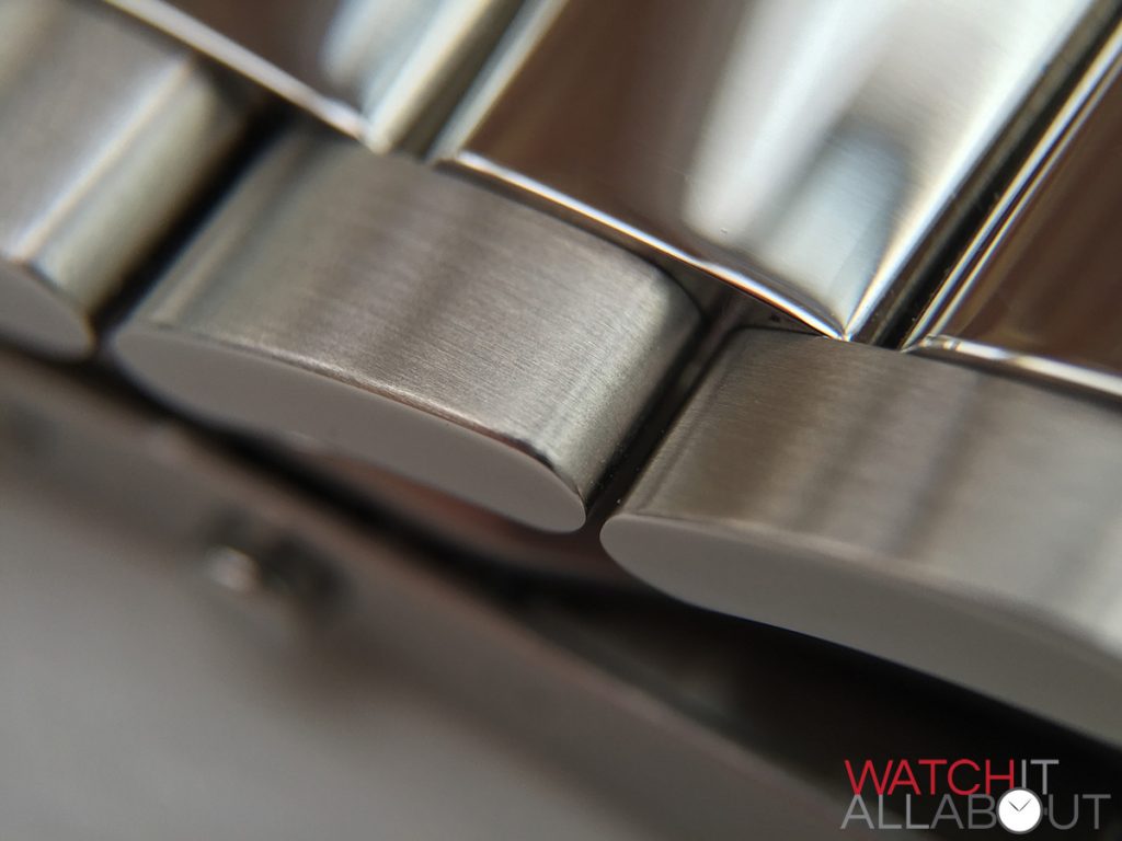
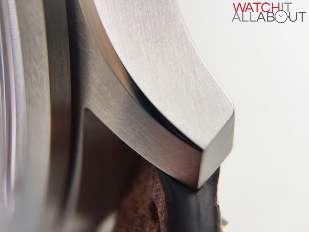
The case is fully brushed bar a lovely polished chamfered edging at the top and bottom of either side. This thin sliver provides a nice alternating finish to the case. As expected the machining and finishing across the entire case is very high quality.
Here’s a mockup I’ve created to show how the final crown should look:
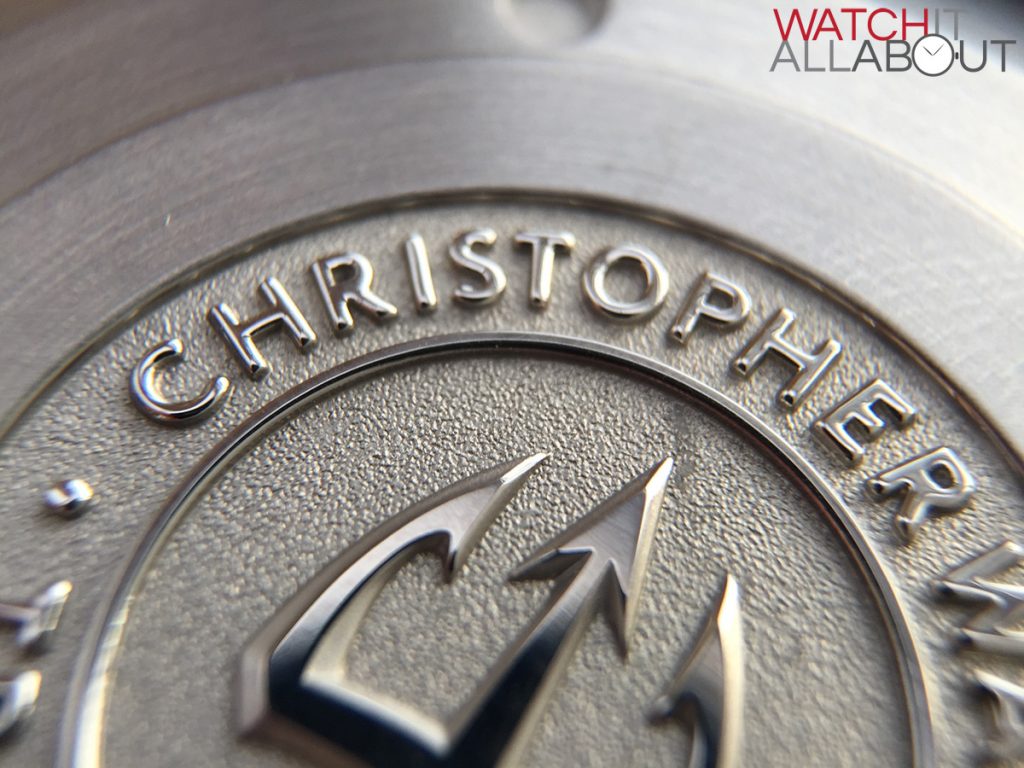
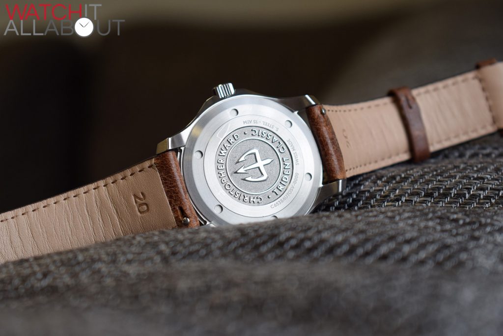
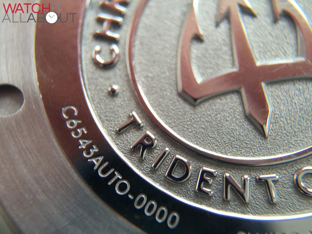
The caseback features a deep stamped Trident motif, impressively finished. Surrounding this is the watch specifics deeply engraved.
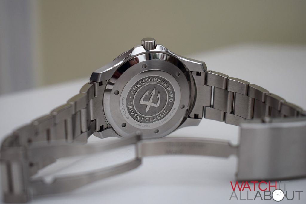
The C65 range has always been more of a dress watch than the C60s, therefore it has a lesser water resistance at 150m. But this is still good enough for swimming and snorkelling.
Moving onto the sapphire crystal, the Classic’s is completely flat and 4mm thick – and the anti-reflective coating is excellent, it certainly has been upgraded. The sapphire crystal on the Vintage is a completely different style – it is tall, “boxed” and double domed – perfect for the style and personally I think it looks fantastic. The double dome means that it keeps good legibility of the dial at all angles, whilst the tall edges provide a little bit distortion just around the outside.
The dial
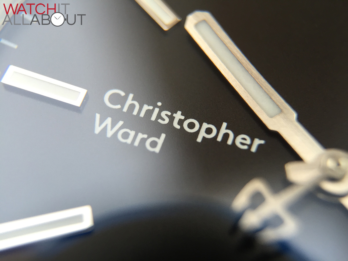
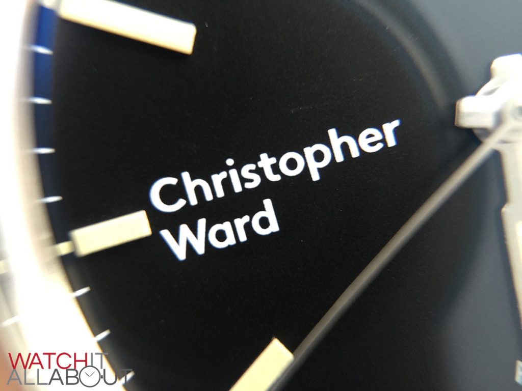
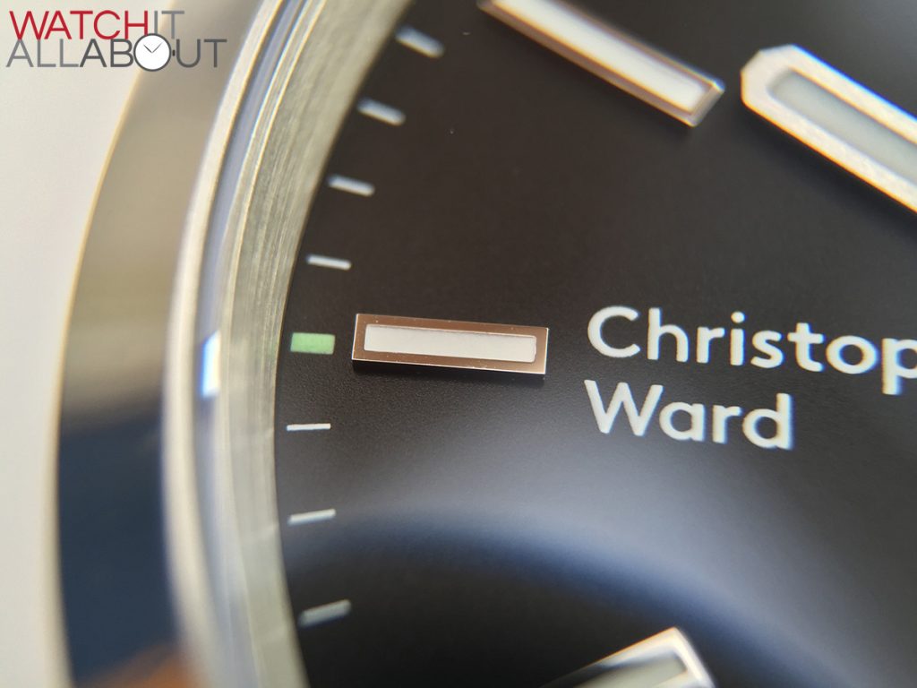
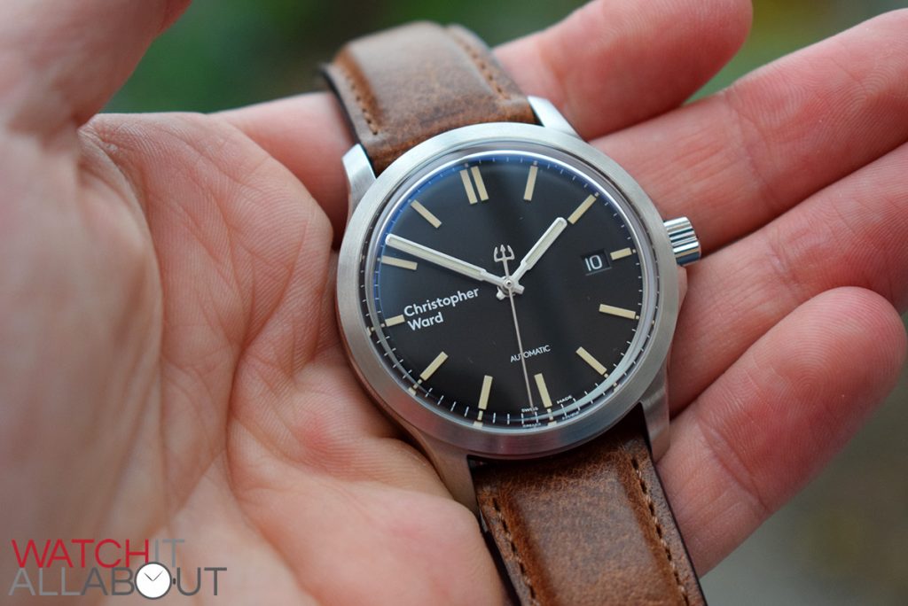
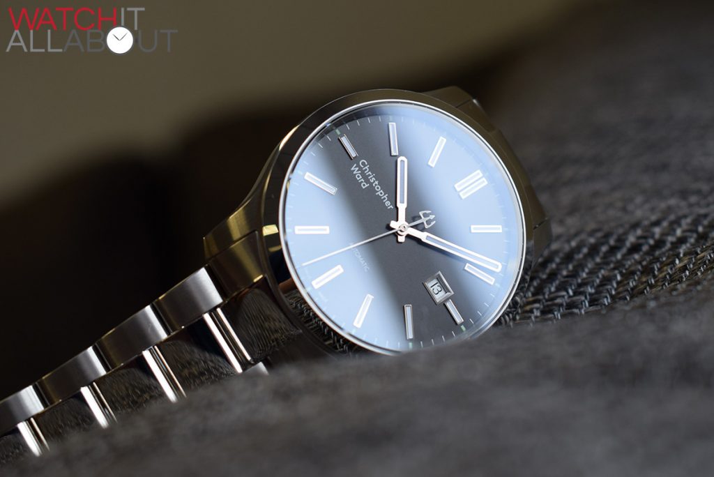
Obviously the main change to the dial on the these new C65s is the positioning of the logo at 9. The wave pattern has also been dropped (something that I always liked).
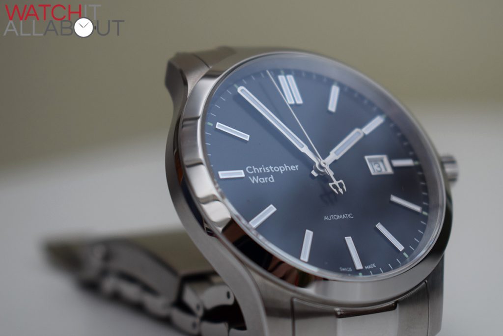
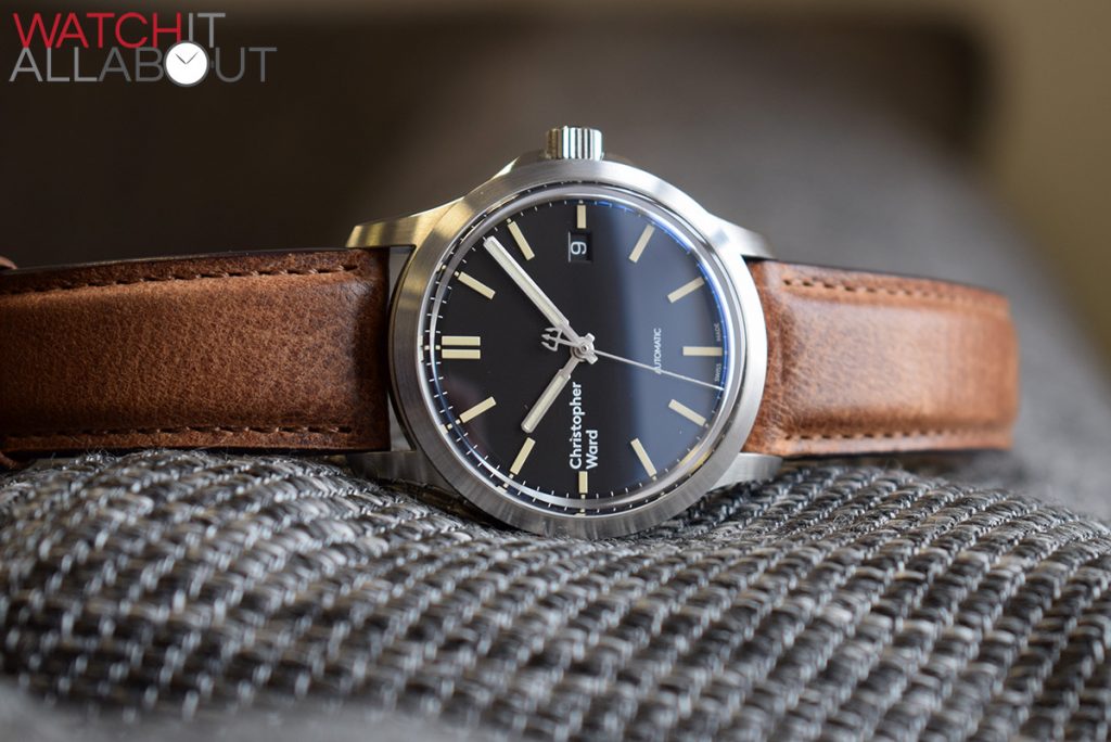
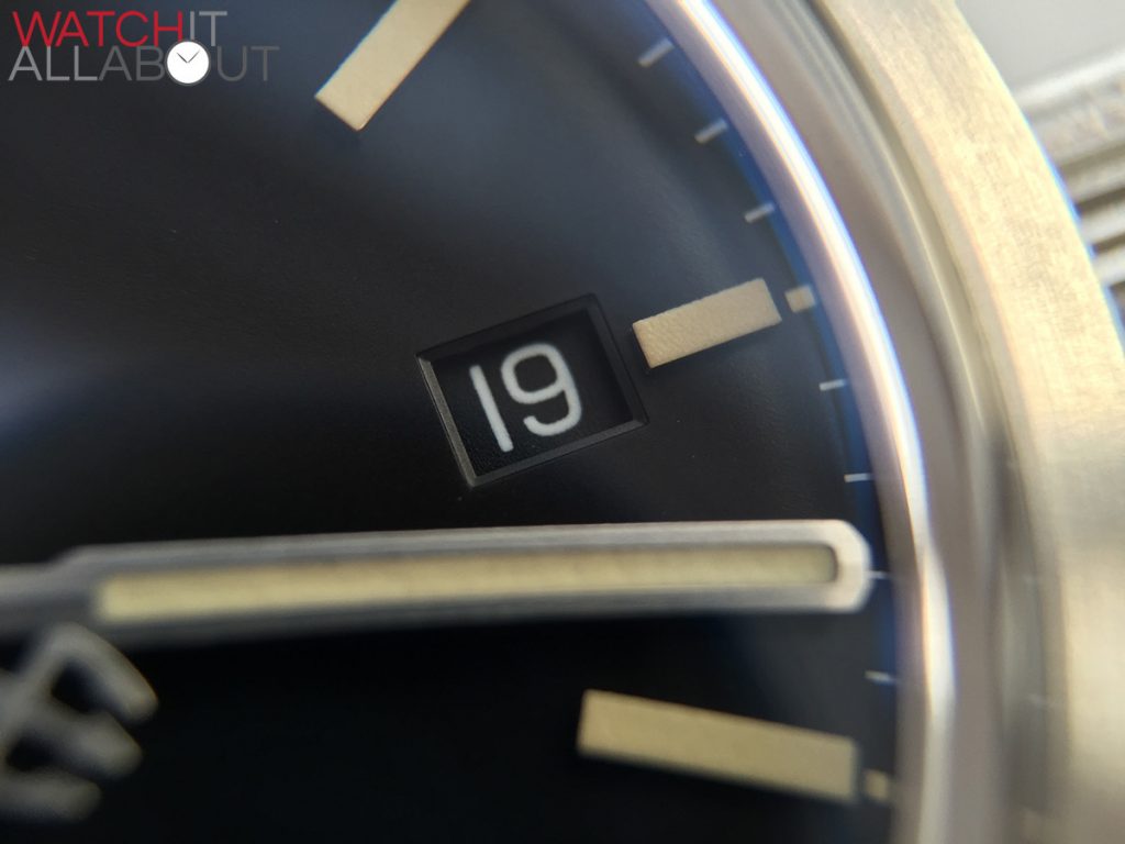
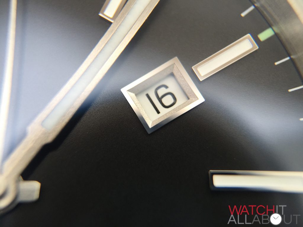
The Vintage is only available with a black dial, and the Classic we have here is also the black – but it’s available in white as well. The layout is the same on both, with a date wind at 3 and “Automatic” printed in the centre of the bottom half. This means that the top half is more or less completely empty, which has take some aback, and I think in the eyes of many the new location of the logo at 9 for every CW watch moving forward is more concerning for them than the new logo itself.
The Vintage has a matching black date wheel to go with the dial, but the Classic does not, which is interesting. Usually I’m not too bothered about no-matching dials and date wheels but it would have been good to have some continuity between the models. The date window on both watches is exquisite: neither are just cut straight out, but rather they have delicate borders surrounding them.
Moving onto the lume, the Vintage has a cool “old radium” style on the hands and applied hour markers – with a faded colour, almost like a light brown, Very vintage. The Classic has SuperLuminova lume – and I’m pleased the say that the strength and quality on both watches is much better than it has been previously. The lume glows brightly and charges quickly.
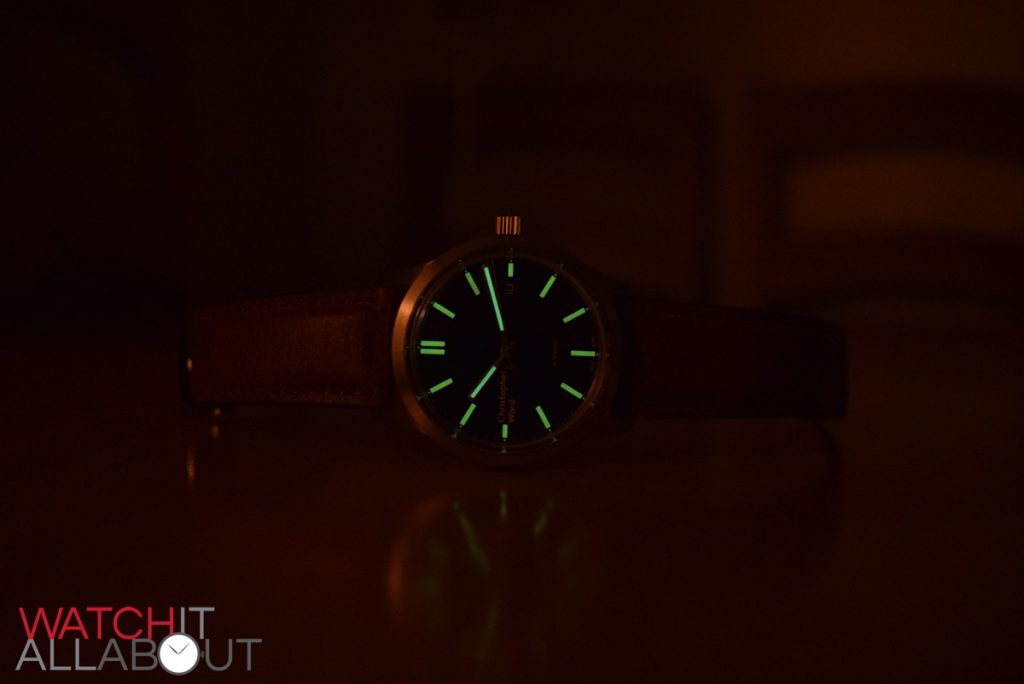
C65 mkII Vintage Lume
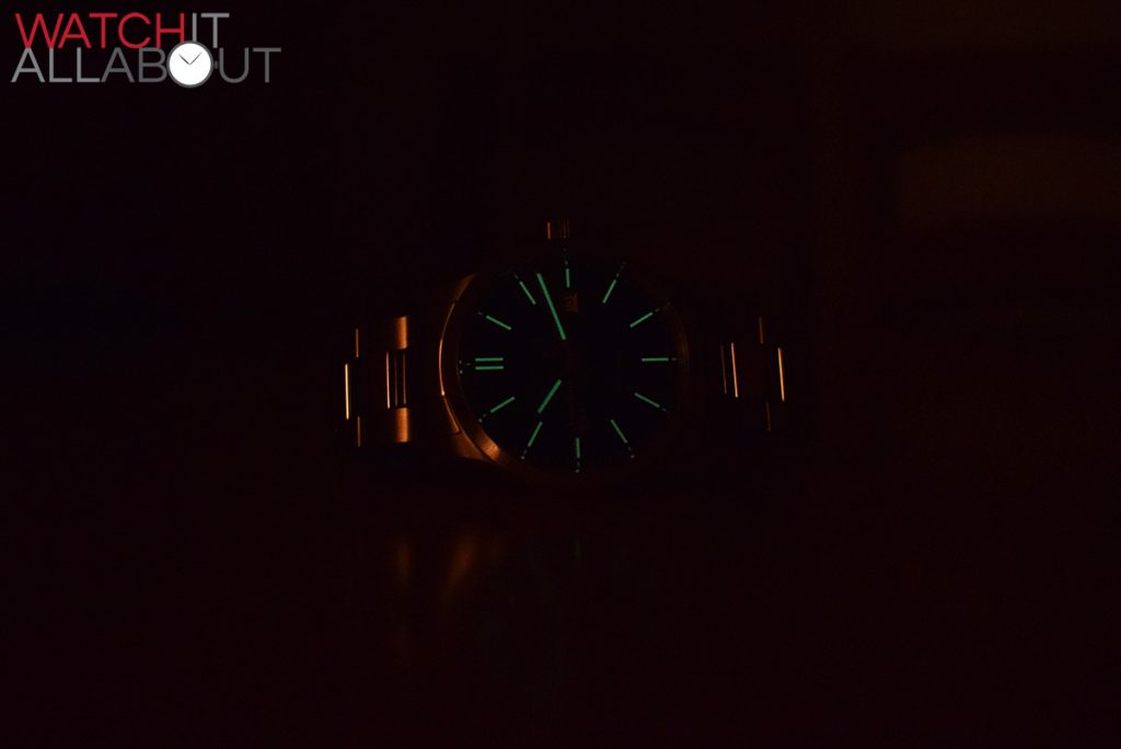
C65 mkII Classic Lume
I’ve not come across the style of the new hands before – let’s call them “cricket bat” shape, and then of course we have the ever-present trident second to signify these watches being part of the Trident family. I do really like the new hand design and I’m quite surprised that they went with something so opposite to the previous sword / onion hands.
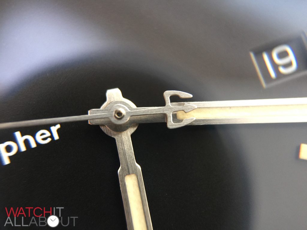
The applied hour markers are almost the same on both watches, bar the markers found on the Classic have a polished border surrounding them, providing a nice reflection when the light hits the dial. The layout is the same for both: simple batons at every hour bar a double baton at 12.
The strap(s)
We have both options on show here, the Vintage on its new “Tibor” leather strap, and the Classic on the bracelet.
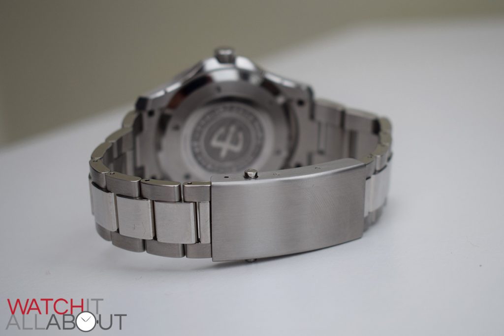
The leather strap on the Vintage measures 20mm wide at the lugs, reducing to 18mm at the buckle, and the bracelet on the Classic measures 22mm wide at the lugs, reducing to 20mm at the buckle. Obviously the wider strap on the Classic is because of the larger case.
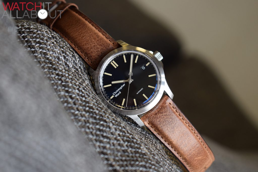
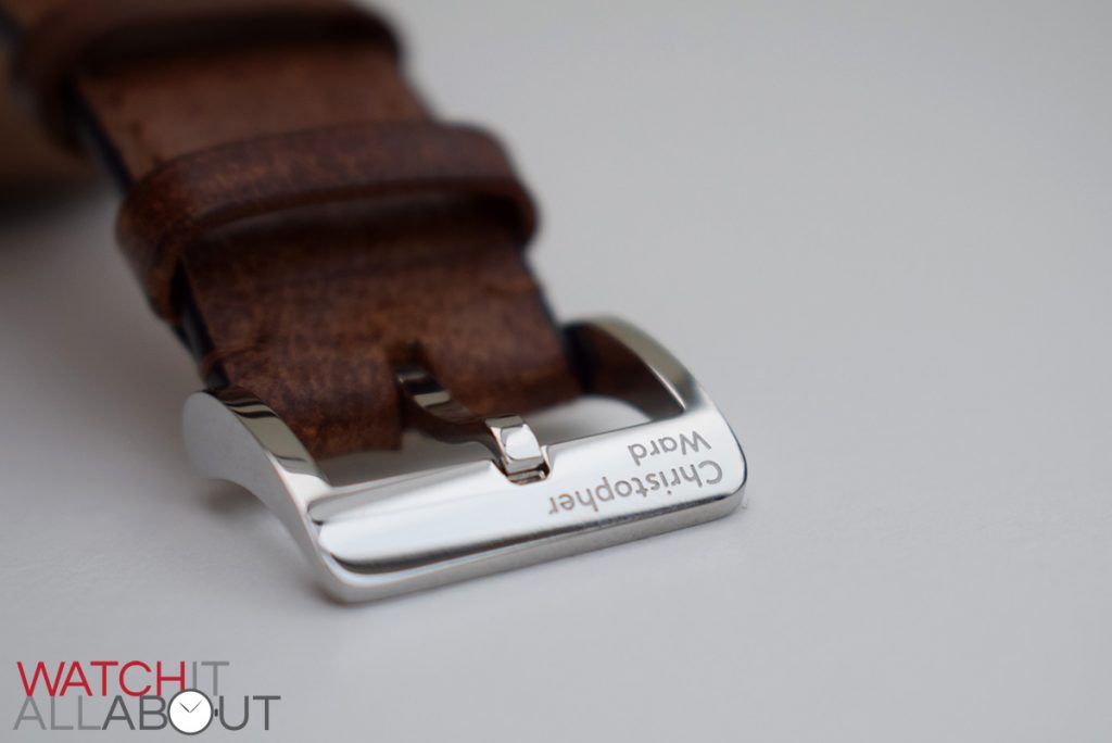
The leather used on the vintage is a completely new kind, and I really like how it looks and feels on the wrist. It certainly provides a vintage vibe, whilst being suitably modern. I’m also pleased to see that it has the quick release pins. The quality of the leather is excellent as it is always the case with Christopher Ward straps.
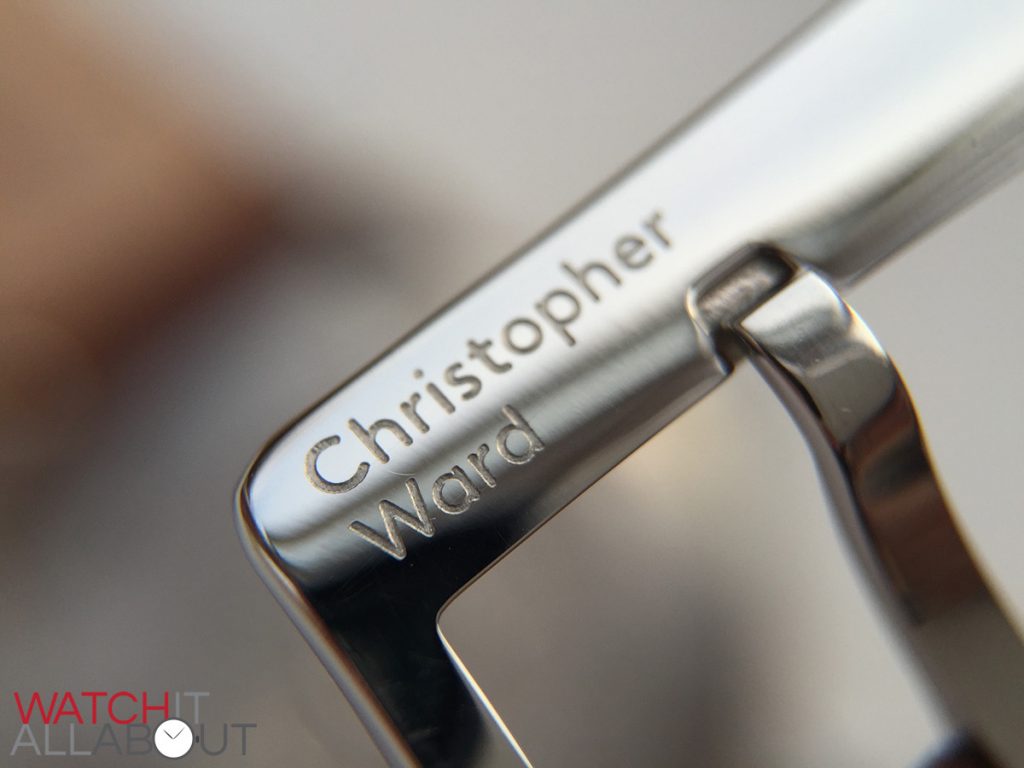
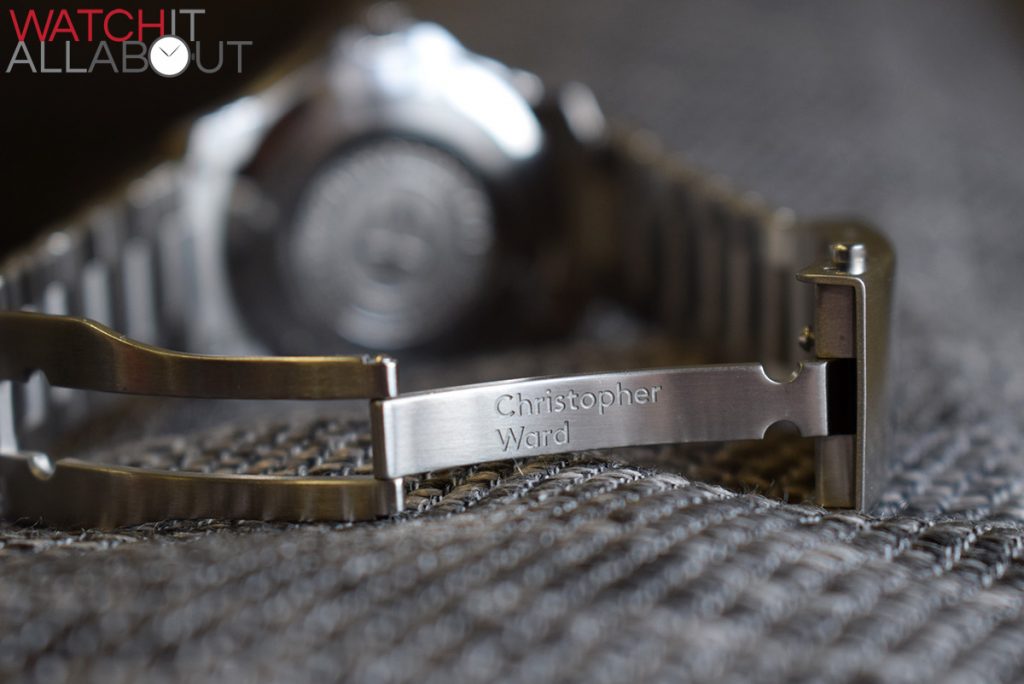
I’ve never actually seen a Christopher Ward tang buckle before, so I’ve not got anything to compare it to, but I’m quite pleasantly surprised how well the new logo fits on it.
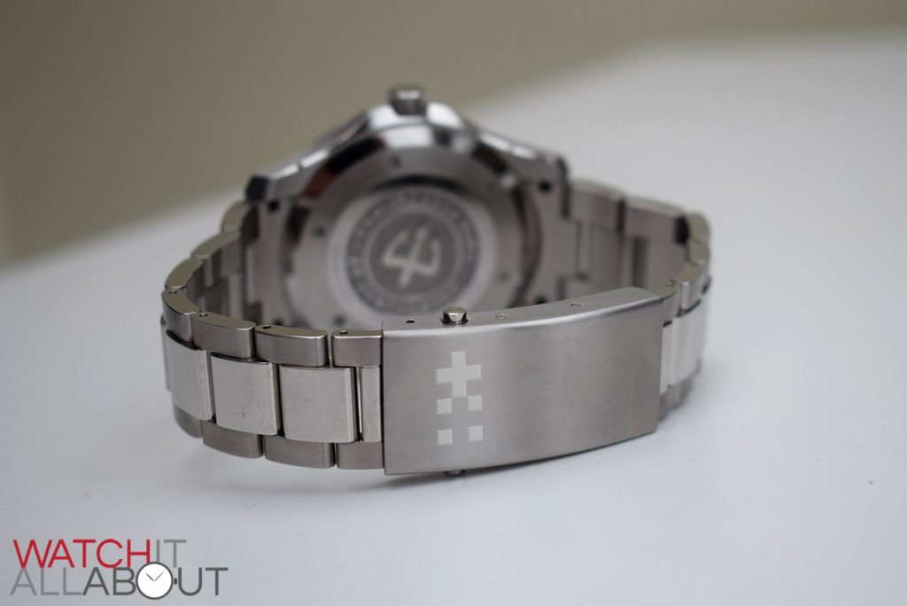
The steel bracelet on the classic is exactly the same as it was before. The only noticeable difference is the markings on the buckle – currently there is no engraving on the top, which is a shame. If you open up the buckle you will notice the new logo on the arm. I’m not sure if the top of the buckle will house any engraving in the future, or if this is it for good; personally I hope it will have the British and Swiss flag pattern that will be found on the crown.
Here’s another example I’ve mocked up to show how the buckle would look with the flag pattern engraved on it, which I think would look cooler than the current plain offering:
The movement
As has been the case for many years, Christopher Ward won’t say which movement your C65 mkII contains – it’ll either be the ETA 2824-2 or the Sellita SW200-1. It basically depends on the availability when production starts. To be brutally honest, there’s pretty much nothing to set these two apart – the Sellita is based on the ETA, and they even did some outsourcing for them in the past. The only noticeable difference is the extra jewel found in the SW200, just below the ratchet wheel, and the fact that they use newer machinery and tools (according the CW). So it’s swings and roundabouts really – would you prefer a movement with the ETA name, or the Sellita with its newer manufacturing? Either are simply wonderful movements and you get 5 years warranty with Christopher Ward so you’re in a pretty good position no matter which one you get.
The competition
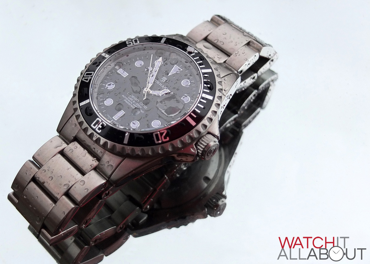
I’ve always considered the Steinhart Ocean family to be the main competitor of the Trident range. But, the styling doesn’t quite match the new C65 mkII. Still, it’s worth the suggestion of the Ocean 1 as it’s such an outstanding watch for less than £300.
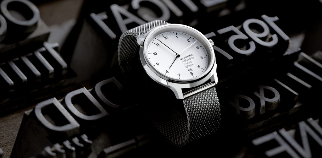
We also have the Mondaine Helvetica, which is a sort of similar style for around £280, but it’s quartz.
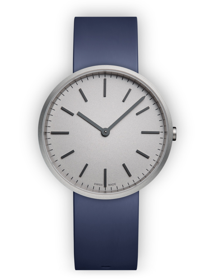
There’s also Uniform Wares, which offers another Swiss Made minimalist design which looks pretty nice starting at £250.
Final comments
Yes, the main point of discussion is always going to be the new logo – and I think that it looks a little better and more balanced on the smaller Vintage. For me, time has been a great friend. Like most people, at first I was quite shocked at the rebrand – and I think it was the surprise more than anything that resulted in so much negativity. Now I’ve had time to digest it, I’m starting to come around slowly.
New logo aside, and now talking about the quality of the watches – they’re both excellent as is always the case with Christopher Ward. I’m not too sure why the Vintage is an extra £50 though, especially with a smaller case. The only thing really that justifies the price difference is the raised sapphire crystal.
If I was to make a choice between the two, I’d definitely go for the C65 mkII Vintage. I’ve actually surprised myself with how much I like it. The Classic isn’t quite outstanding enough in the design department, whilst the Vintage has something different to it that sets it apart in my eyes.
Vintage gallery

Classic gallery


Richard
25 May, 2016 at 7:39 am
I have no doubt with the quality of the C65 MKII but I just can’t get past the new logo and its positioning. To me it cheapens the appearance and distracts from what should have been a lovely designed watch. Unfortunately it will not be a watch that I will be adding to my Christopher Ward collection.
Earl Grey
24 June, 2016 at 9:15 am
Nice review of a nice new watch (the Vintage). Strange choice of other watches to consider, though. To me the obvious competition to the Vintage is the Sinn 556 Jubilaeum and Mocca. Classy dial, raised markers, good lume in a brushed 38mm case with outstanding water resistance. The classic Gentleman’s sports watch, incredible function in a beautiful understated package. Both offer a great alternative to much more expensive watches from Omega and Rolex, namely the AquaTerra and Datejust. There are precious few other sub $1200 watches that do all that those two do, and the 556 with applied markers very sadly doesn’t have a date, which for me takes it out of the running. 🙁