
Reviewing the Akheilos Shark 500m has been pretty easy for me. Akheilos are based in China, in the Guangdong Province – the Chinese central hub of all watch manufacturing. Of course, the Submariner style is going to be the most popular model of all factories, which is why there are a) so many brands offering them and b) why they tend to be very aggressively priced.
Akheilos are yet another brand trying to offer every specification going, with a couple of minor tweaks to stand out from the crowd, at a ridiculous price.
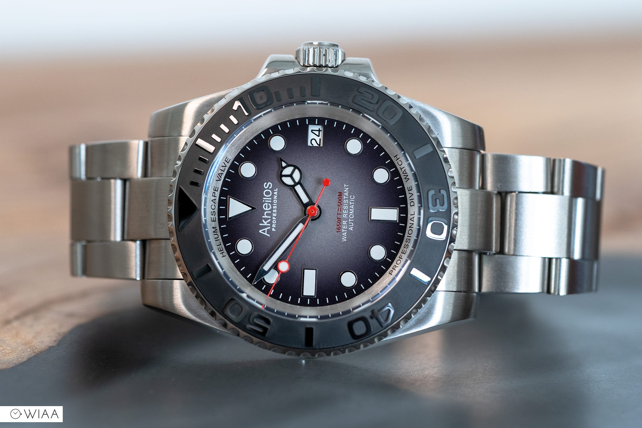
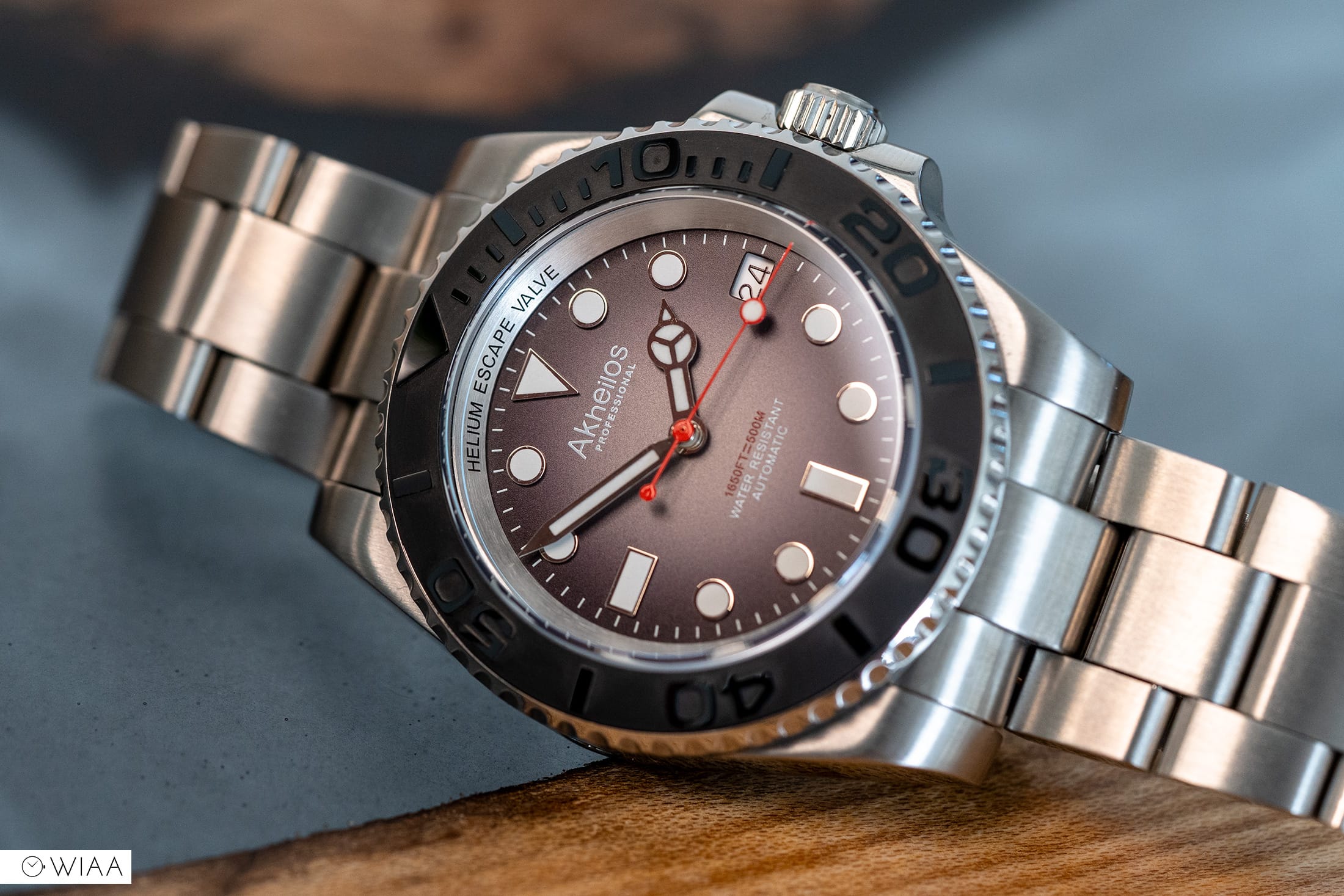
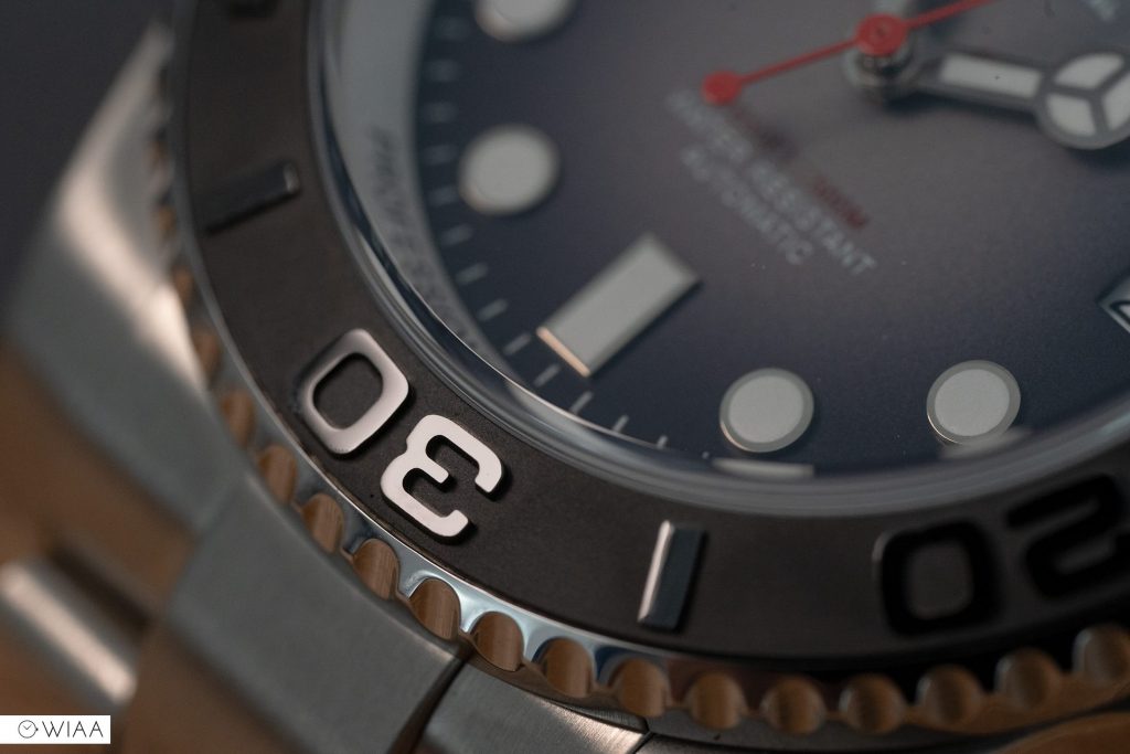
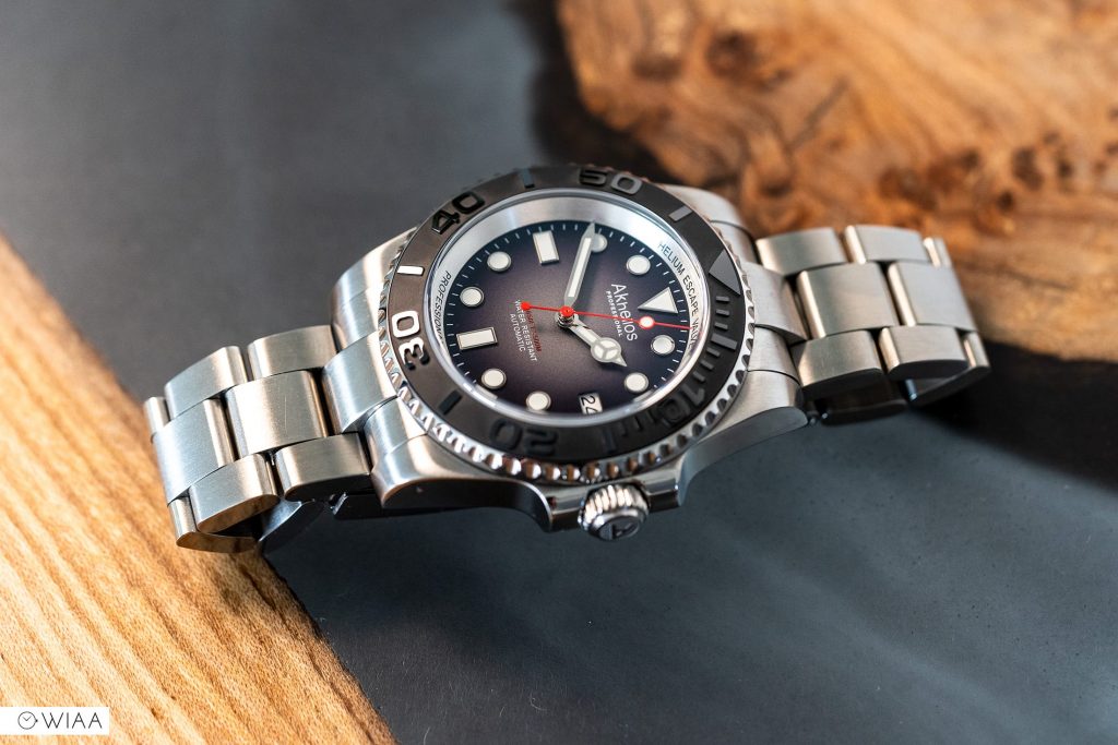
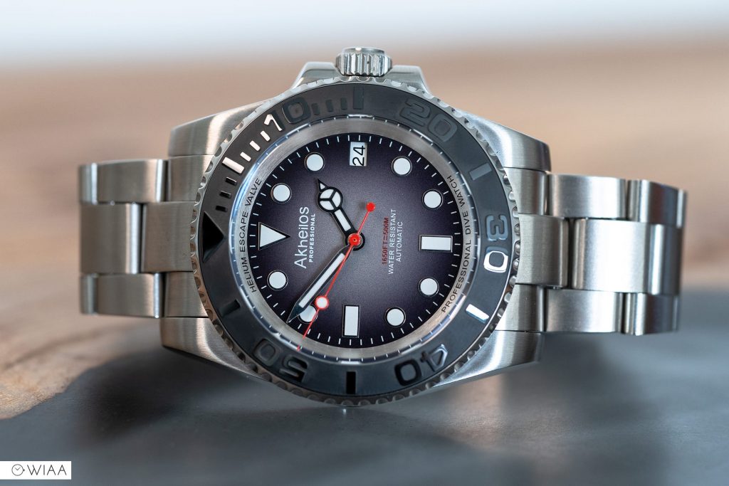
Yes, there are Submariner style watches available for less. But for me, I feel it’s still competitive. The overall build quality is a step up from the usual homage, and the 3D ceramic bezel insert is superb, it has a higher than usual 500m water resistance, as well as the radial gradient on the dial offering this watch something slightly different.
However, there’s one or two minors to note. Let’s jump in and check it out.
The specs
- Dimensions: 42.5mm diameter x 14.2mm height x 48mm lug to lug
- Weight: 153g
- Water resistance rating: 50ATM / 500m
- Movement: Seiko NH35
- Accuracy: +2.4 sec/day
- Lug width: 20mm
- Warranty: 2 years
- Price: $299 / ~£225
- Buy here: https://www.akheiloswatch.com/shark-500m-blue-p0034.html
The video review
When you glance at the specs and consider the price, there’s absolutely nothing to balk at. Perhaps a better hi-beat movement than the NH35 wouldn’t go amiss, such as the Miyota 9015, but that would certainly bump the price up even higher.
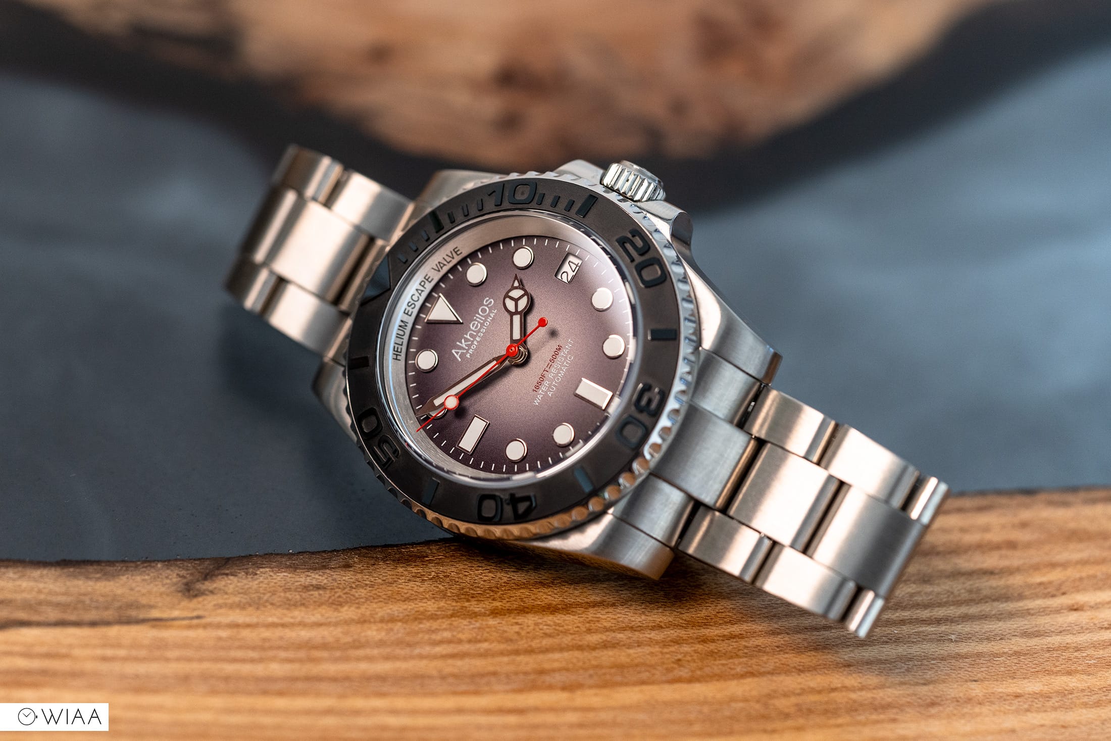
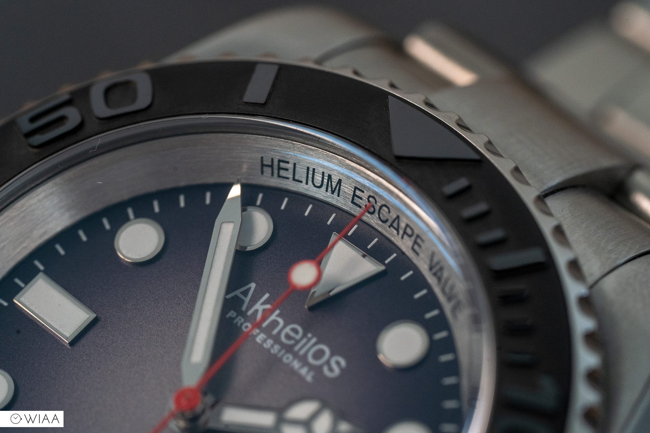
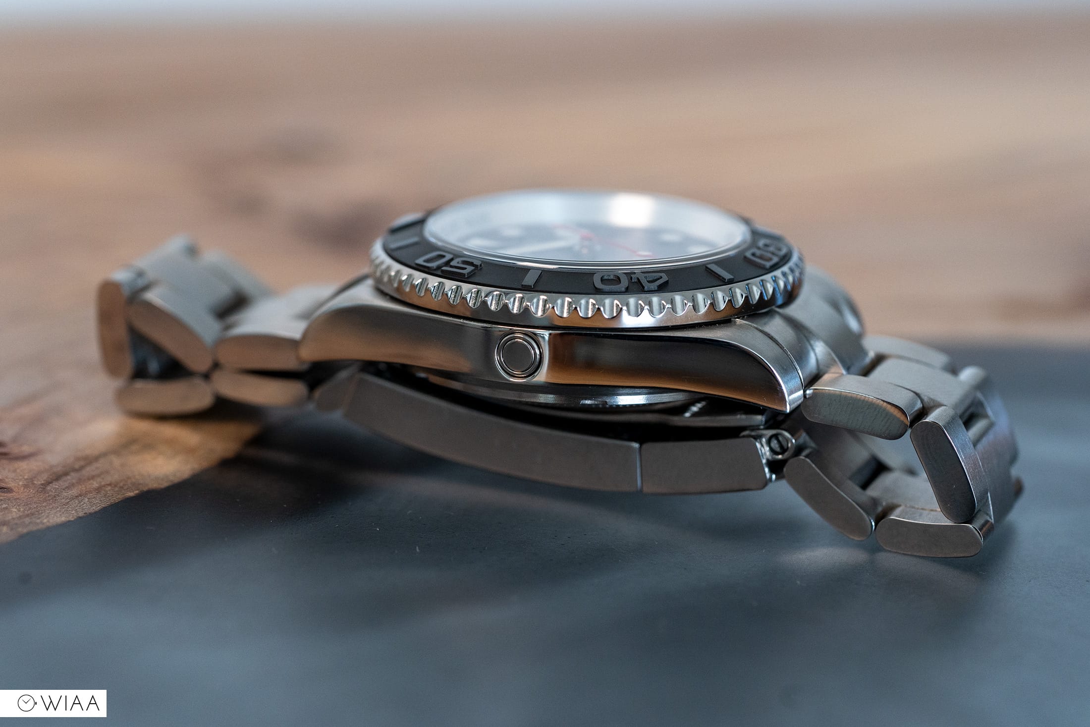
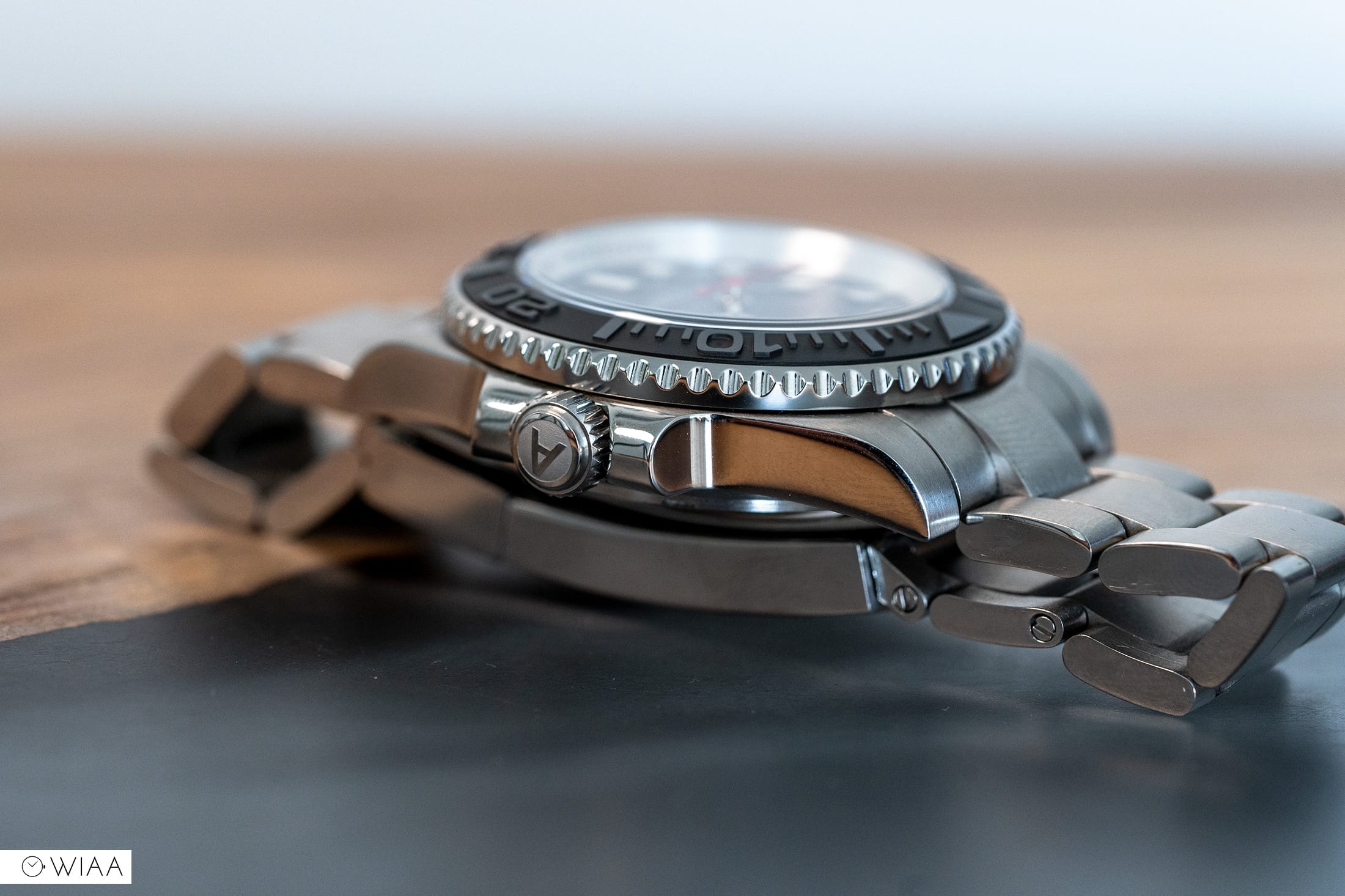
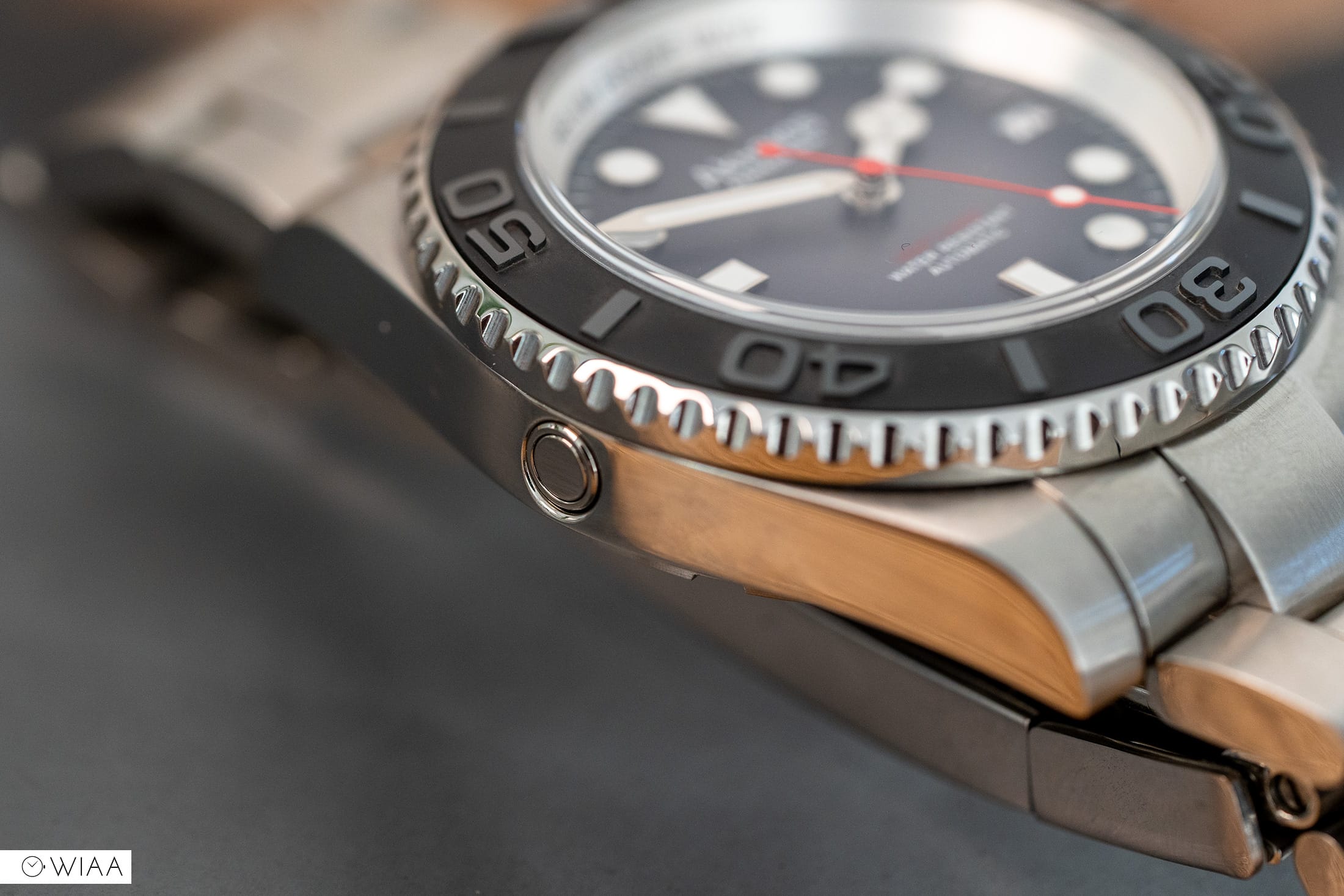
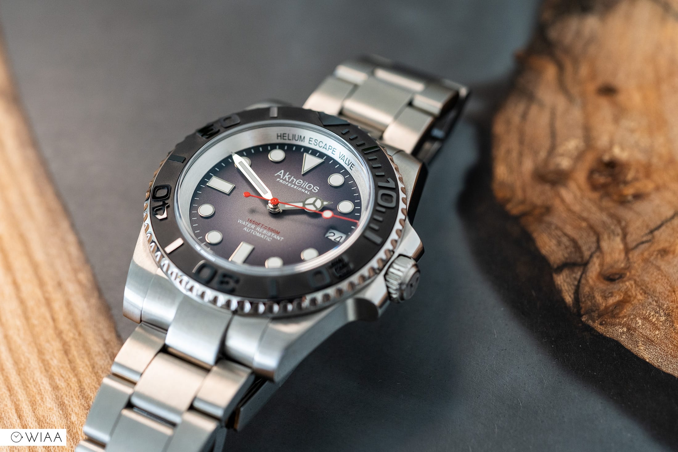
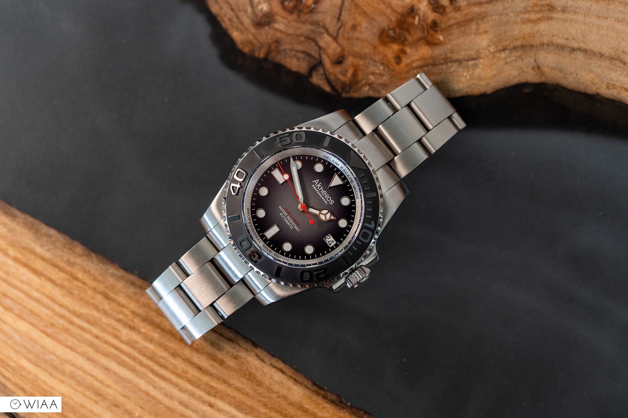
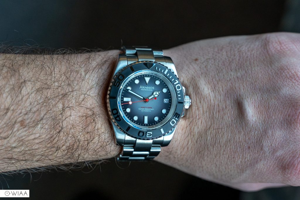
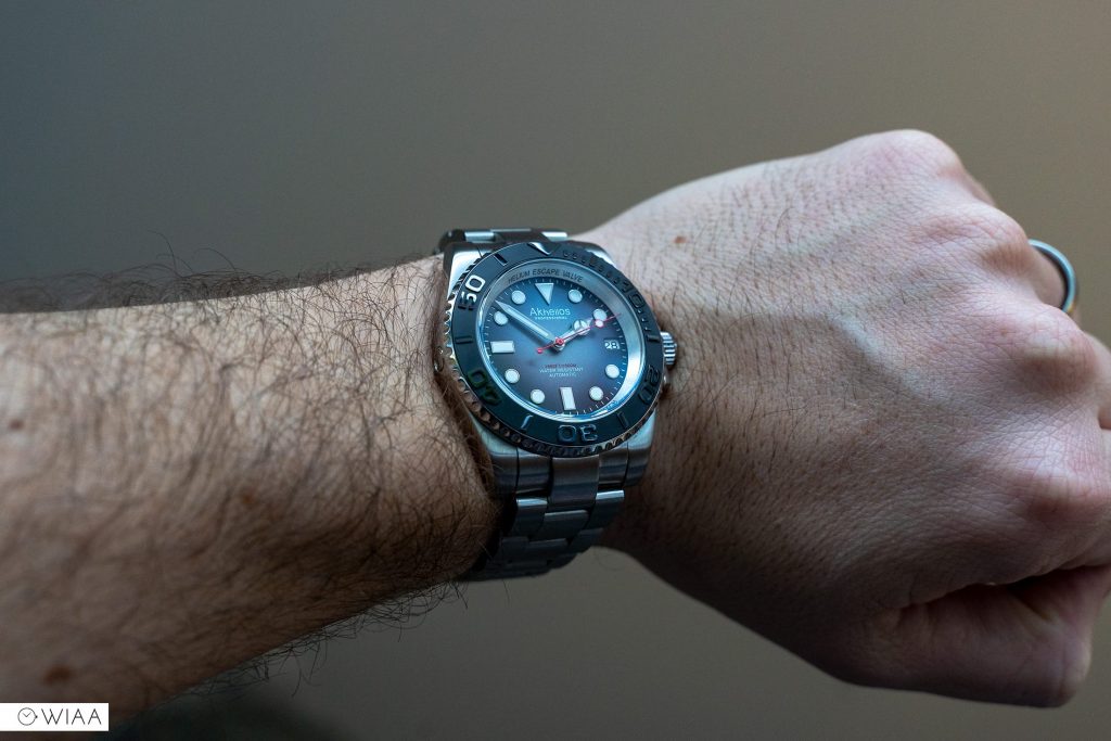
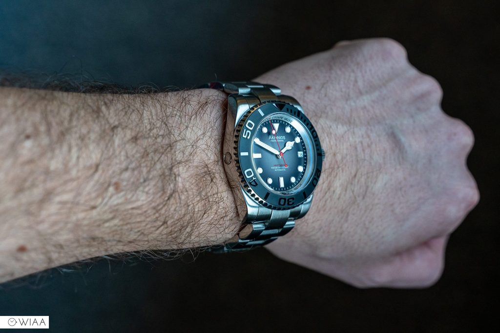
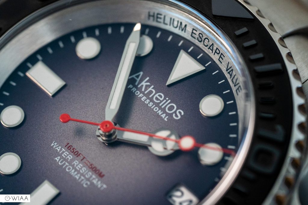
For me, the star of the show is definitely the black ceramic bezel insert. Impeccably crafted; with tall. clean, crisp digits polished on top set against a blasted style backdrop. It’s certainly a much more rugged appearance than the norm. The action of the 120-click bezel is also very good – firm and smooth, but the alignment is the tiniest fraction out (that shouldn’t deter you, it’s quite common on cheaper watches – especially Seiko believe it or not).

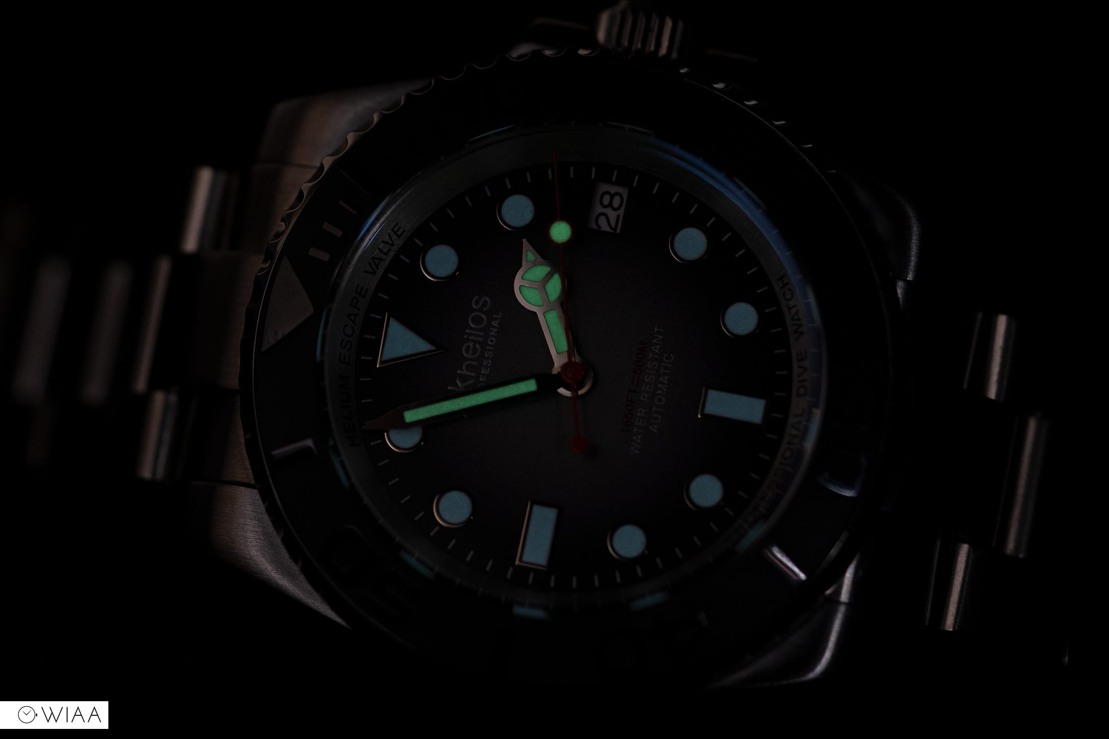
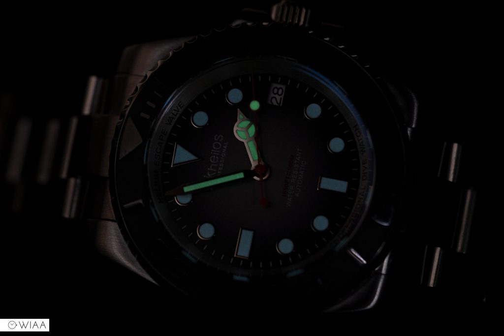
SuperLuminova BGW9 lume has been applied on the dial markers; however the handset has SLC3. The strength is certainly better than average, which is good – but some may not like the slightly different hues these two lume types display.
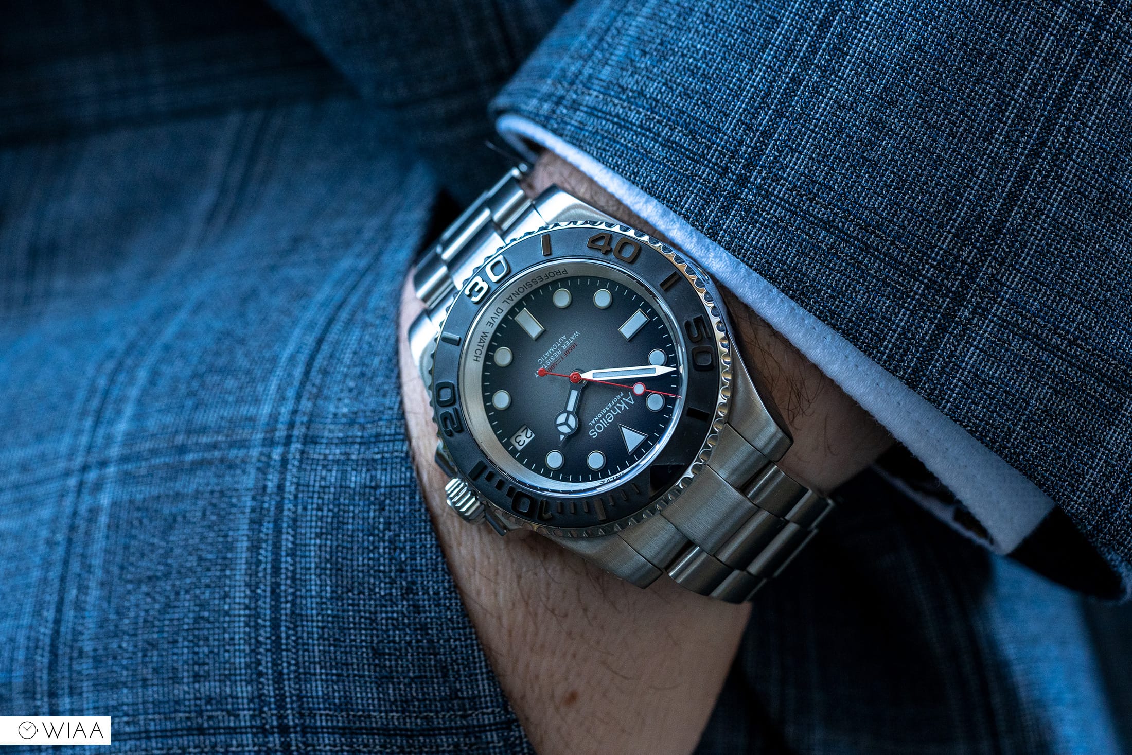
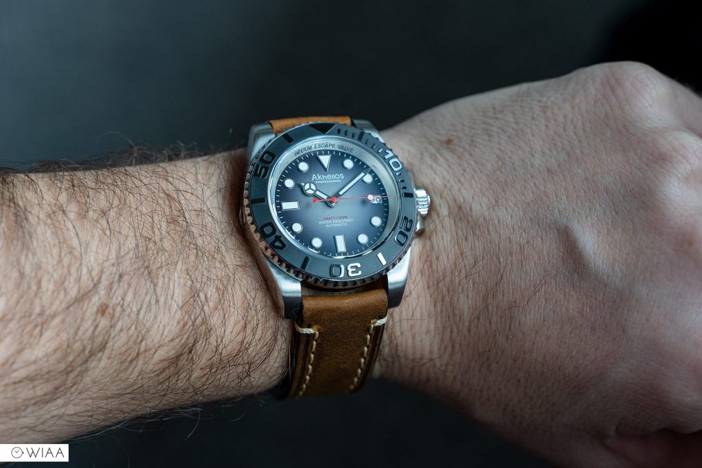
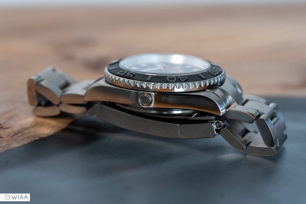
The 42.5mm case wears smaller than that due to the comparatively short lug to lug length. It also doesn’t feel like a watch with over 14mm height. It’s got the dimensions to appear impressive, but it’s very comfortable on my 7” wrist.
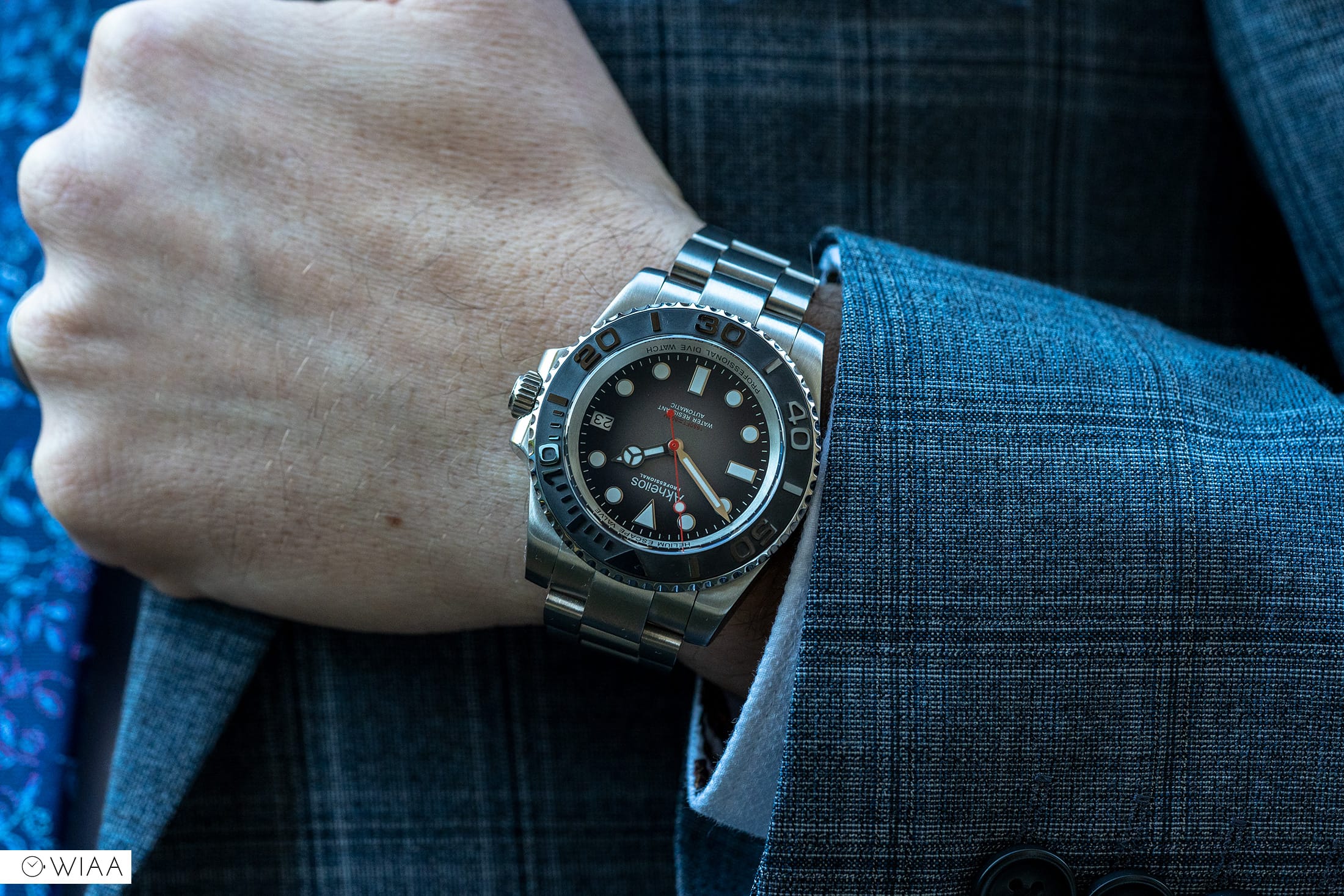

There’s a cheeky little helium release valve at 9, centrally in the polished side of the case. On the opposite side, the screw-in crown features the A of the logo neatly, albeit lightly, embossed against a frosted backdrop.
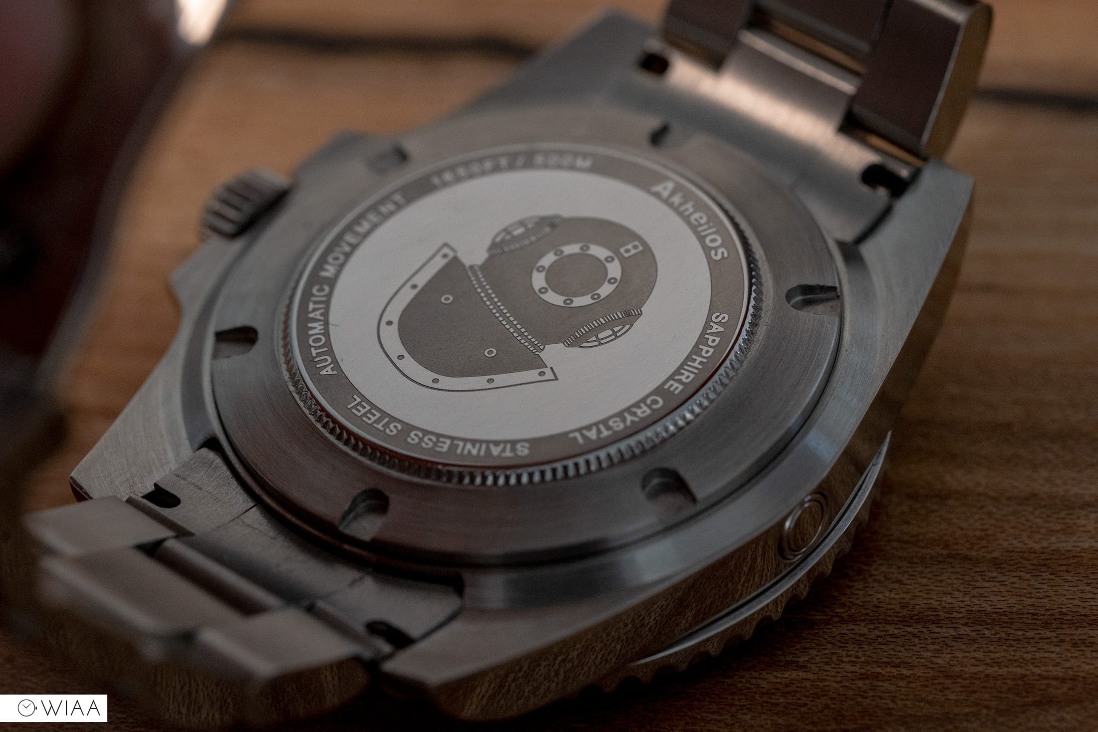
The screw-in caseback is quite interesting; rather than opting for the normal rather boring plain flat brushed center, the Shark 500 features a vintage diving helmet. This is obviously a nod to the impressive depth rating, however as the name of the model is the “Shark” perhaps an engraving of one of those majestic beasts would have been more suitable.
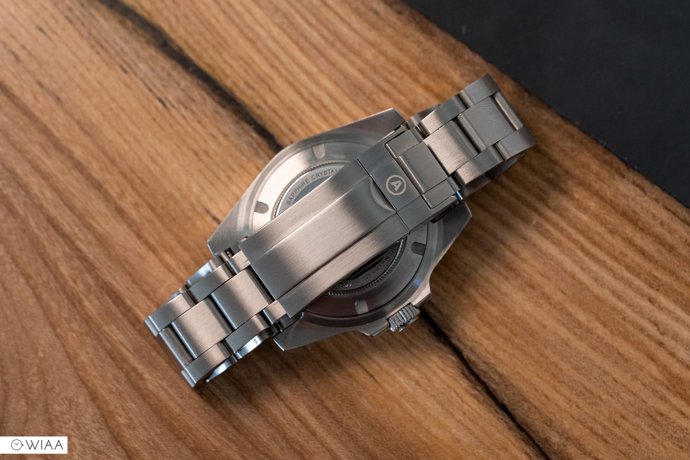
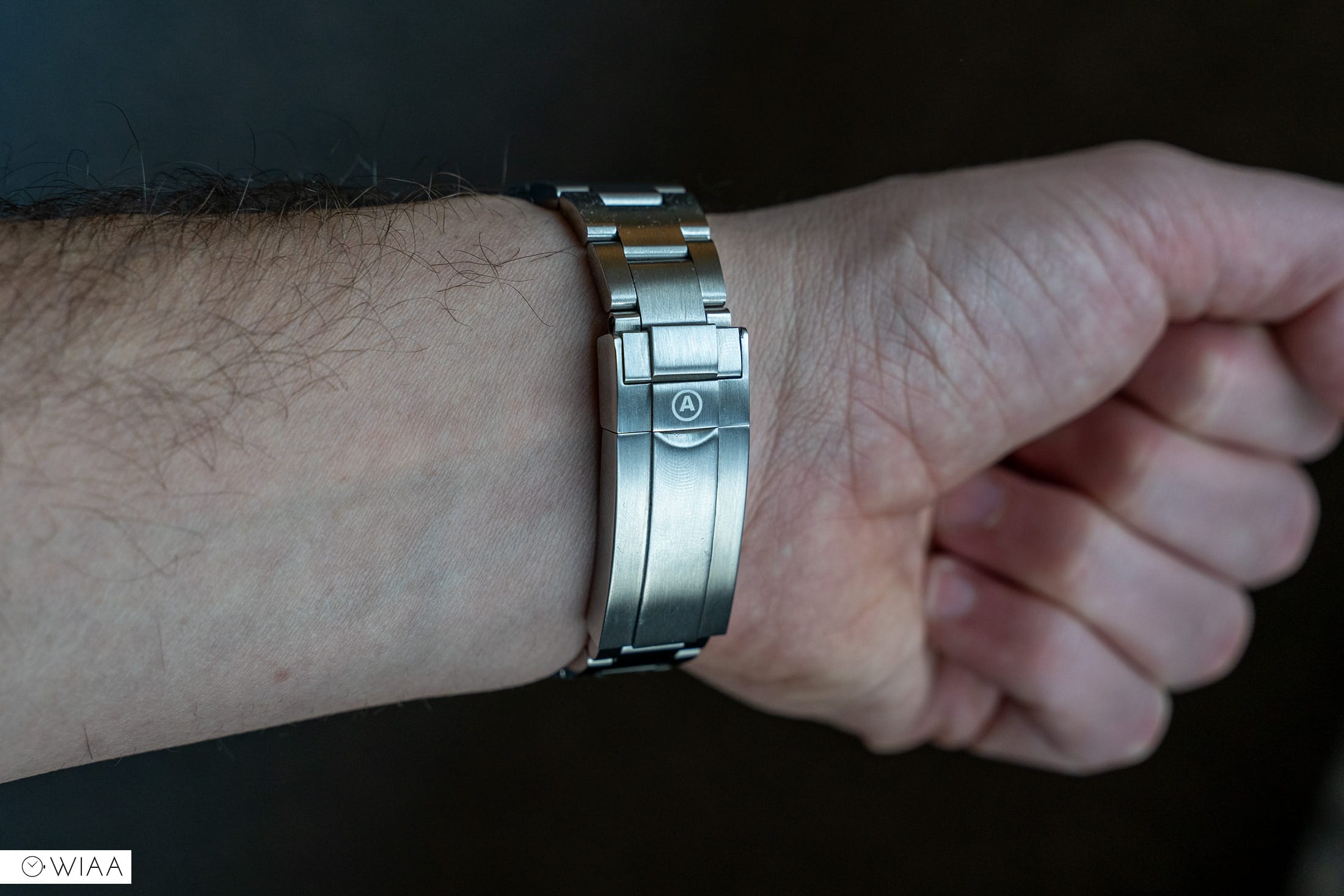
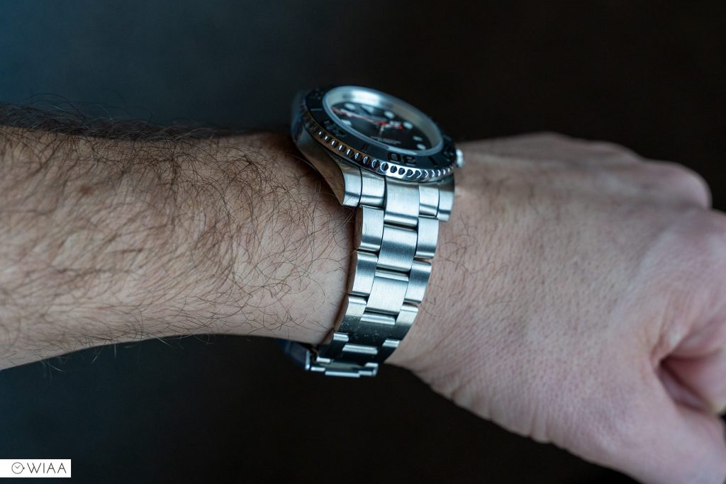
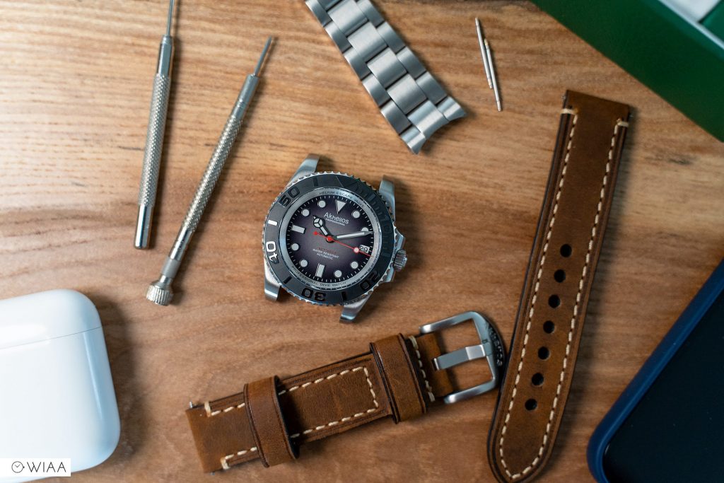
The bracelet and clasp is a very impressive piece of engineering; most certainly better than the majority of other Submariner homages. The screw pins to secure the links were very easy to use and were never at risk of cross-threading. It’s comfortable on, with smooth action and a malleable flex. The double locking buckle feels secure and features the A logo laser etched on the flap bar – it’s a shame it’s not engraved.

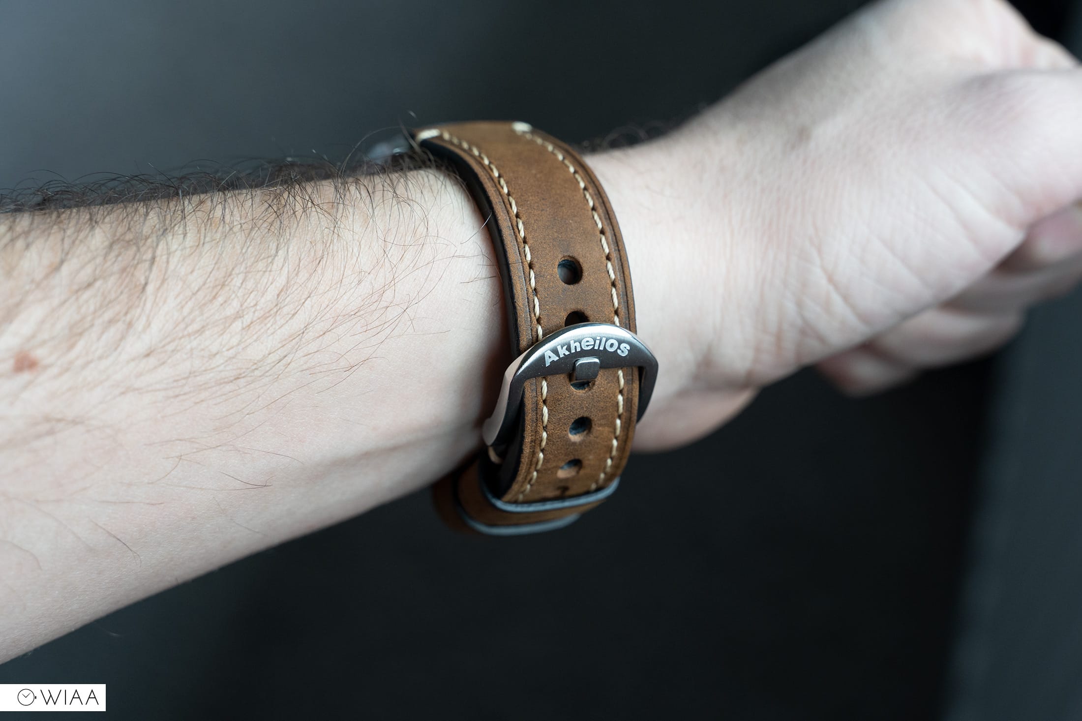
It’s worth noting that the watch comes with a spare strap too; a beautiful thick, well-oiled genuine leather strap. The quality is top-notch, a lovely oaky brown colour, and it’s really supple out of the box. On top of that, you get a pin removal tool to be able to switch them out; as well as a screwdriver to resize the bracelet.


As mentioned previously, the NH35 could be classed as its weak spot. But, there’s nothing wrong with it. It’s a solid, dependable movement that will provide many years of service… it’s just not a very glamorous movement.
However, there is something that definitely classes as the weak spot for me. The logo.

With a background in design, I look at it and weep a little. Firstly, a pretty bland font. Secondly, what’s going on with the title case? A normal k, but a midget h and i, is a bit of a branding disaster in my eyes. The letters are all over the place and looks pretty amateur if you ask me. If you want to keep it simple, then pick a nice serif font in caps – at least it’ll be elegant enough to match the watch. This was a similar story for Phoibos, another brand very similar to Akheilos. But, they changed their branding and now it’s much nicer. My hope is that Akheilos follow suit.
Of course, I say these things because a logo means a lot to me, due to my background. For many, they won’t give two hoots over the logo – they just want the best value watch money can buy. And that’s totally fine; I completely get that.
Final comments
At $299 / £225, the Akheilos Shark 500 has a lot going for it. Very good build quality, with a couple of little tweaks to make it visually stand out from the rest of the Submariner homages. For me, the logo’s a pretty big turn off in terms of design. For those of you who only care for decent quality watches for the money, then it’s a good option. Otherwise just make sure you’re happy with how it looks.


Elekton Watches
1 December, 2020 at 3:05 pm
Good job! Amazing review about Akheilos Shark 500M Watch!